
14 Dark Moody Bedroom Ideas That Feel Luxurious (Not Gloomy)
A dark bedroom can feel incredibly cozy, sophisticated, and inviting when the right details come together. After testing different paint finishes, bulb temperatures, and furniture layouts in real bedrooms, I’ve found that dark moody bedroom ideas succeed or fail on three things: the undertone of the color you choose, the warmth of your lighting, and how much contrast you allow in the room. Get those right, and a dark bedroom feels like a five-star hotel suite. Get them wrong, and it feels like a basement.
If your bedroom currently feels plain, cold, or unfinished, you don’t need a full renovation to fix it. Repainting one wall, switching to warmer bulbs, or layering in velvet and linen textures can transform the entire mood of the room in a weekend. Below are 14 tested, practical ways to bring depth, richness, and comfort into a darker bedroom — without it ever feeling heavy, cramped, or gloomy.
1. Charcoal Cocoon Walls
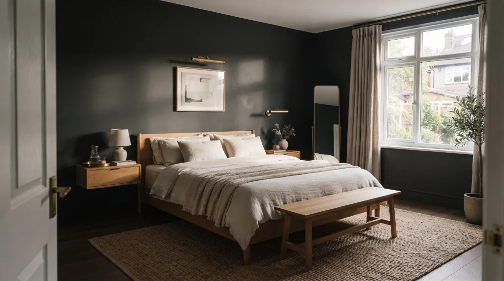
A deep charcoal wall gives a bedroom that intimate, cocooned feeling that makes dark interiors so appealing in the first place. It reads as sophisticated rather than stark because charcoal sits between true black and gray, so it absorbs light softly instead of swallowing it.
Pair it with warm oak furniture, cream bedding, and softly textured linen curtains to stop the room from feeling heavy or one-note. The contrast between the cool wall and the warm furnishings is what creates depth while keeping the space feeling lived-in and comfortable rather than staged.
In my experience, a matte or eggshell finish works far better here than satin or gloss, because matte paint absorbs harsh reflections instead of bouncing light back in uneven patches — this matters most in bedrooms lit by a single overhead fixture. Add a chunky woven jute or wool rug under the bed and a few aged-brass accents (a picture light, a small tray, drawer pulls) to introduce warmth without adding another color.
Quick styling tips:
- Choose bedding in oatmeal, ivory, or soft taupe — avoid stacking several dark tones on top of the wall color.
- Keep the bed low-profile and furniture simple so the wall stays the focal point.
- This look performs best in rooms with generous daylight, since shifting natural shadows reveal subtle variation in the charcoal finish throughout the day.
2. Deep Navy Walls
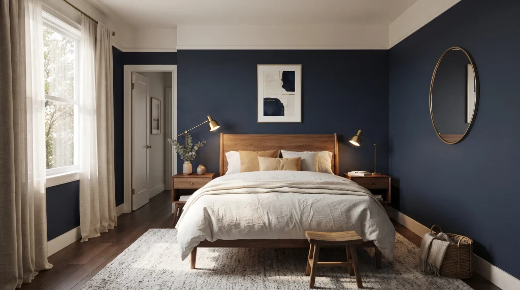
For a richer, more dramatic bedroom, deep navy walls introduce color without relying on flat black. The blue undertone gives the room a finish that reads as both modern and timeless, and it photographs beautifully next to warm white bedding, walnut furniture, and brushed brass lighting. Keep the ceiling and trim a shade lighter than the walls — pure white or warm off-white — so the room doesn’t visually shrink, especially in bedrooms under 120 square feet.
Deep navy works best when the rest of the room leans warm to balance its cool depth. Bring in camel, caramel, tan, or muted cream through pillows, throws, upholstery, and framed art. Warm bulbs around 2700K soften the blue after sunset, turning what could feel cold into a comfortable glow rather than a cave-like atmosphere.
For smaller bedrooms, use reflective touches sparingly — a single framed mirror opposite the window, or one metallic lamp base, is usually enough to bounce light around without breaking the moody effect. A textured headboard, a soft wool area rug, and layered curtains (a sheer plus a heavier navy or linen panel) add dimension without competing with the wall color. The result is a calm, elegant retreat that still feels bright enough for everyday routines like getting dressed or reading in bed.
3. Velvet Statement Headboard
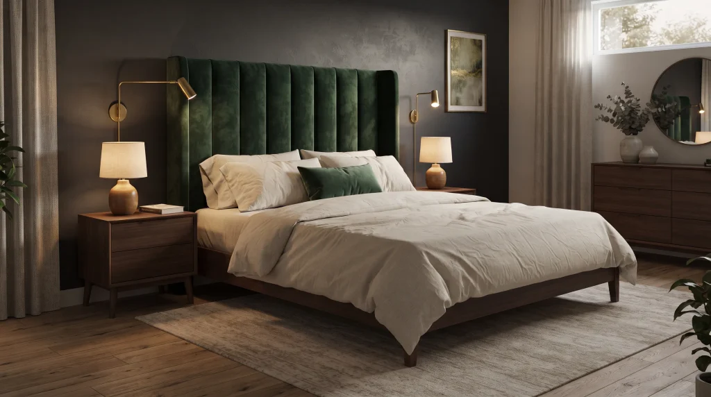
Velvet accents bring instant richness to a dark bedroom, especially when the surrounding palette stays restrained. A deep forest-green or burgundy velvet headboard becomes the natural focal point while charcoal walls and neutral bedding keep the rest of the composition calm. Velvet’s pile catches light differently across its folds, so it adds visual movement and texture without requiring busy patterns or extra decor.
In my experience, one substantial velvet piece almost always looks more refined than five small velvet accessories scattered around a room — a single headboard, bench, or accent chair does more for the space than a handful of throw pillows. Finish the setting with simple linen sheets, dark wood furniture, and warm lamps positioned at bedside height rather than overhead.
The most practical way to use velvet is to let the texture do the decorating instead of adding more colors. Choose one dominant upholstered piece, then echo its tone subtly through a single cushion or a small bench at the foot of the bed. Soft, angled lighting is important here — direct overhead light flattens velvet’s pile and makes the fabric look harsher and less dimensional than it actually is.
Place table lamps near the bed and consider a swing-arm wall light for reading. Keep the floor visually calm with natural wood or a low-pile, muted rug so nothing competes with the headboard. This combination gives a bedroom a polished, boutique-hotel feel while staying practical and easy to maintain for daily use.
4. Dark Wood Layers
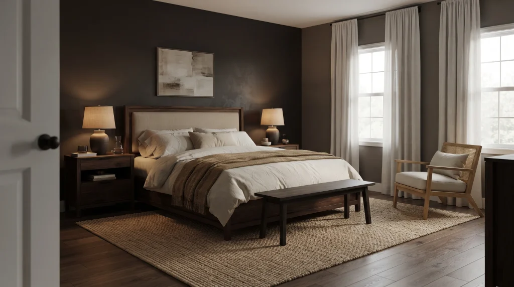
Dark wood furniture grounds a moody bedroom and makes it feel naturally sophisticated without relying on several decorative colors. Instead of introducing new hues, let walnut, espresso, or smoked oak become the main visual layer in the room. Pair the furniture with cream linen bedding and warm neutral textiles so the darker timber stays prominent rather than getting lost against equally dark walls.
Matching two or three wood tones — for example, a walnut bed frame with espresso nightstands and a lighter oak accent chair — usually creates more visual harmony than mixing four or five different finishes in one room. Keep furniture shapes simple and let the wood grain itself provide visual interest, then add a woven rug or a textured throw to introduce softness against the hard surfaces.
The beauty of dark timber comes from its natural variation, so resist the urge to cover every surface with small objects. A substantial wooden bed, coordinated nightstands, and perhaps one simple bench are usually enough structure for the room.
Use warm, low lighting to highlight the wood grain and make the space feel inviting after sunset — uplighting or a picture light angled across the headboard works particularly well. If the walls are also dark, introduce lighter bedding, curtains, or a pale rug to create breathing space around the furniture so the room doesn’t feel like a single dark block. For smaller rooms, choose pieces with visible legs and clean lines so light can pass underneath, keeping the space feeling open while preserving the dramatic character dark wood naturally brings.
5. Emerald Green Accent Wall
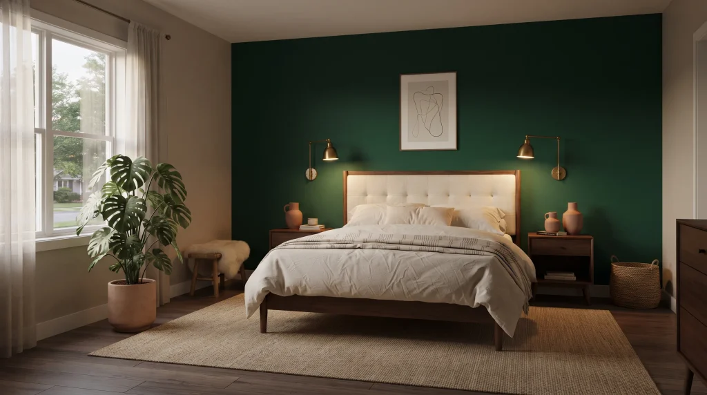
Emerald green can completely change the character of a darker bedroom by adding a saturated jewel-tone accent that still reads as sophisticated rather than costume-y. Use it deliberately — on one wall, behind the bed, or through a substantial upholstered headboard — rather than covering every surface. The rich green pairs naturally with walnut, brass, ivory, and warm beige, creating contrast that still feels cohesive because green already sits close to brown and gold on the color wheel.
A few large-leaf plants, like a fiddle-leaf fig or a monstera, reinforce the connection to nature without introducing another dominant color, and they help the wall feel intentional rather than an isolated design choice. That balance is what makes the room feel luxurious instead of overly styled or showroom-like. Emerald is a particularly effective choice when you want color — not pattern or clutter — to be the room’s defining feature.
To keep emerald green from feeling overwhelming, build the rest of the palette around quieter, supporting shades: cream bedding, warm wood, aged brass hardware, and muted clay or terracotta accessories. If the room gets limited daylight, warm lamps and wall sconces prevent the green from reading as cool or flat once the sun goes down. This works especially well behind a bed, where the accent wall becomes a strong visual anchor and often removes the need for additional artwork. Keep patterns to a minimum and let the richness of the paint, the upholstery, and the plants carry the visual interest instead.
6. Warm Black Contrast
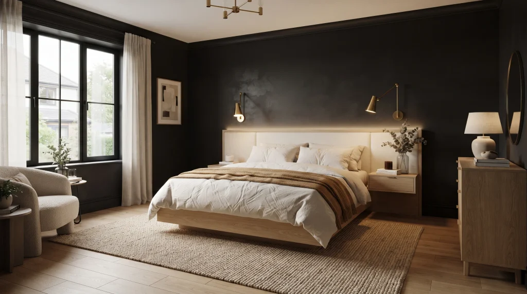
Soft black walls create the boldest possible backdrop, but the room only feels inviting — not like a cave — when warm materials are used to balance the darkness. Light oak flooring or furniture, cream bedding, caramel textiles, and a large beige or jute rug provide the contrast needed to keep the space visually comfortable rather than oppressive. Rather than pairing black with stark white, choose warmer off-whites (think ivory or bone) that blend naturally with timber tones and warm-toned bulbs.
A simple bed frame and streamlined nightstands let the wall color remain the strongest feature in the room, rather than competing with busy furniture silhouettes. This approach suits anyone who wants dramatic bedroom decor but still needs the room to feel relaxed and functional for everyday use, not just for photos.
Lighting makes the single biggest difference when working with black or near-black walls. During the day, let natural light reveal the texture and proportions of the room — black walls actually show more depth and dimension in daylight than most people expect. At night, rely on bedside lamps, wall sconces, or concealed LED strip lighting behind the headboard instead of one bright overhead fixture, which flattens the walls and makes the room feel smaller.
Warm 2700K–3000K bulbs soften darker surfaces and make them feel dimensional rather than flat. A textured rug also visually connects the furniture to the floor, which matters even more when the flooring itself is dark. Keeping the number of finishes limited — no more than three or four materials total — is what keeps this look feeling intentional and refined rather than gloomy.
7. Burgundy Bedding
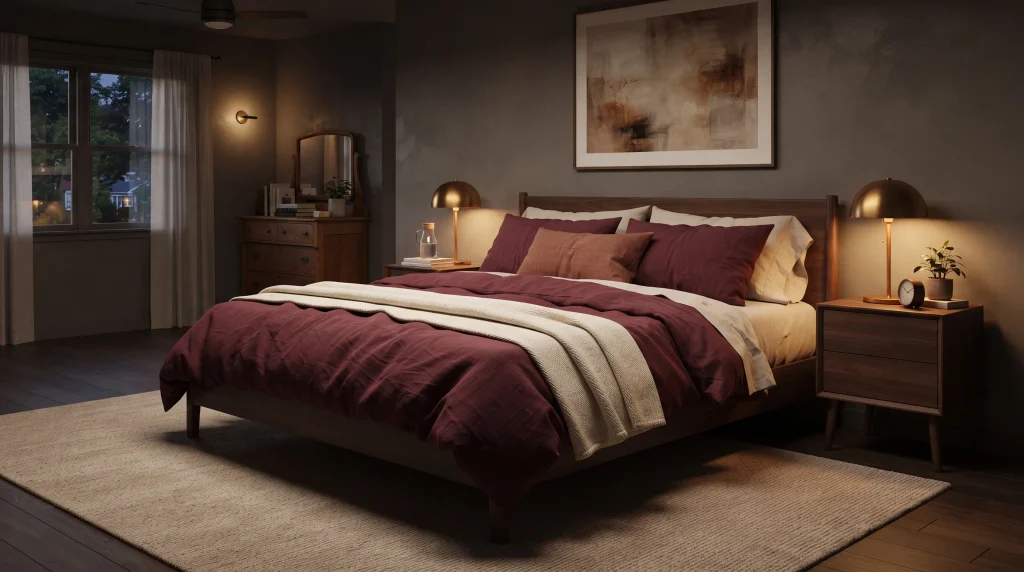
Burgundy bedding gives a darker bedroom an instant sense of richness without committing to a dramatic wall color, which makes it one of the lowest-risk ways to try a moody look. The deep wine shade works beautifully against charcoal, warm beige, cream, or soft brown backgrounds, and it reads as elegant rather than heavy because it’s a warm, red-based tone. Choose linen or washed cotton bedding to keep the color relaxed and tactile rather than overly formal or hotel-stiff.
A walnut bed frame and brass lighting reinforce the warmth of the burgundy, while a cream throw folded at the foot of the bed adds contrast across the palette. Burgundy looks especially effective when it carries most of the room’s color story — as the main textile layer — rather than being scattered across many small accessories where its impact gets diluted.
The easiest way to style burgundy is to build in layers: start with neutral sheets, add a burgundy duvet or quilt as the dominant layer, then introduce one smaller accent — a lumbar pillow or a folded throw — in rust or muted terracotta. Avoid combining more than two jewel tones in one room, since the space can quickly start to feel visually crowded rather than curated.
Soft, warm lighting also makes the bedding appear richer and more dimensional after sunset than daylight alone can show. Because bedding is easy and affordable to swap seasonally, this approach gives you the flexibility to change the entire feel of the room without repainting — burgundy and cream for cooler months, then a lighter linen swap for summer.
8. Gothic-Inspired Gallery Wall
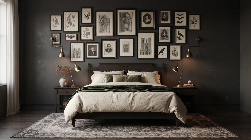
A carefully edited gallery wall brings personality to a moody bedroom while keeping the overall design sophisticated rather than themed or costume-like. Instead of filling the wall with random pieces, choose artwork that shares a visual language — botanical sketches, architectural prints, vintage portraits, or monochrome photography all work well together. Black frames create consistency across different image styles and help unrelated pieces feel like a single collection.
Position the arrangement above the bed or along one dedicated feature wall so it reads as a clear focal point rather than clutter. Leaving consistent breathing room — roughly 2 to 3 inches — between frames makes the arrangement look intentional and gallery-like, and it allows each piece to stay visible against a darker wall instead of blending into shadow.
Balancing a vintage or gothic influence with modern restraint is what keeps this from tipping into a costume. Pair the artwork with clean bedding, dark timber furniture, and simple lighting so the room feels curated, not like a theme park. You can vary frame sizes for visual interest, but repeat one material or finish — all black metal, or all aged wood — to keep the collection cohesive.
Warm brass sconces mounted at either side of the arrangement soften the black frames and add a subtle metallic contrast without extra clutter on the nightstands. For renters, removable picture-hanging strips make it easy to experiment with placement before committing to nail holes. This setup is particularly effective in bedrooms that lack architectural character, since artwork alone can create history, depth, and visual interest without any structural changes.
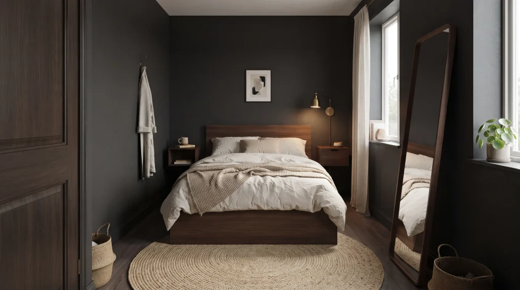
9. Cozy Small-Room Retreat
A small bedroom can actually benefit from a darker palette when the design stays simple and consistent — this is one of the most counterintuitive but effective dark moody bedroom ideas. Rather than treating limited square footage as a limitation, use one deep wall color across all four walls to visually connect the room and create an intentional cocoon effect, similar to how a small, dark restaurant booth feels more intimate than an open dining room.
A compact walnut bed, floating nightstands mounted to the wall, and wall-mounted swing-arm lighting keep the floor area completely clear, which matters more in small rooms than color choice does. Add cream bedding and a textured beige or jute rug to create contrast without losing the intimate atmosphere the dark walls create. This is one of the most practical approaches for tight spaces because every piece earns its place, while the darker backdrop actually makes an oddly shaped or small room feel more cohesive rather than choppy.
The trick to making this work is avoiding competing surfaces in a compact layout. Choose furniture with slim, low profiles, keep decorative objects to a strict minimum, and use vertical wall space for lighting or a single piece of art instead of floor space.
A tall, leaning mirror placed near a window bounces daylight deeper into the room, while lighter linen curtains prevent the space from feeling sealed off during the day. I’ve seen this work especially well in guest bedrooms and city apartments where natural light is already limited — rather than fighting the room’s size with pale colors that show every shadow, embrace the coziness and let controlled contrast do the work.
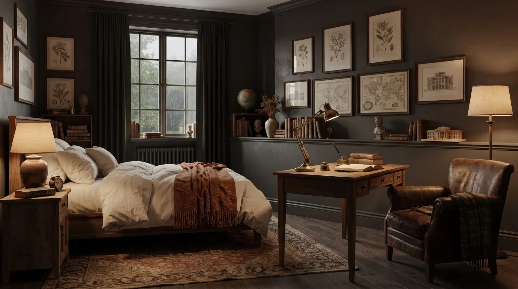
10. Dark Academia Details
Dark academia details give a bedroom a collected, intellectual character without turning it into a costume or theme. Start with rich brown, charcoal, or deep olive tones as the base palette, then layer in aged wood, leather, vintage-style artwork, and warm metal accents like brass or bronze. A small writing desk or a leather reading chair in the corner adds both personality and real function, especially in a bedroom that doubles as a reading nook.
Keep the bedding simple — cream or warm beige — so the room doesn’t become visually crowded once the desk, chair, and artwork are all in place. The strongest versions of this look mix genuinely old pieces (a vintage side table, a secondhand leather chair) with newer furniture rather than relying entirely on manufactured “vintage-style” decor, which tends to look flat and staged by comparison. That mix of old and new is what makes the room feel personal and established rather than assembled from a single catalog.
Lighting plays an outsized role in this style because leather, brass, and aged wood all rely on warm, low light to look their best. Choose table lamps, picture lights, or fabric-shaded sconces instead of a single bright overhead fixture, which flattens texture and makes the room feel clinical.
A patterned wool or Persian-style rug softens dark flooring underfoot, while framed maps, botanical sketches, or architectural prints add character to otherwise plain walls without needing an entire gallery wall. Using fewer, more substantial decorative pieces — one great chair rather than five small objects — makes the room feel authentic instead of staged, while keeping it practical and easy to move around in daily life.
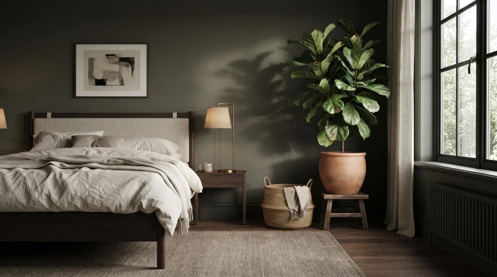
11. Moody Plant Corner
A plant corner softens the heavier character of a dark bedroom while adding life, texture, and natural movement that static decor can’t provide. Place one larger leafy plant beside the bed, near a window, or in an unused corner where it becomes part of the room’s overall composition rather than an afterthought. Deep green foliage looks especially striking against charcoal, navy, brown, or olive walls, since the plant’s natural texture contrasts with the smooth, flat paint.
Use terracotta, stone, ceramic, or woven planters to introduce earthy materials without adding another loud color to the room — the planter should support the plant, not compete with it. This combination creates a natural contrast that makes a darker palette feel fresher and more alive, and it gives an otherwise quiet, unused corner a clear visual purpose instead of sitting empty.
Choose plants based on the actual light the corner receives, not just how they look in photos. A bedroom with bright indirect light can support a wider range of greenery — fiddle-leaf figs, rubber plants, or areca palms — while genuinely darker corners need more tolerant varieties like a snake plant, ZZ plant, or pothos, which will survive lower light without stretching or yellowing.
Keep the surrounding decor simple so the foliage stays the noticeable feature rather than getting lost among other objects. A woven basket beside the planter adds another organic texture, while a warm floor lamp nearby creates attractive leaf shadows on the wall after sunset. In my experience, one well-positioned, larger plant almost always looks more polished than several small pots scattered around a room — it reads as a design choice rather than clutter.
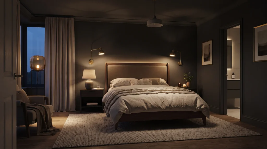
12. Layered Mood Lighting
Layered lighting can completely change how a darker bedroom feels after sunset, and it’s arguably the single most important element on this entire list. Instead of depending on one bright ceiling fixture, combine bedside lamps, wall sconces, floor lighting, or a subtle LED glow behind the headboard to create several distinct light sources at different heights. Different light sources create pockets of brightness that reveal texture and depth, while keeping the overall room feeling intimate rather than flatly lit.
Warm bulbs — generally in the 2700K to 3000K range — work especially well with charcoal, navy, brown, and burgundy because they enhance the richness of those colors instead of washing them out the way cooler, bluer bulbs (4000K and above) tend to do. This approach also gives you real control over the atmosphere throughout the day: brighter task lighting for reading or getting dressed in the morning, then softer, warmer sources in the evening when you want the room to feel calmer and more restful.
Think about lighting at multiple heights so the room isn’t illuminated from only one direction, which is what makes many dark bedrooms feel flat or two-dimensional. Bedside sconces provide focused reading light without taking up nightstand space, while a low floor lamp or a concealed LED strip behind the headboard adds gentle background illumination that fills in shadows
. Choose shades that diffuse the bulb rather than exposing a harsh point of light directly at eye level. For everyday practicality, use separate switches or dimmable fixtures wherever possible — that flexibility matters more in a dark bedroom than almost any other design choice, because good lighting changes the appearance of every single surface in the room and creates a noticeably more comfortable evening environment.
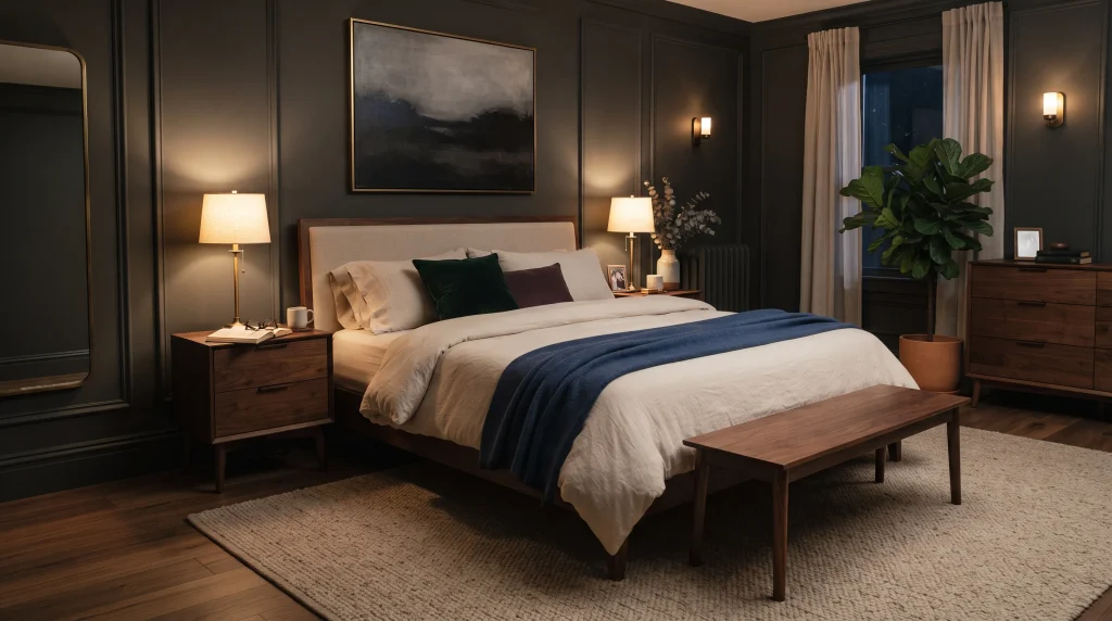
13. Jewel Tone Layers
Jewel tones make a dark bedroom feel layered, sophisticated, and visually memorable without requiring complicated decoration. Emerald, sapphire, plum, and deep teal all work especially well when introduced through bedding, cushions, throws, or a single upholstered feature piece rather than through paint alone. Keep the walls and larger furniture pieces relatively restrained so the saturated colors have room to stand out instead of competing with an equally bold wall.
Cream or warm beige bedding provides a useful visual pause between deeper jewel shades, preventing the room from feeling like a color explosion. Aim for controlled richness rather than a collection of competing colors — repeating one jewel tone in two or three places (a pillow, a throw, and a small accent chair, for example) makes the entire room feel deliberately coordinated rather than randomly decorated.
When working with saturated colors, texture becomes just as important as the shade itself. Velvet, linen, wool, and woven materials make jewel tones appear softer and more dimensional than the same color would look on a flat, smooth surface. Warm brass lighting and dark wood furniture are natural partners for this palette because they don’t introduce competing undertones.
If the bedroom is small, use jewel tones mainly in removable textiles — pillow covers, a throw blanket — rather than painting a wall, so you can adjust the intensity of the look as your preferences or the seasons change. In my experience, one dominant accent color used consistently throughout the room creates a far more polished result than trying to give every single accessory its own dramatic jewel tone.
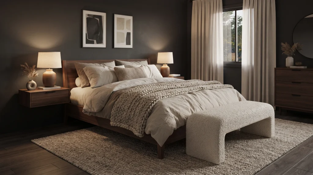
14. Textured Neutral Balance
Texture is one of the easiest and most overlooked ways to make a dark bedroom feel warm instead of visually heavy. Keep the color palette genuinely simple — charcoal, cream, taupe, beige, and natural wood — then create all of the room’s visual variation through material texture instead: linen, boucle, wool, cotton, and woven fibers. A chunky knit throw across the foot of the bed, a textured boucle bench, and a large jute or wool rug beneath the furniture immediately add depth without adding a single new color to the room.
Because the color palette stays restrained, the different surfaces themselves become the visual interest — your eye moves across the room noticing texture rather than color contrast. This approach is especially useful when you want a sophisticated space that feels cozy without relying on lots of decorative objects, art, or accent colors to do the work.
A textured neutral palette works across nearly any room size and furniture style, which makes it one of the safest dark moody bedroom ideas to commit to long-term. Choose washable bedding and durable, low-pile rugs for everyday use, especially in bedrooms that double as reading or relaxation spaces. Warm ceramic lamps, natural timber furniture, and soft linen curtains further soften darker walls without adding pattern.
Avoid introducing more than one or two patterns total, since patterns compete directly with texture for visual attention. Instead, vary the scale of materials — a chunky knit next to a smooth linen next to a nubby boucle — so the room feels layered from a distance and genuinely interesting up close. This creates a balanced, livable retreat where the darker backdrop feels intentional and comfortable rather than like an unfinished design choice.
Frequently Asked Questions
Do dark bedrooms make a room feel smaller?
Not necessarily. A dark bedroom can actually make an oddly shaped or small room feel more cohesive because the walls visually recede rather than showing every corner and angle. The key is keeping trim, ceilings, or one element lighter than the walls, and using layered lighting so the room doesn’t rely on a single overhead fixture.
What is the best paint finish for a dark moody bedroom?
Matte or eggshell finishes generally work best for dark bedroom walls because they absorb light softly instead of reflecting it in harsh, uneven patches, which is more noticeable on darker colors than lighter ones.
What lighting temperature works best in a dark bedroom?
Warm bulbs in the 2700K to 3000K range are best for dark or moody bedrooms. They enhance rich colors like charcoal, navy, and burgundy, while cooler bulbs (4000K and above) can make dark walls feel flat, cold, or clinical.
How do I keep a dark bedroom from feeling gloomy?
Balance dark walls or furniture with warm materials — light wood, cream or ivory bedding, brass fixtures, and layered lighting at multiple heights. Limiting the room to three or four total finishes also keeps the look intentional rather than heavy.
Can a small bedroom handle dark colors?
Yes. Small bedrooms often benefit from a single dark color used consistently across all four walls, which creates a cocoon-like effect rather than emphasizing the room’s limited size the way patchy contrast can.
Conclusion
Creating a darker bedroom is really about finding the right balance between drama and comfort. From rich wall colors and dark wood to velvet, jewel tones, plants, and layered lighting, each idea on this list can add depth while keeping the space genuinely welcoming to live in, not just to photograph. Dark moody bedrooms can feel luxurious without being difficult to recreate, especially when you focus on a few meaningful changes — one wall, better lighting, richer bedding — instead of trying to redecorate every corner at once.
Save this article so you can come back to your favorite ideas when you’re ready for a refresh, and try just one change this weekend to see how much it shifts the feel of your room.





2 Comments