14 Brown Bedroom Ideas for a Warm, Layered, Cozy Retreat
A brown bedroom can feel incredibly cozy—or surprisingly dark when the color is not balanced well.
The right mix of shades, textures, lighting, and natural materials can change everything.
These Brown Bedroom Ideas show simple ways to bring warmth and character into your space without making it feel heavy or dated. From chocolate accent walls and walnut furniture to caramel details, layered bedding, and soft brown curtains, each idea offers an approachable way to create a bedroom that feels comfortable and thoughtfully styled.
Whether you are refreshing a small room or starting from scratch, you’ll find practical combinations that are easy to picture in your own home. In my experience, even one carefully chosen brown element can make a neutral bedroom feel much more inviting.
This guide walks through 14 real ways to bring brown into a bedroom, whether you want a single accent wall, a full wood-furniture overhaul, or just a change of bedding. None of these require a full renovation. Most start with one element — a curtain, a nightstand, a paint sample — and build from there. Pick the one that matches your current room and your patience level, and go from there.
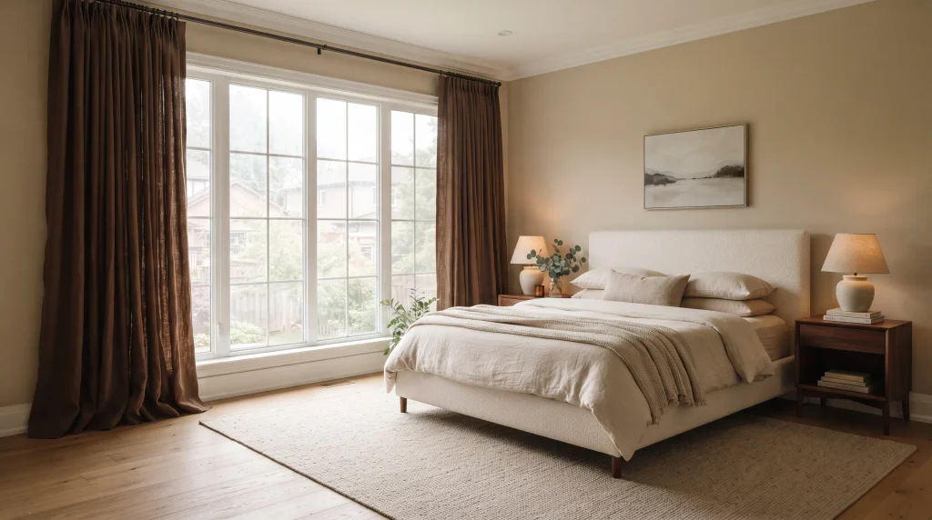
1. Brown Linen Curtains
Curtains are the lowest-commitment way to test brown in a bedroom before you touch the walls. Swap a pair of white panels for a mocha or chocolate linen, and the room reads warmer within the hour — no paint, no new furniture, just fabric catching light differently across the day.
Mount the rod a few inches below the ceiling line rather than right above the window frame. That small adjustment is what makes a room with average ceiling height suddenly feel taller, and it costs nothing extra beyond a longer curtain rod. Linen specifically works better than cotton or velvet here, because its loose weave scatters light instead of absorbing it flatly — a heavy velvet in the same shade can make a room feel noticeably darker.
If privacy matters, look for lined panels rather than doubling up with sheers underneath, which can look cluttered in a small bedroom. Brands like IKEA’s Sanela or Pottery Barn’s Emery linen both come in a true walnut-brown that photographs well against cream or oatmeal bedding, and both are widely available if you want to see the color in person before ordering.
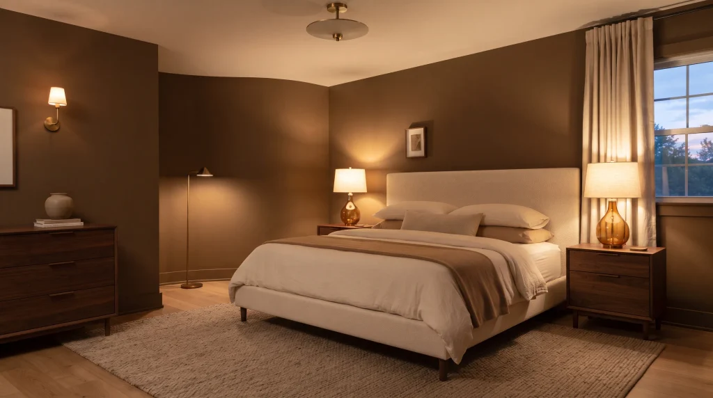
2. Warm Brown Lighting
Lighting temperature changes how brown reads more than almost any other variable in the room. A bulb rated above 3000K will make chocolate and walnut tones look muddy and slightly gray; a warm 2700K bulb makes the same surfaces look rich and glowing. This is the single most common mistake I see in brown bedrooms — people get the paint color right and then light it with a cool white LED that undoes all of it.
Use at least two light sources: a bedside lamp on each side of the bed, plus one additional source — a floor lamp, ceiling fixture, or wall sconce — so the room doesn’t rely on one harsh overhead beam. Amber or ribbed glass shades diffuse the light further and add a small decorative layer without requiring extra accessories.
A dimmer switch is worth the modest cost. Bedrooms need bright, functional light for getting dressed in the morning and much dimmer, warmer light for reading or winding down at night, and a single fixed brightness rarely serves both. If you’re renting and can’t rewire, plug-in lamps with dimmable smart bulbs solve the same problem without any electrical work.
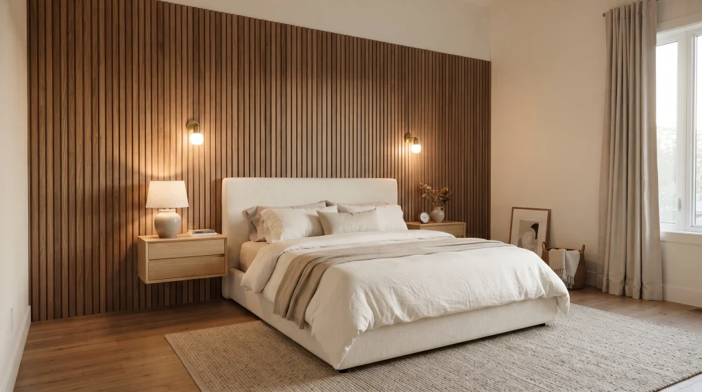
3. Brown Wall Paneling
A large blank wall behind the bed is one of the most common “unfinished” spots in a bedroom, and paneling solves it without requiring artwork, shelving, or a gallery wall. Vertical slats in particular make a low-ceilinged room feel taller, because the eye follows the lines upward rather than stopping at the headboard.
Choose a medium brown rather than a near-black stain if you want the room to stay bright — very dark paneling can swallow light in a room with limited natural daylight, especially through winter months. Real wood slats give the most texture and shadow depth, but pre-finished MDF panel kits (widely sold at hardware stores under names like “shiplap” or “slat wall” panels) achieve a similar look for a fraction of the cost and installation time.
Pair the paneled wall with lighter furniture — oak or ash rather than another dark wood — so the feature wall doesn’t compete with the rest of the room. Add a sconce on either side for practical reading light; it also throws a soft raking shadow across the panel grooves at night, which is genuinely one of the better small design details you can add to a bedroom for the cost.
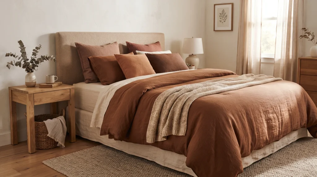
4. Cinnamon Brown Bedding
Bedding is the fastest, cheapest way to change a bedroom’s temperature — literally and visually. Cinnamon brown specifically has a reddish undertone that reads warmer and more alive than a flat taupe or gray-brown, and it photographs beautifully in both morning and late-afternoon light, which is when most people actually see and enjoy their bedroom.
Start with a warm white or ivory sheet set, not stark white — stark white next to cinnamon can look slightly clinical by contrast. Layer a cinnamon duvet or quilt on top, then mix in two or three pillows in adjacent tones: rust, terracotta, or a deeper chestnut. Different fabrics matter more than matching exactly; a smooth cotton sheet under a slightly nubby linen duvet gives the bed texture that a single matched set never will.
Because bedding is easy to swap, this is a genuinely low-risk way to test whether you like brown before committing to walls or furniture. If you decide it’s not for you, it’s a return or a donation, not a repaint. Look for organic cotton or linen-cotton blends if you tend to run warm at night, since heavier cinnamon-toned duvets are sometimes made from denser cotton sateen that traps more heat than percale.
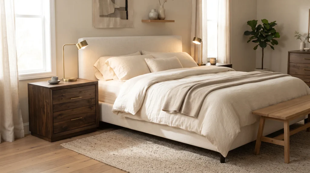
5. Dark Wood Nightstands
Swapping two nightstands is one of the highest-impact, lowest-effort changes you can make to a bedroom, and it’s the one I recommend most often to people who aren’t ready to commit to a bigger project. A pair of espresso or walnut nightstands next to a lighter bed frame instantly gives the sleeping area more visual definition, almost like adding parentheses around the bed.
Keep the surrounding walls lighter — taupe, warm white, or soft beige — so the darker furniture doesn’t disappear into an equally dark backdrop. This contrast is what makes the nightstands read as an intentional design choice rather than mismatched furniture.
For function, prioritize a drawer or shelf if you actually use your nightstand for charging cords, glasses, or a book — an open-shelf design looks great in photos but tends to collect visible clutter in daily use. Keep the tabletop styling minimal: one small lamp, one object, nothing more. In my own bedroom, adding a small brass lamp and a single ceramic dish for jewelry was enough; anything more on that surface just looked busy next to the dark wood grain.
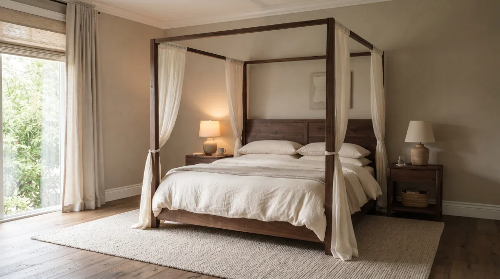
6. Espresso Canopy Bed
A canopy bed is a bigger investment than most items on this list, but it does more visual work than almost anything else in the room — the frame itself becomes the architecture, so you don’t need much else. An espresso or dark walnut frame draws the eye upward and gives even a plain rectangular bedroom a sense of height and intention.
Balance the weight of the dark frame with light bedding — cream or ivory linen, not another dark tone — otherwise the bed can start to feel heavy rather than grounded. A neutral textured rug underneath helps too, softening the hard lines of the wood.
You don’t need to drape the canopy in heavy fabric to make it work. A clean, open frame with no curtains at all reads as more contemporary; sheer white or ivory panels soften it if you want something closer to traditional. Either way, keep the surrounding decor restrained — one throw, one small woven accent — since the bed frame is already doing the heavy lifting. Adding more than that tends to compete rather than complement.
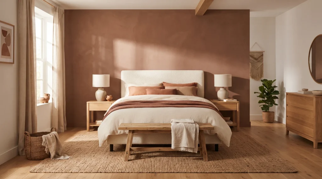
7. Terracotta Brown Palette
Terracotta sits at the warmer, more orange end of the brown family, and it tends to feel less formal and more sunbaked than a traditional chocolate or espresso tone. It works especially well in rooms that get strong afternoon light, since the warmth in the paint amplifies the warmth in the light rather than fighting it.
Use it on the walls if you’re feeling bold, or ease in through bedding, cushions, and ceramics if you’re not ready to repaint. Pair it with cream upholstery and natural oak furniture — pairing terracotta with a cooler gray tends to flatten the color and make it look muddier than it actually is.
Lean into handmade-looking materials here: matte ceramic lamp bases, a jute or sisal rug, linen bedding with visible texture. Glossy or heavily lacquered pieces tend to clash with terracotta’s earthy character. If a full terracotta wall feels like too much of a leap, painting just the wall behind the headboard is a lower-risk way to get the same warmth without committing the whole room, and it’s easy to repaint later if your taste shifts.
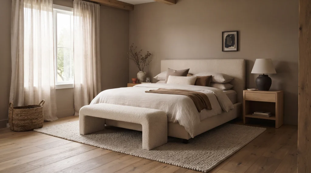
8. Taupe Brown Layers
Tonal layering is the technique professional stylists use most often, because it creates depth without any hard contrast — everything sits in the same warm-neutral family, just at slightly different depths. Start with taupe-brown walls, then build outward with beige, oatmeal, mushroom, and a touch of caramel across the bedding and furniture.
The trick that actually makes this work is texture variation, not color variation. If every surface is a flat, smooth version of the same shade, the room can start to look washed out rather than calm. Mix a linen duvet with a boucle bench, a woven basket, and a wool rug — the material differences do the work that color contrast would otherwise need to do.
Don’t match every element exactly. Let the walls sit slightly deeper than the bedding, and let the furniture introduce one genuinely different wood tone as a break. A single darker accent — a lamp base, a picture frame — keeps the whole look from reading as flat. This approach takes a little more restraint to plan than a bold accent wall, but it tends to age better and feels less trend-driven over time.
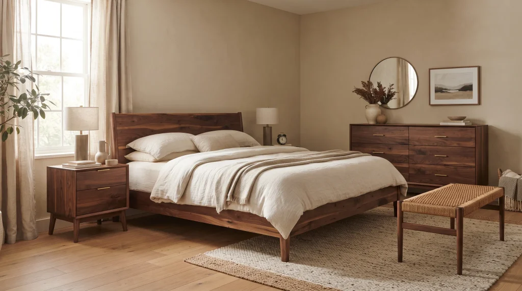
9. Walnut Wood Furniture
Walnut is one of the few materials that can carry an entire bedroom’s warmth on its own, without needing a painted wall to back it up. A walnut bed frame, nightstands, and dresser bring rich, visible wood grain into the room, and that grain does more to make a space feel warm than a flat painted brown ever will.
Keep the walls a warm beige or soft white so the furniture stays the focal point rather than blending into an equally dark backdrop. Cream bedding on top of a walnut frame creates the clearest, most classic version of this contrast.
You don’t need every piece of furniture to match perfectly — in fact, furniture that’s too matched can look like a showroom set rather than a lived-in room. Repeat the walnut tone in two or three spots (a nightstand and a bench, for example) rather than in every single piece. Look for furniture with visible, uneven grain rather than a heavily lacquered, uniform finish; the natural variation is what makes walnut look warm instead of just dark.
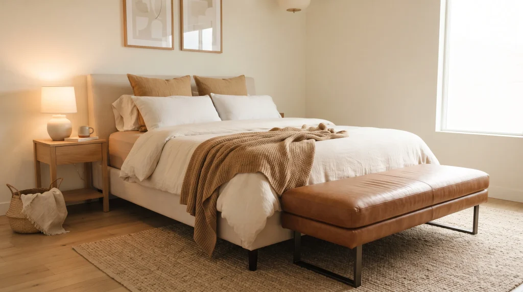
10. Caramel Accent Decor
If you’re not ready to repaint or replace furniture, caramel accents are the easiest entry point into a brown bedroom. A cognac leather bench at the foot of the bed, a caramel throw, or a couple of tan cushions bring warmth into an otherwise neutral room without touching a single wall or major furniture piece.
This works particularly well in rental bedrooms, where painting isn’t an option and furniture needs to stay flexible. Choose two or three caramel elements and repeat them intentionally — one large piece (a bench or chair) and one or two smaller accents — rather than scattering unrelated brown tones around the room, which can look accidental instead of styled.
Leather is worth considering here specifically because it ages well and develops a slightly deeper patina over time, unlike some fabrics that fade unevenly in direct sun. A cognac leather bench is also genuinely useful — somewhere to sit while putting on shoes — so it’s not purely decorative. Finish with a woven basket or linen curtain in a related tone to tie the caramel accents back into the rest of the room.
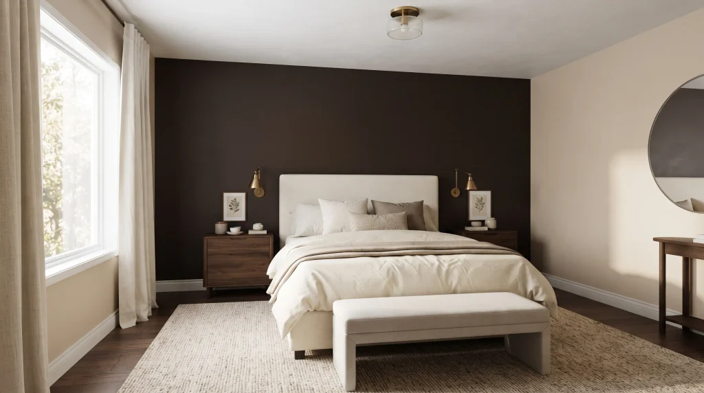
11. Brown and Cream Contrast
Brown and cream is close to a foolproof combination because the two shades do opposite jobs: brown grounds a room, cream keeps it feeling open and bright. Use brown on the walls or major furniture, then let cream carry the bedding, curtains, and any upholstered pieces — the lighter surfaces bounce daylight back into the room and stop the darker tones from making it feel smaller.
This pairing is also one of the easiest to live with long-term, because cream elements are simple and inexpensive to refresh. Swap out pillows, a throw, or artwork when your taste shifts, while the larger brown wall or furniture stays exactly as it is — no repainting required for a full seasonal refresh.
For the strongest result, use your deepest brown in one place — typically the wall behind the bed — and let cream dominate everywhere else, rather than splitting the room evenly between the two. A little beige or taupe in between softens the transition so the contrast doesn’t feel too abrupt. Warm brass or wood-toned lighting fixtures tie the two palettes together nicely at the end.
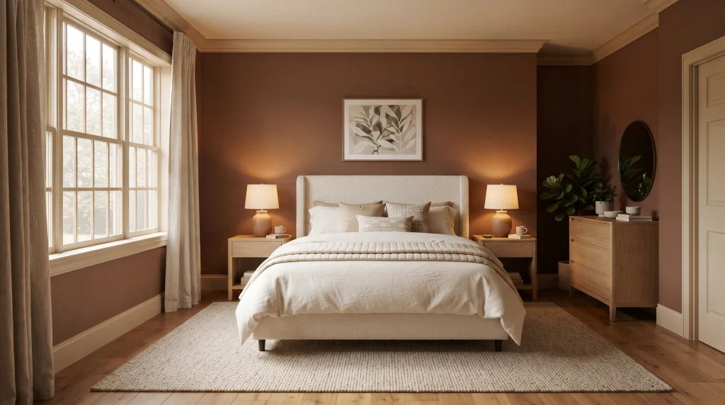
12. Cocoa Brown Walls
Full walls of brown intimidate more people than they should. The fear is almost always “it’ll feel like a cave” — and it will, if you choose a cool-toned or gray-leaning brown and pair it with stark white trim. The real fix isn’t about depth of color at all; it’s about undertone.
Look for a brown with a visible red or orange base — something closer to Farrow & Ball’s “Bancha” or Sherwin-Williams’ “Cavern Clay” — instead of a flatter, gray-adjacent shade like a standard “chocolate” swatch. In a north-facing bedroom I worked on, that undertone difference changed everything: the same wall in a cooler brown looked murky by mid-afternoon, while the warmer-toned version held its richness all the way until sunset.
Go with a matte or eggshell finish rather than satin — sheen on a dark wall shows every roller mark and creates uneven light bounce, which is distracting in a room meant to feel calm. And don’t commit all four walls on instinct alone: tape up a sample at least two feet square and watch it through a full day, since brown shifts more dramatically between morning and evening light than most lighter neutrals do.
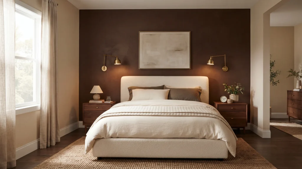
13. Chocolate Accent Wall
An accent wall lets you experiment with a bold, saturated brown without committing to painting the whole room — and it’s the option I recommend most to people who love the drama of a dark wall in photos but are nervous about living with it daily. Place the deepest chocolate shade behind the headboard specifically; that positioning gives the bed a natural focal point and keeps the color from making the whole room feel smaller.
Keep the remaining three walls in a warm beige or soft cream so the room still feels bright and open. Walnut furniture pairs naturally with the deep brown backdrop, and a warm brass or gold light fixture adds just enough contrast to keep the wall from feeling flat.
Resist the urge to fill the accent wall completely. One large mirror, a pair of symmetrical sconces, or a single oversized piece of art is usually enough — overcrowding a dark wall with small frames tends to make it look busy rather than intentional. This is also one of the more reversible choices on this list: a single wall is a weekend repaint if you eventually change your mind.
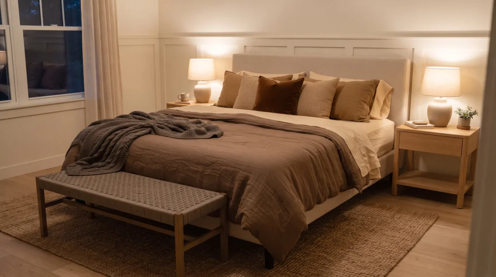
14. Mocha Layered Bedding
A well-layered bed can carry an entire room’s warmth even when the walls stay completely neutral, which makes this one of the most flexible ideas on this list. Start with cream sheets as your base, add a mocha duvet, then bring in caramel, tan, and a deeper chestnut through pillows and a folded throw at the foot of the bed.
Mixing fabrics matters more than matching colors exactly. Pair a smooth cotton sheet with a slightly nubby linen duvet and a knitted throw — the texture differences read as intentional layering rather than a single matched set pulled off a shelf. Choose shades that sit at noticeably different depths rather than close variations of the same tone, since too-similar shades can blur together instead of creating visual interest.
A woven bench or ottoman at the foot of the bed can repeat one of the deeper tones while adding practical seating. Finish with a small rug underneath in a complementary neutral and warm bedside lighting to bring out the richness of the fabric layers at night. This is genuinely one of the easiest updates to make in a single weekend, and one of the easiest to undo if your taste changes.
Frequently Asked Questions
Is brown a good color for a bedroom?
Yes, when the undertone is warm rather than gray or cool. Brown with red or orange undertones tends to feel cozy and calming, while gray-based browns can read as dull or cave-like, especially in rooms with limited natural light.
What colors go well with brown in a bedroom?
Cream, ivory, and warm white create the clearest contrast and keep a brown room feeling bright. Terracotta, caramel, and rust work as complementary accents, while sage green or dusty blue can add a cooler counterpoint if you want more contrast.
Does brown make a bedroom feel smaller?
It can, if used on all four walls in a small room with little natural light. Using brown on a single accent wall, in furniture, or through bedding instead of a full paint job avoids this while still bringing in warmth.
What lighting works best in a brown bedroom?
Warm bulbs around 2700K bring out the richness in brown tones; cooler bulbs above 3000K can make the same surfaces look muddy or gray. Layer at least two light sources rather than relying on one overhead fixture.
Conclusion
Brown rewards a light touch more than almost any other bedroom color — a single well-chosen element, whether it’s a curtain, a nightstand pair, or a layered duvet, can shift the whole feeling of a room without a full renovation. Start with whichever idea matches your current space and your appetite for change, live with it for a few weeks, and build from there. If you try one of these, I’d genuinely like to hear which one made the biggest difference in your room.




One Comment