16 Sage Green Kitchen Designs for a Modern Look
A beautiful kitchen doesn’t need a complete renovation to feel fresh. Sometimes, the right color is all it takes to change the mood of the room. You don’t need a $30,000 gut remodel to make your kitchen look fresh. Sometimes, just changing the cabinet color does all the heavy lifting.
Sage Green Kitchen Designs has become huge lately because it gives you actual color without feeling loud or trendy. Whether you’re painting existing cabinets, adding a quick backsplash, or just looking for color combos that won’t feel dated in three years, here are practical ways to bring sage green into your kitchen.
When working with muted greens like sage, my top recommendation is focusing on natural light and hardware contrast. Pairing sage cabinets with warm brass or matte black fixtures prevents the space from looking dull, especially in smaller kitchen layouts
1. Sage Lower Cabinets with White Uppers
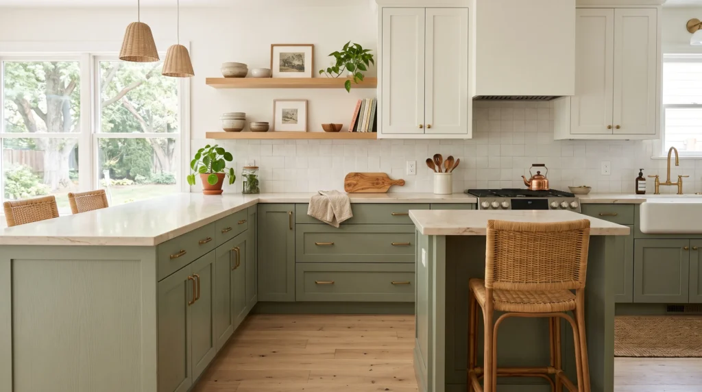
If you’re worried a full green kitchen will feel dark or small, paint only the lower cabinets. Keeping the upper cabinets off-white or cream makes the ceiling feel higher, while the darker sage below hides scuffs, shoe marks, and daily spills far better than pure white does. This is one of the most forgiving ways to introduce color because it lets you test how much green you actually want to live with before committing to a full repaint.
Why it works: The pale upper section keeps the room feeling open, which is especially useful in kitchens with limited natural light or a lower ceiling height. Because your eye travels upward toward the lighter cabinets first, the room reads as taller and airier than it would with a single dark color from floor to ceiling.
How to put it together:
- Pair the lower cabinets with a lightly veined quartz or marble-look countertop — heavy veining can compete with the two-tone cabinet split, so keep the pattern subtle
- Add one warm texture to bridge the two tones, such as oak bar stools, a wood cutting board left out on the counter, or brass cabinet pulls
- Choose a durable, washable paint finish for the lower cabinets specifically, since this is the area that takes the most daily abuse from bags, pets, and kids
- If your kitchen backs onto a dining or living space, extend the cream upper tone into nearby trim or shelving so the transition between rooms feels continuous rather than abrupt
This layout also tends to be more budget-friendly than a full cabinet repaint, since you’re only refinishing half the cabinetry, and it gives you room to change the upper cabinet color again later without touching the sage base.
2. Sage Green Kitchen Island
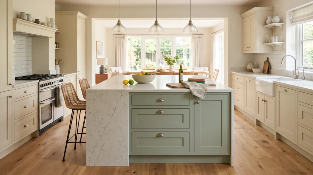
Painting an entire kitchen green is a big commitment. Painting just the island isn’t. It creates a focal point in the middle of the room while your wall cabinets stay neutral, so you won’t tire of the color in a couple of years — and if you ever do, repainting one island is a weekend project, not a full renovation.
Design details that make it work:
- A white quartz countertop with softly rounded edges keeps the island substantial without looking bulky, and the rounded profile is safer for kitchens where kids or pets move through often
- Deep drawers for pots and pans, plus comfortable stool seating on the open side, make the island functional rather than purely decorative
- Matte black or brushed brass hardware adds contrast without competing with the green — pick one metal and repeat it on the faucet and any pendant lighting above the island
- Under-cabinet or toe-kick lighting on the island base can make the sage color read differently at night, adding warmth once natural light fades
Practical planning notes: leave at least 42–48 inches of clearance around the island for comfortable movement, and make sure the overhang on the seating side is deep enough (about 12 inches) for knees to tuck under comfortably. If the island includes a sink or cooktop, budget for slightly more maintenance on that section of paint, since it will see more splashes than the rest of the cabinetry.
This layout is particularly effective in open-plan homes, where the island visually separates the kitchen from adjoining living or dining space without needing a wall to do it. Pendant lighting above the island reinforces that separation while keeping sightlines open across the room.
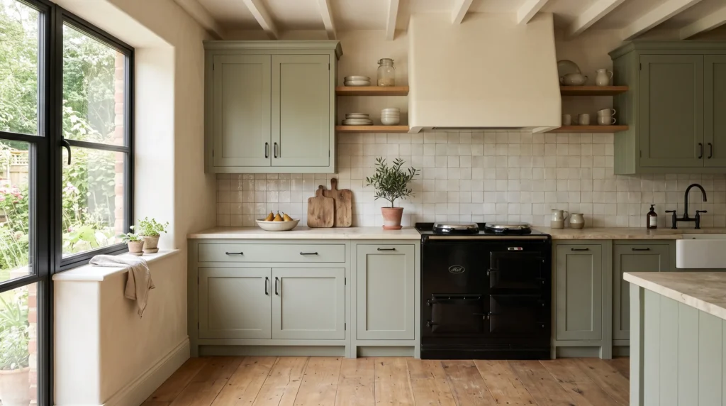
3. Muted Sage Shaker Cabinets
Shaker-style doors are a design classic because the simple frame-and-panel shape rarely looks dated — the style has been in continuous use in American kitchens for close to two centuries. A muted, gray-toned sage keeps shaker cabinets from feeling too formal or farmhouse-specific, which is part of why this pairing works across a wide range of home styles, from traditional to transitional.
A grounded pairing: matte black pulls, warm oak flooring, natural stone countertops, and handmade-look backsplash tile. The room gains character through materials rather than extra color or decoration, which keeps the overall look from feeling overdesigned.
Why the shape matters long-term: because shaker doors have a simple, recognizable profile, you can change the surrounding elements — hardware, lighting, backsplash — without the cabinets themselves ever looking out of place. That’s a real advantage if you’re renovating on a budget now but want the option to update details in five or ten years without replacing cabinet doors again.
Styling tips:
Limit countertop decor to a few functional pieces — a wooden board, a ceramic bowl — so the cabinetry’s classic lines stay the visual focus
Choose a satin or matte paint finish rather than high-gloss — gloss tends to make the recessed shaker panel lines look more plastic and less handcrafted
Keep the backsplash tile in a similar tonal family (cream, warm white, soft gray) so it doesn’t compete with the shaker door’s own shadow lines
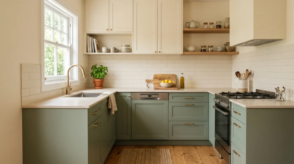
4. Two-Tone Sage Cabinets for Small Kitchens
In galley or small kitchens, dark upper cabinets can feel like they’re closing in on you, especially in rooms with only one window or a single source of natural light. Putting sage on the bottom and soft cream on top breaks up the vertical space and draws the eye upward, which makes narrow kitchens feel wider and taller at the same time.
Undertone matters more than usual here: choose a sage with gray or warm undertones rather than a bright mint or true green — cooler, more saturated greens can look sterile or clinical under standard overhead kitchen lighting, particularly in a small, enclosed space where there’s less daylight to soften the tone. Test a sample on the actual wall at different times of day before committing, since small kitchens often have mixed lighting (a window plus overhead fixtures) that can shift how the color reads.
Making the transition feel intentional, not accidental:
Add a single pendant or under-cabinet light near the color transition to draw a little extra attention to that line, rather than letting it disappear into shadow
Keep pale stone counters and a simple tile backsplash so the eye has a clean line between the two cabinet tones
Align the upper and lower cabinet doors so the horizontal break between colors falls at a consistent height across the whole run — an uneven line reads as unfinished
In a true galley layout, applying the same two-tone split on both sides of the room reinforces the effect and keeps the kitchen feeling cohesive rather than lopsided
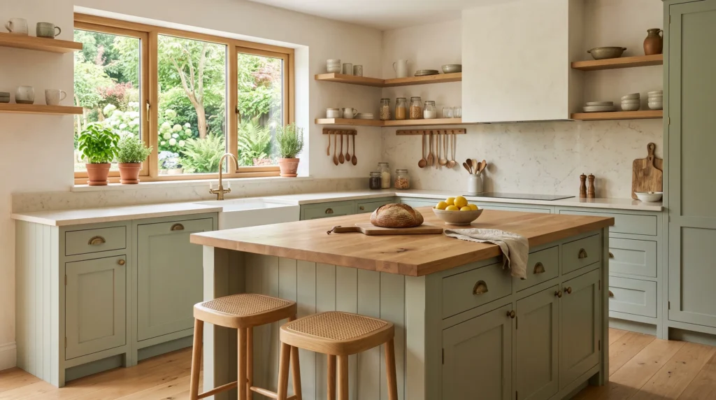
5. Sage Cabinets with Natural Wood
Sage green and raw wood pair naturally because they echo tones found outdoors — leaves, bark, stone — so the combination tends to feel calming rather than decorated. You don’t need much: one substantial wood element, like a butcher-block island top or a pair of open oak shelves, is enough to warm up painted cabinetry and keep it from feeling flat or cold.
Choosing the right wood tone: lighter woods like white oak or ash tend to keep the kitchen feeling bright and contemporary, while warmer woods like walnut or reclaimed pine lean more traditional or rustic. Match the wood undertone to your sage — a sage with cooler gray undertones pairs well with lighter oak, while a warmer, more olive-leaning sage works nicely with richer walnut tones.
Keep it cohesive: repeat the same wood tone in two or three spots — for example, the island top, open shelving, and counter stools — instead of mixing several different wood finishes in one room. Mixing too many wood tones (say, a walnut island next to oak flooring next to a pine shelf) can make the kitchen feel unplanned even if each individual piece looks good on its own.
A few ways to bring in wood without a major renovation:
Introduce a small wood shelf above the sink or stove for everyday items
Swap one run of upper cabinets for open wood shelving
Add a wood cutting board or tray as a permanent countertop feature rather than something stored away
Use wood counter stools instead of upholstered or metal ones
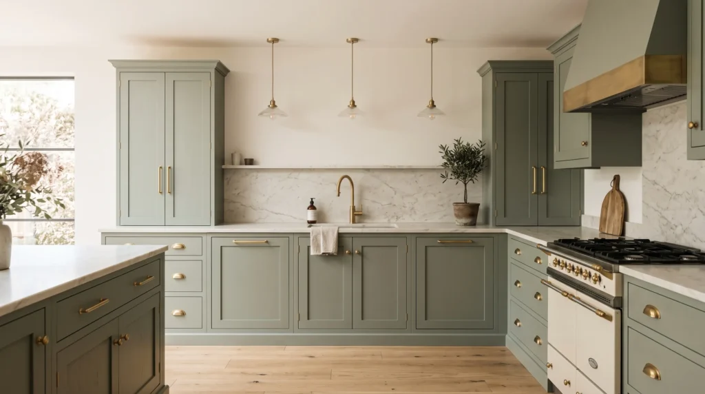
6. Brass Hardware with Sage Cabinets
If chrome or nickel hardware feels cold against green cabinets, switch to brushed brass or unlacquered bronze. Warm metals catch and reflect light in a way that cool metals don’t, which makes them feel more at home against an earthy cabinet color. Use the finish consistently — drawer pulls, cabinet handles, and the faucet — rather than mixing brass on the cabinets with chrome on the sink, which can make the room feel unplanned.
Brushed brass vs. unlacquered brass: brushed brass has a protective coating that keeps its finish consistent over time, making it a lower-maintenance choice. Unlacquered brass will patina and darken naturally with use, which some homeowners like for the aged, lived-in look it develops, but it requires more upkeep if you want to maintain a bright, uniform shine.
Building the rest of the palette around brass:
If your kitchen has black or dark window frames, brass provides a warm counterpoint that keeps the space from feeling too cool or industrial
A softly veined quartz or marble-look countertop adds movement without overwhelming the cabinetry — avoid countertops with strong gold or yellow veining, which can clash with the brass rather than complement it
This combination works especially well with simple slab-front cabinet doors, since the hardware and countertop become the visual interest instead of an ornate door profile competing for attention
Extend the brass into lighting fixtures — pendant lights or sconces — so the warm metal tone repeats around the room rather than appearing only at counter height
7. Sage Green Tile Backsplash
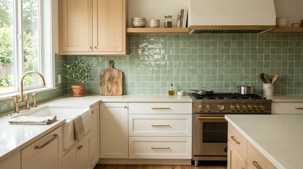
Not ready to paint your cabinets? Put the color on the wall instead. A sage backsplash behind the stove or sink adds personality while keeping cabinetry neutral — a good option for renters, anyone planning gradual updates, or homeowners who want to test whether they actually like sage green before committing to it on cabinetry, which is a much bigger surface area and a more expensive change to reverse.
Two textures, two very different effects:
- Glossy subway tile reflects light around the room and wipes clean easily, making it a practical choice directly behind a stove or sink. It also reads as more classic and less trend-dependent.
- Handmade Zellige-style tile adds visible texture, slight color variation from tile to tile, and a more artisanal look — but the uneven surface takes more effort to wipe down around a busy cooktop, since grease and splatters can sit in the texture.
Where to stop the tile: running the backsplash only behind the range or sink keeps the project smaller and less expensive, while extending it to full-height (countertop to upper cabinet) creates a bigger visual statement. A full-height backsplash also protects more wall space from moisture and staining, which matters if you cook often.
Grout choice matters too: a grout color close to the tile keeps the wall looking like a single block of color, while a contrasting grout emphasizes each individual tile shape — worth deciding on purpose rather than defaulting to whatever the installer suggests.
8. Sage Cabinets with Veined Stone Countertops
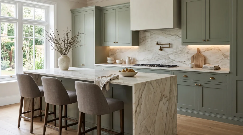
A dramatic stone countertop makes sage cabinetry feel layered rather than flat. Look for soft gray, cream, or taupe veining — a pattern that complements the cabinet color rather than competing with it. Avoid countertops with strong warm gold, rust, or orange veining, which can clash with a green that leans cool or gray.
Marble vs. quartz — the real trade-off:
- Natural marble offers the most visual depth and truly unique veining, since no two slabs are identical, but it’s porous and needs regular sealing to prevent staining from oil, wine, or acidic foods. It can also etch (lose its polish) from contact with citrus or vinegar.
- Quartz with a marble-look pattern gives you a similar visual effect with far less maintenance — no sealing required, and it resists staining and etching much better. The trade-off is that the veining is printed or engineered rather than naturally occurring, so patterns can repeat if you look closely across a large surface.
Getting the pairing right:
If using real marble, ask your fabricator about a honed (matte) versus polished finish — honed marble shows etching less obviously than a high polish, which is worth considering in a busy kitchen
Repeat only the countertop’s quietest, most muted tones elsewhere in the room — in stools, pottery, or wall color — rather than trying to match every vein color
Under-cabinet lighting can highlight the stone’s veining at night, when it’s otherwise harder to see against the darker sage cabinetry
9. Sage Cabinets with Open Shelving
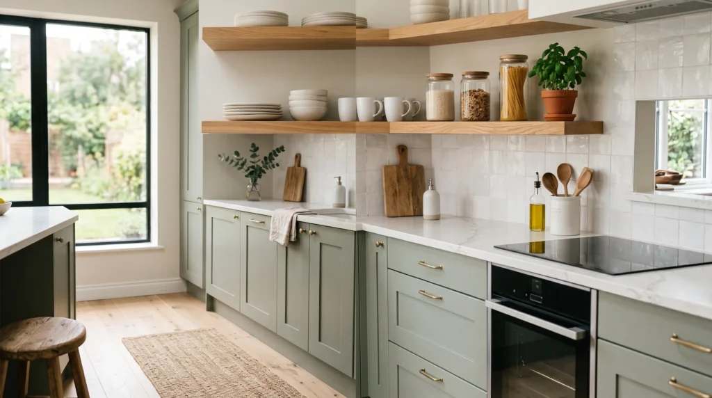
Swapping a section of upper cabinets for two floating oak shelves opens up a wall instantly, both visually and in terms of actual light — closed cabinets block more of the wall than an open shelf with a few objects on it. It’s also a practical edit: only display what you actually use daily, so the shelves don’t turn into dust collectors that need constant cleaning.
Styling open shelves without them looking cluttered:
- Group items by color rather than by function, so a shelf of white bowls and cream mugs reads as intentional rather than random
- Leave visible breathing room between objects — a shelf packed edge to edge looks busy no matter how nice the individual pieces are
- Keep the total number of displayed items limited; a good rule of thumb is roughly 60–70% of the shelf surface left empty
- Mix heights and shapes slightly (a stack of bowls next to a single tall pitcher) so the arrangement doesn’t look too uniform or too random
Practical considerations before removing cabinets: open shelving means everything on it collects kitchen grease and dust faster than items behind a closed door, so it works best near lower-traffic cooking zones rather than directly above a stove. It also means you’ll want to keep the display genuinely tidy, since there’s nowhere to hide clutter. This approach works particularly well in kitchens with limited natural light, since removing bulky upper cabinets opens up the sightline and lets whatever light there is travel further across the room.
10. Full Sage Cabinetry
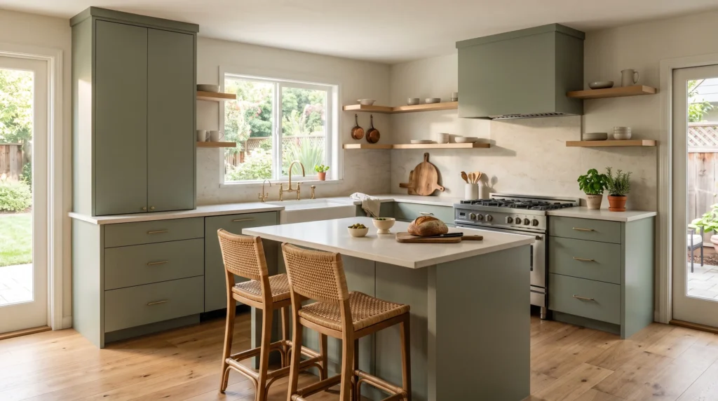
A kitchen with sage cabinetry throughout looks confident but doesn’t have to feel heavy. The keys are a muted, gray-toned green, warm white walls, pale countertops, and simple cabinet fronts — ornate raised-panel doors combined with a strong, saturated color can start to feel busy or dated faster than a clean, flat-panel door in the same color.
Managing the amount of color in the room: because every cabinet surface is green, everything else in the kitchen needs to work harder to keep the space feeling balanced. Large windows or glass upper cabinets help prevent a deeper sage from making the room feel closed in, especially in kitchens that don’t get much natural light to begin with. Pale flooring — light oak, whitewashed wood, or pale stone tile — also helps keep the overall room bright rather than letting the green dominate from floor to ceiling.
Keeping it from feeling like a themed room:
This approach tends to work best in medium to larger kitchens; in a very small, enclosed kitchen, full cabinetry in a deep color can make the room feel smaller rather than more cohesive
Keep the countertop mostly clear so the cabinetry stays the strongest visual element, rather than competing with a busy backsplash or heavily patterned counter
Let one or two functional accessories — a wood cutting board, a small herb planter, a ceramic bowl — add personality without turning into clutter
Vary the cabinet door style slightly if possible — for example, glass-front doors on one or two upper cabinets break up the solid color and add visual interest without introducing a second paint color
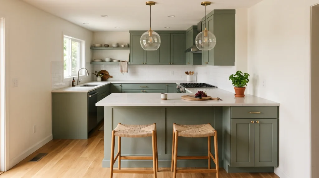
11. Sage Peninsula Seating
If your kitchen can’t fit a full island, a peninsula gives you extra workspace and seating without needing the floor space a freestanding island requires. Because a peninsula stays connected to the existing cabinet run on one end, it’s often a simpler and less expensive addition than building a fully freestanding island with its own plumbing or electrical runs.
Getting the dimensions right:
- Extend the cabinetry with a slightly wider countertop overhang — typically 12 to 15 inches — on the open seating side
- Make sure there’s enough knee clearance underneath for adults to sit comfortably without bumping the cabinet base
- Match stool height to the counter: standard counter height (36 inches) needs 24-inch stools, while a taller bar-height counter (42 inches) needs 29–30 inch stools
- Leave at least 24 inches of width per person seated at the peninsula so people aren’t elbow to elbow
Making the space feel like its own zone: a pendant light or two above the peninsula helps define it as a distinct seating area without adding a wall or visually closing off the room — which matters in smaller kitchens where every sightline counts. This spot often becomes the default location for breakfast, homework, or quick food prep simply because it’s the most flexible surface in the kitchen, so it’s worth prioritizing durable, easy-to-clean countertop material here specifically.
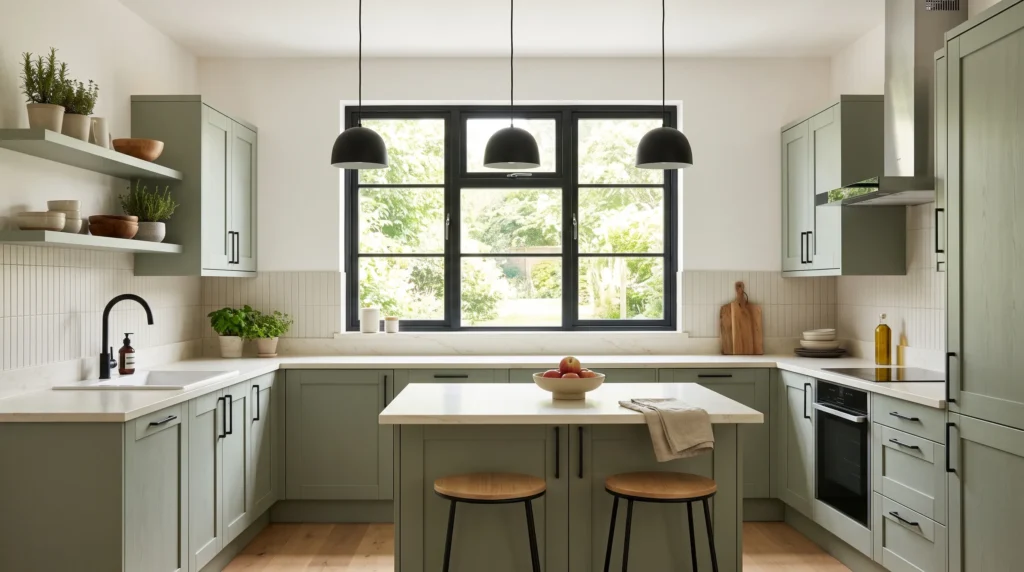
12. Sage Green with Matte Black Accents
For a more modern edge, add matte black hardware — faucet, window frames, slim pendant lights, cabinet pulls. A little goes a long way: a few thin black details are enough to sharpen the look without overpowering the softer sage tone underneath.
Why matte over glossy: a matte or satin black finish tends to look more contemporary and less severe than high-gloss black, which can read as heavier and more formal. Matte finishes also hide fingerprints and water spots better, which matters on a faucet or frequently touched cabinet hardware.
Where black works best:
- Faucet and plumbing fixtures — a single black faucet against sage cabinetry and pale countertops creates an immediate anchor point in the room
- Window frames, especially in kitchens with black-framed windows or doors elsewhere in the home, which ties the kitchen into the rest of the house’s finishes
- Slim pendant lighting, where thin black fixtures read as almost architectural rather than decorative
- Cabinet hardware, though this is usually the boldest choice since it repeats across every door and drawer
Keeping the balance right: balance the darker accents with warm white walls or light wood flooring so the kitchen doesn’t feel heavier overall — black absorbs light rather than reflecting it, so too much of it in a small or dim kitchen can make the space feel smaller. Repeating black in several small, thin details (rather than one large black feature like an oversized range hood) tends to read as more intentional and less like a mismatched addition.
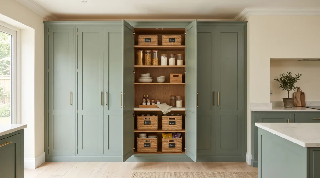
13. Sage Green Pantry Wall
A full-height sage pantry cabinet adds color and storage without covering every surface in the kitchen — a useful middle ground between painting nothing and painting everything. The vertical line draws the eye upward, which can make a room with standard ceiling height feel a bit taller, similar to the effect of floor-to-ceiling curtains in a living room.
What to put behind the doors: adjustable interior shelving is worth prioritizing here, since a pantry cabinet’s main job is storage. Deeper shelves near the bottom can hold small appliances (stand mixer, slow cooker) that would otherwise crowd the counter, while narrower upper shelves work well for dry goods, spices, and serving pieces used less often. Pull-out shelves or baskets make items at the back of a deep cabinet easier to reach without unloading everything in front of them.
Balancing the color with the rest of the room:
If space allows, a narrow glass-front section within the pantry run breaks up the solid color and gives you a place to display attractive serveware
Choose a lighter floor and a countertop that reflects natural light, since the tall cabinet wall already introduces a large block of saturated color
Brass pulls add warmth to the pantry wall, while matte black hardware creates a sharper, more contemporary contrast — either works, depending on the rest of the kitchen’s hardware
Keep decoration on or around the pantry minimal, since the cabinetry itself is already a strong visual feature; a few glass jars, a woven basket, or a small wood tray on an open section is plenty
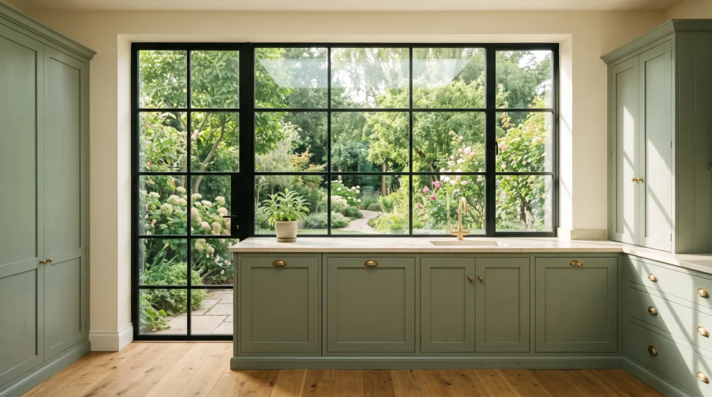
14. Sage Cabinets Around a Window Wall
Framing a large kitchen window with green base cabinets lets natural light change how the color reads throughout the day — often softer and cooler in the morning, warmer in the afternoon as the light shifts. This is one of the more dynamic ways to use sage, since the same paint color can look noticeably different at 8 a.m. versus 5 p.m. It works especially well in kitchens that look out onto a garden, trees, or any green outdoor view, since the cabinet color echoes what’s visible through the glass.
Designing around the window rather than against it:
- Keep the windowsill mostly clear — one small planter or a single ceramic piece is enough — so daylight isn’t blocked and the outdoor view stays the visual priority
- Choose easy-clean materials nearby, since window-adjacent areas near a sink see regular splashes and are harder to wipe down if the sill has a lot of decorative clutter on it
- If the window sits above the sink, consider open shelving on either side rather than closed cabinets, so the whole wall feels lighter and doesn’t box in the window
- Warm oak flooring nearby reinforces the natural, outdoor-facing feel, while creamy wall color keeps the space bright even on days when the window’s light is more limited
A note on testing the color: because a window wall gets dramatically different light throughout the day compared with an interior wall, it’s worth painting a large sample directly next to the window and checking it in both morning and evening light before committing to the full cabinet run.
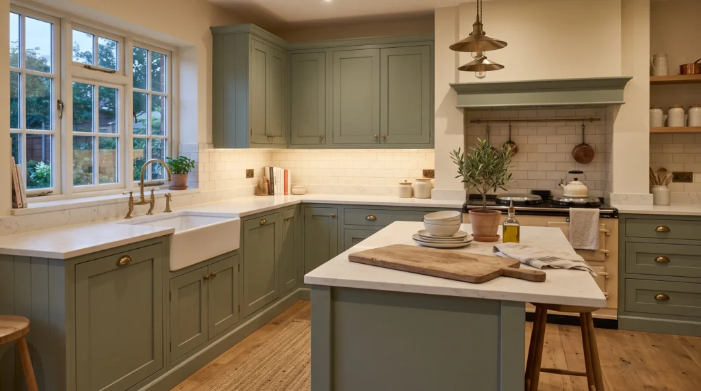
15. Sage and Cream Color Palette
Pairing muted sage cabinetry with cream walls, counters, and backsplash tile creates one of the softest, most forgiving palettes to live with day to day. Cream adds warmth in a way that stark white doesn’t, since pure white has cooler undertones that can create sharp contrast against an earthy green — cream instead bridges the two tones gently, which is part of why this combination tends to feel comfortable and lived-in rather than clinical or showroom-like.
Materials that reinforce the palette:
- Lightly veined quartz or creamy ceramic tile keeps surfaces bright without introducing a second bold color
- Warm oak flooring or cabinetry accents add a third natural tone that sits comfortably between the sage and the cream
- Aged or brushed brass hardware picks up the warmth in both the cream and the wood, tying the palette together at a smaller, detail level
- Warm-toned under-cabinet lighting (rather than stark white LED light) brings out the softer undertones in both the green and cream surfaces, especially in the evening
Finishing touches: keep textiles — dish towels, cushions, a table runner — in linen or cotton in complementary warm neutrals rather than introducing a bold pattern or a cooler-toned fabric, which can pull the eye away from the calm palette you’ve built. Because this combination relies on subtlety rather than contrast, it also tends to photograph and age well, since there’s no single trend-driven element that will look dated in a few years — just a consistent, warm material palette.
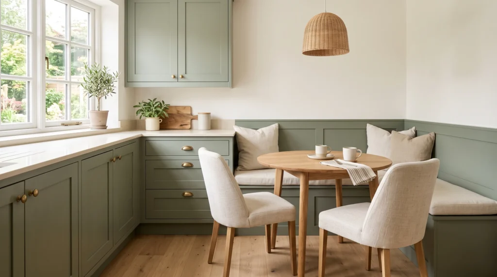
16. Sage Cabinets with a Breakfast Nook
In a compact kitchen, extending sage base cabinets into a corner breakfast nook turns an often-unused pocket of space into one of the most functional spots in the room. Corners are notoriously hard to use efficiently in kitchen design — they’re awkward for cabinetry and appliances — which makes a small eating nook one of the better ways to reclaim that space.
Layout considerations:
- A round wood table softens the straight lines of surrounding cabinetry and improves traffic flow, since there are no sharp corners to navigate around in a tight space
- Bench seating along one or two walls, paired with two chairs on the open side, can seat more people in less floor space than a table with chairs on every side
- A woven pendant light or simple flush-mount fixture above the table defines the space as its own zone without taking up floor area the way a floor lamp would
Durability matters here more than in most kitchen zones: this spot usually handles daily spills, dropped food, and frequent use, so wipeable upholstery (performance fabric or vinyl rather than untreated cotton) and a durable, sealed tabletop are worth prioritizing over purely decorative choices. A tabletop in the same wood tone as any open shelving or the kitchen island helps tie the nook back into the rest of the room rather than making it feel like a separate, disconnected space.
Repeating the same natural wood tone through the table and any nearby shelving, along with a couple of warm textiles, keeps the nook feeling like a natural extension of the kitchen rather than an afterthought squeezed into a leftover corner.
Conclusion
Sage Green Kitchen Designs can bring a calm, modern character to almost any kitchen, whether you use the color across full cabinetry or introduce it through an island, pantry, backsplash, or small seating area. The key is balancing sage with warm neutrals, natural wood, thoughtful lighting, and practical materials. Start with one idea that fits your space and build from there rather than changing everything at once. I’ve seen how small, well-chosen updates can completely refresh a room. Save this post on Pinterest for your next decorating project, try your favorite idea, and share it with someone planning a kitchen makeover.
Will sage green cabinets make a small kitchen look dark?
Not if you choose the right undertone and placement. In kitchens with limited daylight, avoid dark or mud-toned greens — stick to a soft sage with gray or cream undertones and pair it with light countertops that reflect rather than absorb light. A two-tone layout, with white or cream on the upper cabinets and sage reserved for the lower cabinets, also helps bounce light around the room while still giving you the color you want. Painting a large sample directly on your cabinets or a piece of poster board, then checking it under your kitchen’s actual lighting at different times of day, is the most reliable way to avoid a shade that reads darker than expected once it’s on every surface.
What wall color pairs best with sage green cabinets?
A warm off-white or soft cream is the safest choice — shades like Swiss Coffee or Alabaster work well because they add gentle warmth without competing with the green. Stark, cool whites can make a muted sage look slightly dull or gray by comparison, since the contrast between a very cool white and an earthy green tends to flatten the color rather than complement it. For more contrast and a slightly more layered look, a light greige or pale oak wood paneling is also a reliable pairing, and works particularly well in kitchens that already have warm wood flooring or trim elsewhere in the home.
Which hardware finish looks best with sage green?
Brushed brass or champagne bronze — gives the green a warm, higher-end look without feeling overly flashy, and tends to suit both traditional and modern kitchen styles
Matte black — sharpens the lines of the cabinetry for a more modern, contemporary edge, and pairs especially well with simple slab or shaker door styles
Polished nickel or chrome — works well if you prefer a crisper, more traditional or transitional look, though it can feel cooler against sage than the warmer metal finishes above