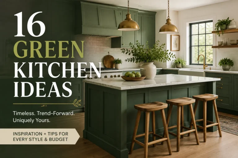
16 Kitchen Cabinet Color Ideas That Actually Work (With Real Pairing Details)
Want a kitchen that feels fresh, beautiful, and completely yours? The right Kitchen Cabinet Color Idea can change the entire mood of the room without a full renovation. Whether your cabinets feel dated, too plain, too dark, or disconnected from the rest of your home, a thoughtful color choice can make everything feel more intentional.
This guide covers 16 cabinet colors, from warm whites and natural oak to moody blues and earthy terracotta, along with the countertops, flooring, and hardware that actually make each one work. Rather than picking a trendy color in isolation, the better approach is starting with what you already have — your flooring, your countertop, your natural light — and choosing a cabinet shade that supports it. Below, each color includes practical pairing notes, undertone warnings, and where it tends to work best.
1. Warm White Cabinets
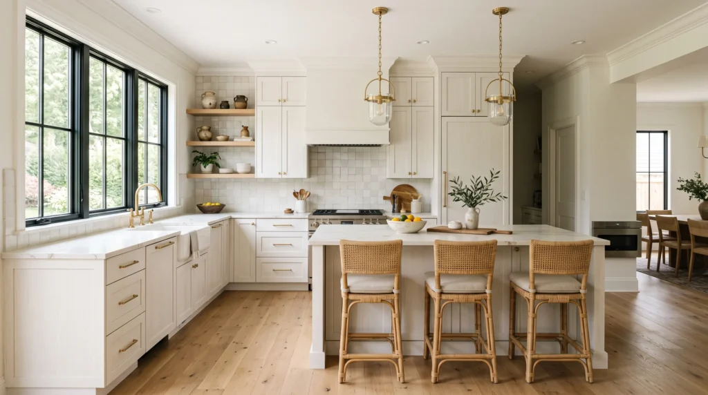
Warm white is the safest high-impact choice in kitchen design, and it earns that reputation honestly. Unlike a stark, blue-based white, a warm white (think Sherwin-Williams Alabaster or Benjamin Moore White Dove) carries a soft cream or beige undertone that keeps a room from feeling clinical. In smaller kitchens especially, pale cabinetry reflects available light instead of absorbing it, which is why it’s the most common recommendation for rooms with limited windows.
Pair warm white doors with wood flooring, brushed brass or unlacquered brass hardware, and a lightly veined quartz or marble-look counter for depth — an all-flat-white kitchen with no texture anywhere else tends to feel sterile rather than calm. A satin or eggshell finish holds up better to daily fingerprints than high-gloss, which shows every smudge under kitchen lighting. One thing worth knowing before committing: warm whites can shift subtly under fluorescent versus warm LED bulbs, so it’s worth testing a sample board under your actual kitchen lights at different times of day before painting the whole run.
2. Soft Sage Green
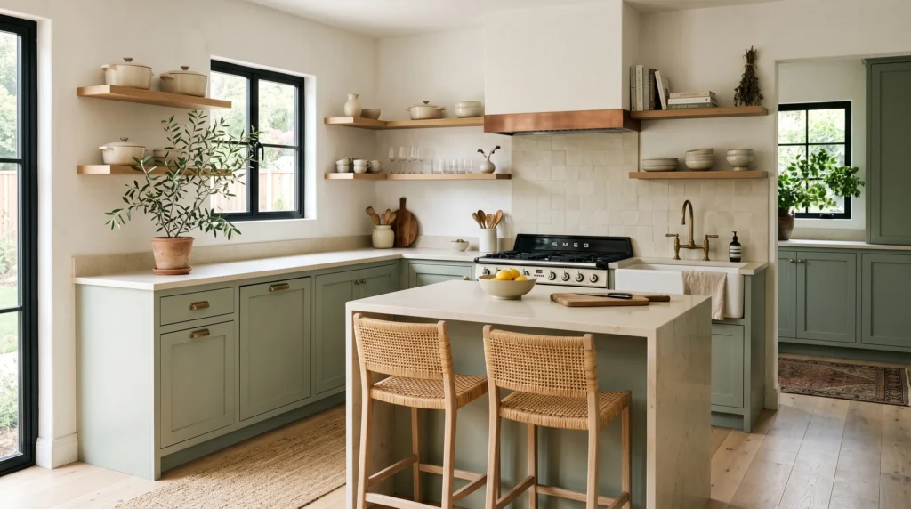
Sage green sits in that useful middle zone between “neutral” and “statement color” — muted enough to live with long-term, distinct enough to actually notice. It reads calmer than emerald or forest green because the gray undertone mutes the saturation. Pair a dusty, gray-leaning sage with warm white walls, oak open shelving, and aged brass pulls; the green behaves almost like a backdrop neutral, which makes it easy to swap in terracotta pottery or seasonal greenery without redoing the whole palette.
The undertone matters more than the name on the paint can. Two “sage greens” from different brands can lean noticeably blue or noticeably yellow — Farrow & Ball’s Green Smoke leans darker and more blue-gray, while Sherwin-Williams’ Evergreen Fog leans warmer. If you’re matching existing wood tones, bring a flooring sample to the paint store rather than relying on the swatch alone. Matte black hardware sharpens the contrast for a more contemporary look; brass keeps it warmer and more traditional.
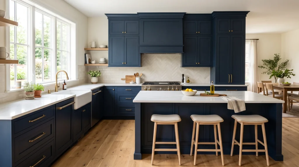
3. Deep Navy Cabinets
Navy is one of the few dark colors that photographs well and holds up in person, which is part of why it’s stayed popular longer than most cabinet trends. It works particularly well as an anchor — on an island, or across a full run of lower cabinets — paired with white or cream quartz, pale oak flooring, and aged brass hardware for contrast. Keep the surrounding walls simple; navy cabinetry does enough visual work on its own.
A genuinely dark navy (not a navy-black hybrid) shifts noticeably with light — it can look almost black in shadow and clearly blue in direct sun, which is worth knowing before you commit to it sight-unseen from a small chip. In a smaller kitchen, using navy only on the island or lower cabinets while keeping the uppers in a lighter tone preserves openness without losing the color’s impact. This is also one of the easier dark colors to resell a house with, since navy reads as classic rather than trend-driven in most buyer surveys.
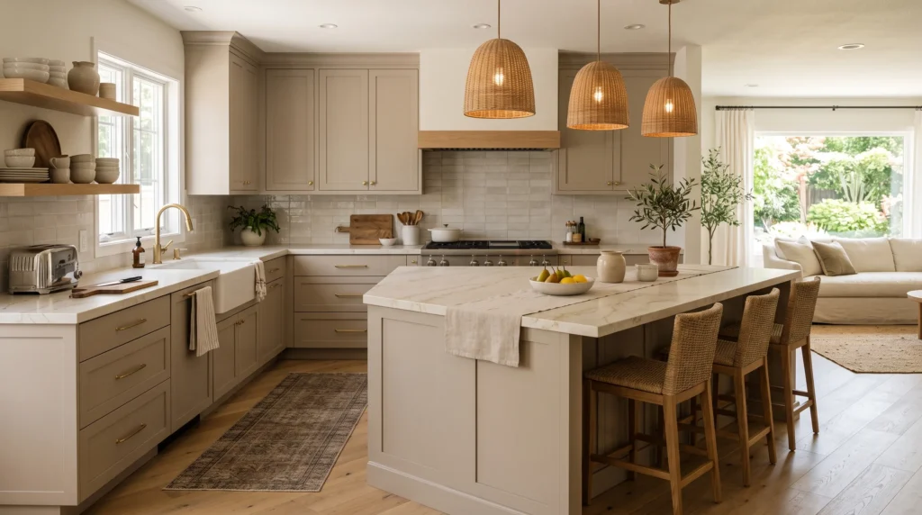
4. Soft Taupe Cabinets
Taupe sits between beige and gray, which is exactly why it works in more homes than either extreme does on its own. It pairs naturally with warm white walls and natural wood, without the slightly cold edge that pure gray cabinetry can bring into a room with warm-toned flooring. It’s a particularly practical choice in open-plan homes, where the kitchen cabinetry needs to visually connect to an adjoining living or dining space rather than stand apart from it.
Practically speaking, taupe also hides daily smudges and water spots better than very light or very dark finishes — worth factoring in if you have kids, pets, or a household that cooks often. Pair it with brushed nickel for a quieter, more contemporary look, or aged brass for warmth. Choose countertops with subtle beige veining rather than a strongly gray-veined stone, since the mismatch between a warm cabinet and a cool counter is one of the most common regretted pairings in kitchen renovations.
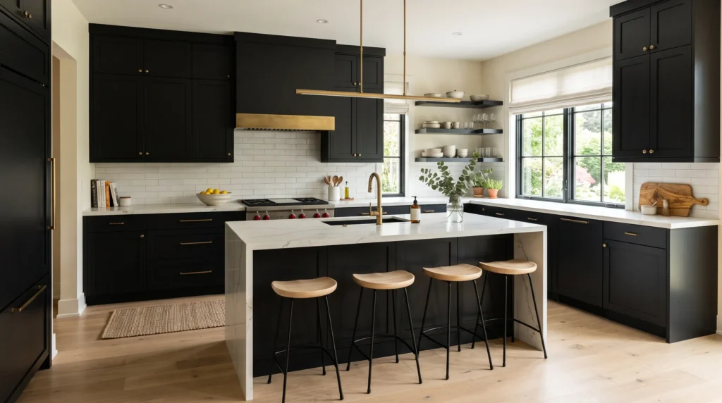
5. Matte Black Cabinets
Black cabinetry reads as architectural rather than trendy when it’s handled with restraint — the mistake most people make is covering every surface in black and ending up with a room that feels heavy rather than intentional. Concentrating black on an island or lower cabinets, with lighter uppers, tends to age better and photograph better than an all-black kitchen.
Matte finishes are worth prioritizing over gloss here specifically because gloss black shows fingerprints, water spots, and dust far more visibly — a real maintenance consideration, not just an aesthetic one. Pair black with pale oak flooring, lightly veined stone counters, and linen window treatments to keep the room from feeling stark; brass hardware against black is one of the more reliable high-contrast pairings in kitchen design. In kitchens with limited natural light, be cautious — black cabinetry paired with dim lighting can make a small room feel noticeably smaller rather than more dramatic.
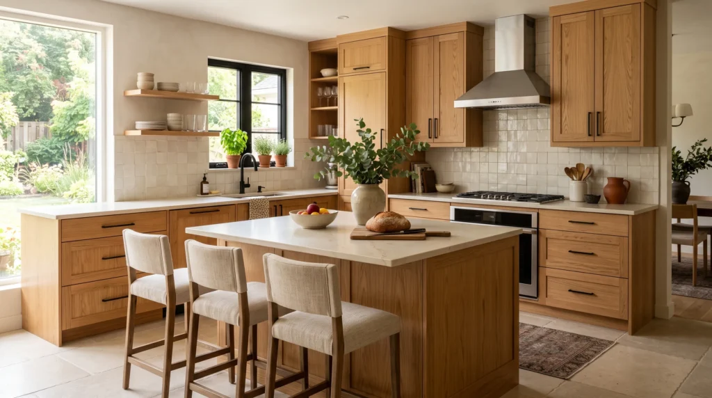
6. Natural Oak Cabinets
Unpainted wood cabinetry has come back into favor largely as a reaction against a decade of all-white and all-gray kitchens — it brings warmth and grain texture that no paint color can fully replicate. Light, straight-grained white oak is currently the most requested wood tone in new kitchen builds, largely because it works with both contemporary and traditional interiors depending on what surrounds it.
Keep the finish fairly matte and let the grain stay visible rather than sealing it into a heavy gloss, which can make wood cabinetry look artificial. Pair it with creamy quartz or handmade-look tile for a softer look, or black hardware for something more graphic. One practical note: natural wood shows dents and water rings more visibly over time than painted MDF, but it also touches up more easily — a scratch in stained wood can often be buffed out, while a chip in painted cabinetry usually needs a full repaint of that door.
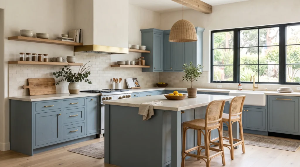
7. Dusty Blue Cabinets
Dusty, gray-leaning blue is one of the more forgiving colors on this list because the gray undertone keeps it from reading as a strong “theme” color the way a brighter blue would. Pair it with warm white walls, pale oak flooring, and creamy quartz to keep the room bright; brass hardware adds warmth, and woven textures (rattan stools, jute rugs) keep the palette from feeling too formal.
This shade is particularly light-dependent — in a north-facing kitchen with cooler daylight, dusty blue can lean noticeably gray; in a south-facing kitchen with warmer light, the blue reads more clearly. If color consistency matters to you, test a sample on the actual cabinet wall, not just near a window. The color also transitions well across seasons — it takes greenery well in spring and warmer textiles well in winter — which makes it a practical long-term choice rather than one you’ll want to update in three years.
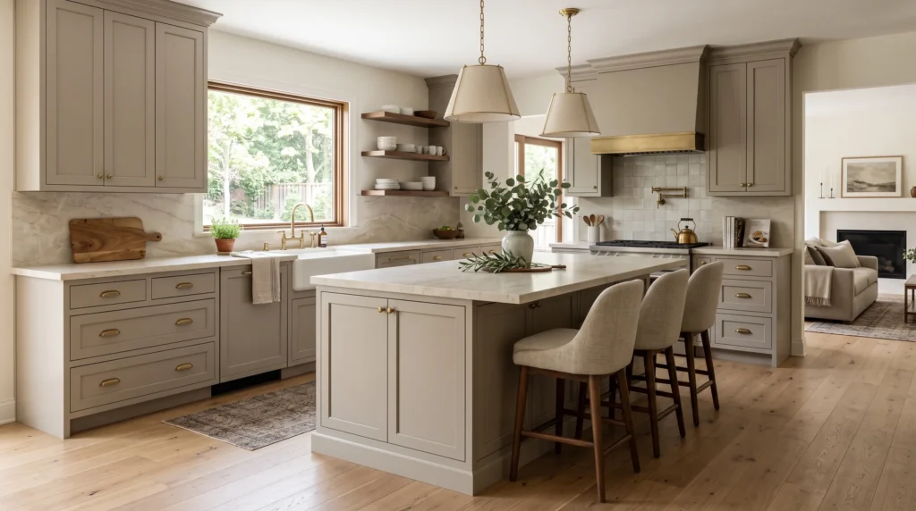
8. Warm Greige Cabinets
Greige — the beige-gray hybrid — is popular precisely because it splits the difference between warm and cool, which makes it easier to match with a kitchen that already has mixed materials (walnut furniture next to a cool stone counter, for example). It shifts subtly with the light throughout the day, which gives flat cabinetry a bit more visual dimension than a true flat neutral would.
The one real risk with greige is undertone mismatch: some greiges lean subtly purple or pink, which clashes badly against warm oak flooring or a yellow-toned quartz. Bring your flooring and countertop samples to the paint counter rather than choosing greige from a chip alone — this is one of the most common regret points homeowners report with this color. Keep walls a shade lighter than the cabinets for gentle separation, and introduce texture through linen or woven seating rather than more paint color.
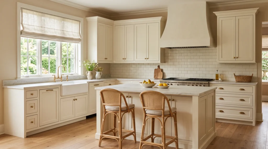
9. Creamy Ivory Cabinets
Ivory carries a warmer, more yellow-leaning undertone than a typical “warm white,” which makes it read as softer and more traditional. It pairs particularly well with oak, marble-look quartz, rattan, and linen, and creates less visual contrast with warm materials than a brighter white would — useful if you want the whole room to feel cohesive rather than segmented into “cabinet zone” and “everything else.”
The main risk with ivory is tipping too far yellow, especially under warm LED lighting. Counter that by choosing stone with cream or soft gray veining rather than anything with a yellow cast, and keep hardware in brushed brass rather than polished gold, which can push the yellow tone further. Ivory works especially well in older homes with existing crown molding or paneled doors, since it complements rather than fights that kind of architectural detail.
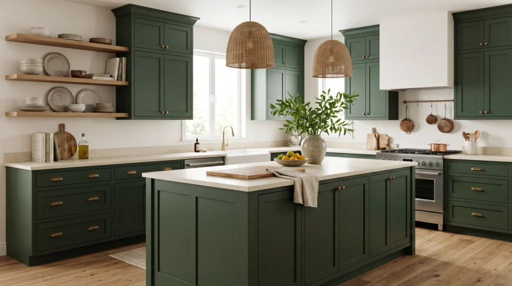
10. Forest Green Cabinets
A true forest green is deeper and more saturated than sage, and it needs more careful handling as a result. It works best in kitchens with generous square footage, where the depth of color creates a grounded feeling rather than closing the room in. Surround it with warm white walls, creamy stone, and natural oak, and let the cabinetry — not the accessories — carry the visual weight.
Undertone matters a lot here: blue-leaning greens read cooler and more formal, while olive or yellow-leaning greens pair more naturally with warm wood and cream finishes. In a smaller kitchen, concentrate the green on an island or a single wall rather than the whole room — full-room forest green in a compact space can feel more like a themed restaurant than a home kitchen. Brass hardware and warm lighting go a long way toward softening the color’s intensity.
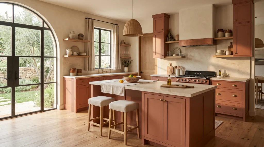
11. Muted Terracotta Cabinets
A softened, clay-based terracotta — closer to dried brick than bright orange — has become one of the more distinctive choices for homeowners who want color without committing to blue or green. It pairs naturally with creamy countertops, pale plaster-look walls, natural oak, and aged brass, evoking a Mediterranean or Southwestern palette without needing literal theme decor.
Because it’s a warm, saturated color, terracotta needs the rest of the room to stay quiet — a busy patterned backsplash or strongly veined dark stone counter competing with it usually reads as cluttered rather than layered. Keep flooring in a natural, non-red-leaning wood tone to avoid an overly warm, monochrome effect. This color also tends to photograph and age well specifically because it echoes natural materials like terracotta tile and unglazed pottery, rather than following a synthetic paint trend.
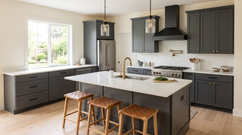
12. Charcoal Gray Cabinets
Charcoal sits between a soft neutral gray and full black, which makes it more versatile across an entire kitchen than true black tends to be. Pair graphite-toned cabinetry with white quartz, pale oak flooring, and warm ivory walls to prevent the room from skewing cold; brass hardware warms it further, while black accents push it toward a more contemporary, edgier look.
Lighting does more work with charcoal than with almost any other color on this list. In a bright kitchen, it creates real depth and makes light countertops look brighter by contrast. In a dim kitchen, it can flatten the room, so pairing it with reflective stone and under-cabinet lighting matters more here than with lighter cabinet colors. Practically, charcoal also hides daily marks and water spots noticeably better than pale finishes, which is worth factoring in for a high-traffic family kitchen.
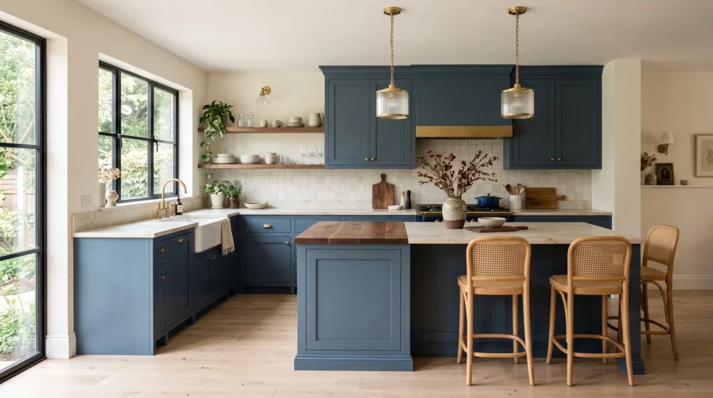
13. Moody Blue Cabinets
A rich blue-gray — darker than dusty blue but without black’s heaviness — gives a kitchen real depth while staying easier to live with than true navy or black. Used across a full cabinet wall it makes a strong statement; concentrated on just an island, it adds a smaller, more manageable dose of color. It’s especially rewarding in kitchens with strong natural light, where the undertone visibly shifts from grayer in the morning to bluer in the afternoon.
Balance it with lighter surrounding finishes — creamy quartz, pale oak flooring, ivory walls — so the room doesn’t feel closed in. Walnut accents can deepen the palette intentionally if that’s the direction you want; brushed brass adds a warmer counterpoint. Because the color already carries visual interest on its own, simple, understated hardware usually looks more intentional here than ornate pulls competing for attention.
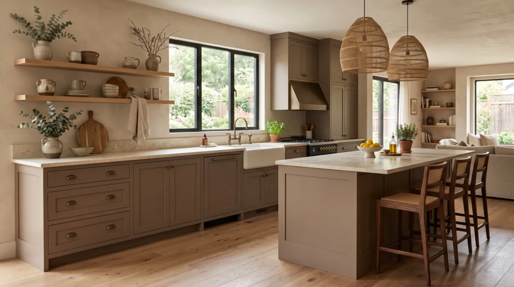
14. Mushroom Brown Cabinets
Mushroom — a muted, gray-leaning brown — has become popular specifically as an alternative to the flat grays that dominated the last decade, offering more warmth without swinging all the way to a traditional wood-brown. It works especially well in larger kitchens, where cooler neutrals can start to feel empty or clinical; the added warmth of mushroom brown gives the space more visual weight.
Pair it with limestone-look counters, walnut seating, oak flooring, or a lightly textured plaster wall for an organic, layered look. Keep hardware simple, since ornate pulls can push this understated color toward a more rustic look than intended. This shade transitions particularly well in open-plan homes, since it bridges naturally into the beige, cream, and wood tones commonly used in adjoining living spaces — worth considering if your kitchen is visually open to another room.
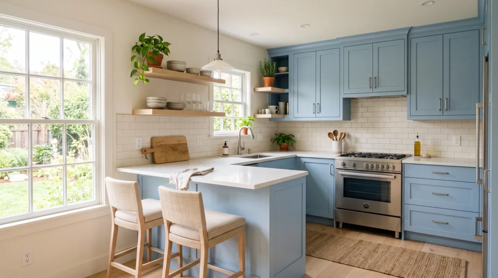
15. Pale Blue Cabinets
A muted, slightly gray-leaning pale blue reads as considerably more sophisticated than a bright robin’s-egg or baby blue, and it works particularly well in compact kitchens where you want personality without visual heaviness. Pair it with warm white walls, pale wood, and white quartz counters, which reflect light and keep the overall room bright.
The undertone decision matters: a blue with slightly warm gray undertones pairs more easily with brass and cream accents, while a cooler, crisper pale blue suits nickel hardware and white accents better. In tight kitchens with limited wall space, this lighter cabinet color visually recedes rather than creating a heavy block of color, which is part of why it’s a frequent recommendation for galley kitchens and smaller apartment layouts specifically.
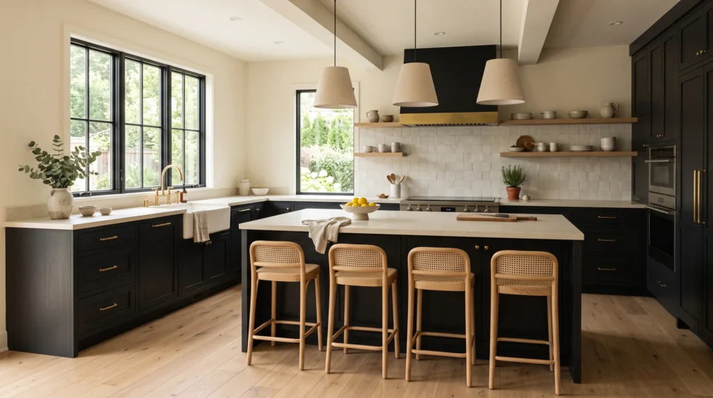
16. Soft Black Cabinets
A softened, slightly warmed black — sometimes labeled “soft black” or “black with a warm undertone” by paint brands — gives definition without the starkness of a true jet-black, glossy finish. It works well across lower cabinets for a grounded look, or across a full wall in kitchens with generous natural light to offset the depth of color.
Matte or low-sheen finishes matter more here than with almost any other color, since gloss black shows fingerprints and water spots constantly in a working kitchen. Keep countertops light, choose flooring with warm undertones, and add natural texture — linen, rattan, unlacquered brass — to prevent the room from reading as flat or overly severe. This palette tends to highlight existing architectural details (moldings, paneled doors) rather than compete with them, which is worth considering if your kitchen already has strong bones.
How to Actually Choose Between These
A great cabinet color can make your kitchen feel brighter, warmer, calmer, or more sophisticated without changing every detail around it. The ideas in this guide show how a carefully chosen Kitchen Cabinet Color Idea can completely shift the atmosphere while working with your existing materials and style. Start with the shades that naturally suit your lighting, flooring, and countertops, then add hardware and decor to finish the look. I’ve seen how even a simple cabinet color change can make a space feel brand new. Save this post on Pinterest, try your favorite idea, and share it with someone planning a kitchen refresh.
Will a dark cabinet color make my small kitchen feel smaller?
Not necessarily — it depends more on how it’s used than the color itself. Concentrating a dark shade on just an island or lower cabinets, while keeping uppers lighter, usually preserves openness. A dim room with limited natural light is where dark cabinetry is most likely to feel heavy; in a bright kitchen, dark tones often create depth rather than closing the space in.
How do I know if a color has the wrong undertone for my kitchen?
Bring a flooring or countertop sample with you when choosing paint, rather than relying on memory or a photo. Undertone mismatches — a purple-leaning greige against warm oak, or a yellow-leaning white against gray-veined stone — are one of the most common regrets in cabinet color choices, and they’re usually only visible once both materials are side by side in person.
Do I need to repaint the whole kitchen, or can I use two cabinet colors?
Two-tone kitchens are common and practical — a darker color on the island or lower cabinets with a lighter shade on the uppers is one of the most reliable combinations, since it adds contrast without making the whole room feel heavy. It’s also a lower-cost way to test a bold color before committing to it across every cabinet.
How much does natural light affect which color I should choose?
Significantly. North-facing kitchens get cooler, bluer daylight, which can make warm colors look muted and cool colors look truer to the chip. South-facing kitchens get warmer light, which can push blues and grays toward looking warmer than expected. Testing a sample directly on your cabinets, not just near a window, is the most reliable way to account for this before painting.