
16 Dark Feminine Bedroom Ideas That Feel Cozy, Elegant, and Completely Your Own
Dark, dramatic, and deeply feminine — your bedroom can feel luxurious without feeling complicated.
I have redecorated several rooms using dark palettes over the years, and the biggest thing I have learned is this: most people are afraid of going dark. They worry the room will feel smaller, heavier, or gloomy.
But when you layer the right textures, warm metals, and soft fabrics against a deeper backdrop, something remarkable happens. The room stops feeling like a box you sleep in and starts feeling like a space you genuinely want to retreat to at the end of a long day. Every dark feminine bedroom I have styled has surprised the person living in it — not because the result was unexpected, but because it felt so much more like them than anything they had lived with before.
If your bedroom feels plain, cold, or lacking in personality right now, these dark feminine bedroom ideas are exactly what you need. From charcoal accent walls and velvet upholstered beds to burgundy bedding, antique brass lighting, romantic canopy frames, and delicate blush accents every idea here shows how darker shades can feel warm, inviting, and sophisticated rather than heavy or oppressive.
The trick is always in how you layer the room, not just in the colours you choose. A charcoal wall paired with cream linen and brass light feels completely different from that same charcoal wall paired with black furniture and cold white light. Context is everything, and each idea below walks you through exactly how to make it work.
The good news is that you do not need to redo your entire room at once. In my experience decorating with dark palettes across both compact UK Victorian bedrooms and larger open-plan Australian spaces, even a single change swapping your bedding, adding a statement mirror, or painting one accent wall can completely shift the mood of a room.
Whether you are decorating from scratch or simply refreshing what you already have, these ideas offer practical, realistic inspiration you can actually use without needing a designer or a huge budget.
16 Dark Feminine Bedroom Ideas
1. Charcoal Accent Walls
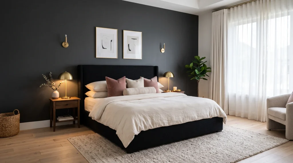
What makes it work: A charcoal accent wall gives you a dramatic backdrop without committing every surface to a dark shade. It is one of the easiest and most effective ways to anchor a dark feminine bedroom because the depth it creates makes everything in front of it look more intentional and considered.
Cream bedding suddenly appears crisper, brass lamps look warmer, and soft cushions gain a visual weight they simply do not have against a plain white wall. The matte finish is important here — eggshell or satin finishes on a dark wall can look commercial or slightly cheap, while matte absorbs light softly and gives the colour a far richer, more sophisticated result.
When I painted the wall behind my own bed in Farrow and Ball Railings, a near-black charcoal with warm undertones, the transformation was immediate. The ceiling felt taller. The brass bedside lamp looked expensive. The whole space had a cohesion and intention it had never had before.
Practical tips to make it work: Use charcoal on the wall behind your headboard only — not all four walls — if your room is smaller than twelve by ten feet. This creates a moody focal point without visually shrinking the space around you. Pair it with cream, dusty rose, or warm taupe bedding to create contrast that feels feminine and balanced rather than stark.
Adding a pale area rug and sheer curtains helps keep the lighter surfaces reflecting natural light around the room, which is important in spaces that do not receive strong direct sunlight throughout the day. Brushed brass or antique gold lamps are particularly effective against charcoal because the warm metal tone prevents the dark wall from reading as cold, and the reflection the metal creates gives the room a gentle depth that other lamp finishes simply do not achieve.
How to style it for a complete look: Beyond the wall and bedding, think about every surface that sits in front of your charcoal backdrop and how it reads from the doorway. A simple upholstered bed in black, dark walnut, or deep navy will anchor the wall without competing with it.
Two matching nightstands in a warm wood tone create symmetry, and a reflective element — a brass-framed mirror, a glass lamp base, or a metallic tray — adds small points of light that keep the dark wall feeling dynamic rather than flat. Keep artwork minimal and choose pieces with warm tones rather than cool ones so they sit comfortably within the palette. The finished result is a bedroom that feels moody, feminine, and beautifully layered — dramatic enough to feel special, restrained enough to feel liveable every single day.
2. Velvet Upholstered Bed
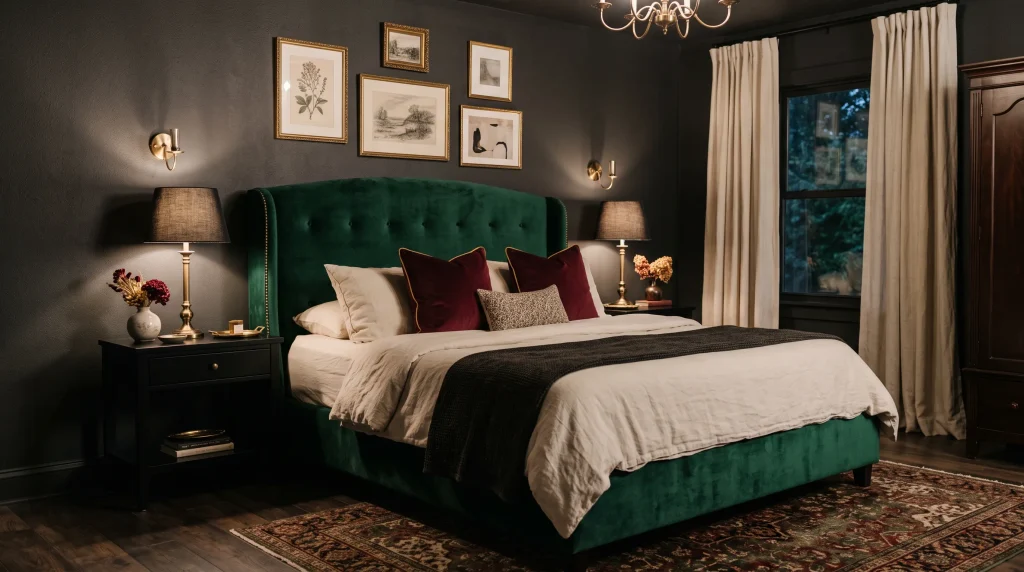
What makes it work: A velvet bed changes the entire character of a room through texture alone, before you even consider colour. The fabric catches light from every angle, creating a depth and richness that plain linen or leather simply cannot achieve.
As you move around the room throughout the day, the pile of velvet shifts between darker and lighter tones depending on where the light falls, which gives the bed a quiet dynamism that keeps the space from ever looking flat or dull. In a dark feminine bedroom, a jewel-toned velvet headboard — emerald, burgundy, plum, or midnight blue — becomes the visual anchor that the whole room builds around.
Everything else can be relatively simple because the bed itself is doing so much of the work. I styled a room for a friend using an emerald velvet frame she bought second-hand and had professionally reupholstered for far less than the cost of a new mid-range bed, and the result looked like something from a boutique hotel.
Choosing the right velvet and colour: Not all velvet is equal, and the quality of the fabric matters more here than almost anywhere else in the room because the headboard is the piece your eye goes to first every single time you walk through the door. Look for a crush velvet or a high-pile velvet rather than a flat microsuede that tries to mimic the look — real velvet has a three-dimensional quality that photographs beautifully and looks genuinely luxurious in person.
For colour, deep jewel tones work best in a dark feminine context: emerald green against charcoal walls creates a richly layered feel, burgundy against cream and walnut feels warm and sophisticated, and midnight blue against brass lighting feels almost regal. Keep the surrounding furniture relatively simple and the bedding in a neutral tone so the upholstered headboard remains the star of the arrangement rather than competing with everything around it.
Everyday styling and maintenance: Balance the richness of velvet with breathable, relaxed fabrics on the actual sleeping surface — cream linen sheets and a slightly rumpled duvet cover prevent the setup from feeling too formal or fussy for everyday life.
A curved or rounded headboard is particularly useful when you want softer lines against darker colours and more angular surrounding furniture, because the curved silhouette introduces a subtle feminine shape without requiring additional decorative details.
Add one textured throw across the foot of the bed in a complementary shade, a small bedside lamp with a warm bulb on each side, and perhaps one framed print above a nightstand. For maintenance, apply a fabric protector spray to velvet upholstery and avoid placing it in direct strong sunlight, which fades the pile colour and flattens the texture over time. With proper care, a quality velvet bed will look as good in ten years as it does the day it arrives.
3. Burgundy Bedding Layers
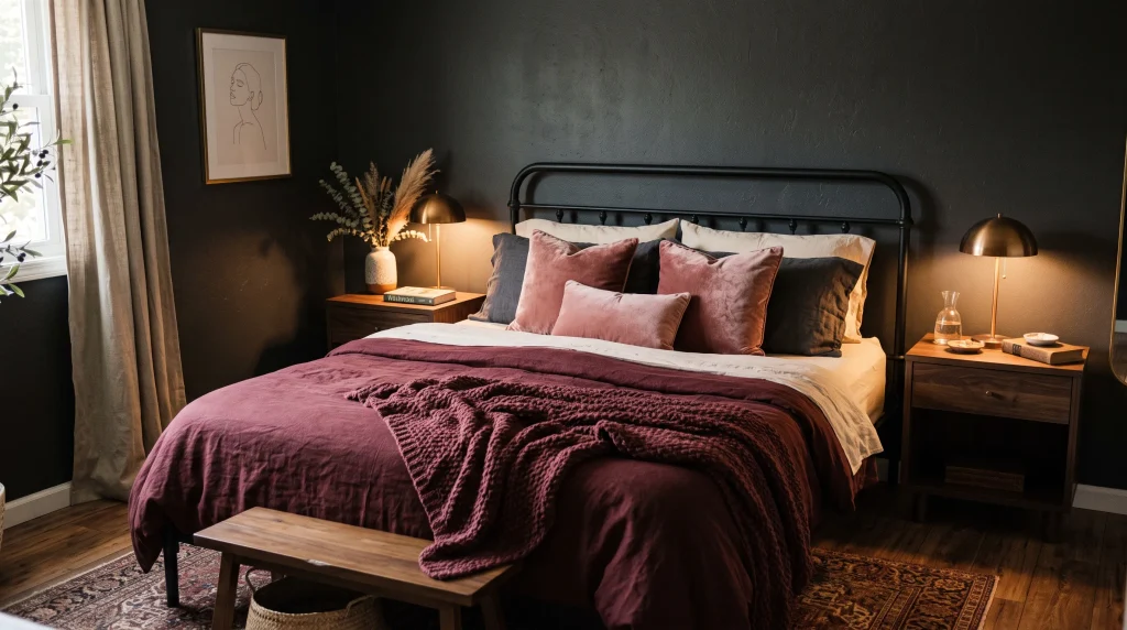
What makes it work: Burgundy is one of the most useful accent colours for a dark feminine bedroom because it occupies a rare middle ground — it is richer and more dramatic than blush, softer and warmer than black, and it pairs naturally with cream linens, dark walnut furniture, bronze metalwork, and charcoal walls without any of those combinations ever looking forced or awkward
. It is the colour that makes a dark bedroom feel genuinely warm rather than simply dark, and that distinction matters enormously when you are spending ten minutes choosing whether to leave the room or curl back into bed on a cold morning. The trick with burgundy is always in the layering rather than the matching. A full burgundy bedding set — duvet, shams, and pillowcases all in the same fabric and shade — can look flat and uninspired, like a hotel room that has not been updated since the early 2000s. The layered approach is what makes it look current, personal, and expensive.
How to layer burgundy bedding properly: Start with cream or warm white cotton or linen sheets as your base — these form the lighter foundation that makes the deeper colour pop. Add a burgundy linen duvet cover or a quilted coverlet in a slightly different texture so the layers read as distinct rather than identical
. Then bring in one or two cushions in a related but not matching shade: dusty rose or muted mauve both sit beautifully next to burgundy without creating a jarring contrast. A single oversized textured throw in a wine or deep terracotta tone draped loosely across the lower third of the bed completes the layered effect. The key is to use linen rather than cotton sateen for your burgundy pieces wherever possible — linen has a natural texture that makes dark bedding look expensive and lived-in rather than stiff and formal, and it gets better with every wash rather than fading into a dull uniform shade.
Connecting burgundy to the rest of the room: For a dark feminine bedroom to feel cohesive rather than like a collection of separate purchases, the burgundy of your bedding should echo quietly somewhere else in the space.
This does not mean painting a wall burgundy or buying a matching rug — it simply means choosing one or two small accessories that pick up the same tone. A ceramic vase on the nightstand, a candle in a tinted glass holder, a thin stripe within the rug pattern, or a detail within a framed print can all do this work without making the room look themed or deliberately matched.
When burgundy appears in two or three places at different scales once large on the bed, once medium in a cushion, once small in an object the colour reads as an intentional, considered choice rather than a coincidence or an afterthought. Limit the overall bedding palette to three tones: burgundy, cream, and one soft accent like dusty rose or bronze, and the result will always look more expensive than the individual pieces actually are.
4. Black Canopy Bed
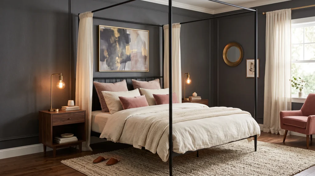
What makes it work: A black canopy bed does two things simultaneously that very few other furniture pieces can manage: it creates a strong architectural focal point and it draws the eye upward, making even a standard eight-foot ceiling feel more significant and purposeful.
The vertical lines of the frame add structure to a bedroom that might otherwise feel soft or visually unresolved, while sheer curtains draped from the top rail soften those lines into something romantic and enveloping rather than industrial or masculine.
The result sits in a very particular and appealing sweet spot: dramatic enough to make the room feel designed and intentional, soft enough to remain comfortable and inviting for everyday sleeping and relaxing. In a dark feminine bedroom specifically, the black frame ties naturally into darker wall colours and furniture without creating visual noise, while the pale curtains introduce a contrast that keeps the whole arrangement from looking heavy or oppressive.
Choosing the right frame for your room size: For smaller bedrooms, a slim metal canopy frame with minimal detailing is almost always the better choice over a heavy traditional four-poster design.
The visual effect is identical height, drama, presence, a clearly defined sleeping zone but without the bulk that makes a compact room feel crowded and difficult to move through. Look for frames where the vertical posts are no more than an inch or two in diameter; anything thicker starts to dominate the room rather than framing it. The crossbar at the top should be similarly slim. I
n a larger bedroom, a more substantial frame with slightly heavier proportions can work beautifully, but even then, restraint in the metalwork details tends to produce a more elegant result than elaborate decorative flourishes. Black powder-coated steel is the most versatile and widely available option, and it ages well without requiring maintenance.
Styling the canopy for maximum impact: The curtains you choose for a canopy frame matter as much as the frame itself, because they are what transform a structural piece of metal into something that feels genuinely romantic and considered. Use ivory, champagne, or very soft white sheers rather than bright white, which looks clinical and harsh against dark walls.
The fabric should be light enough to move slightly in a breeze or when someone walks past this movement is part of what makes a canopy bed feel alive and atmospheric. Leave the curtains fully open during the day so natural light moves freely around the bed, and close them partially at night to create the cocooning, enclosed feeling that is one of the great pleasures of sleeping in a canopy bed. Warm, directional bedside lighting rather than bright overhead fixtures is essential here the lamplight caught in sheer curtain fabric is one of the most beautiful effects a dark feminine bedroom can achieve.\
5. Antique Brass Lighting
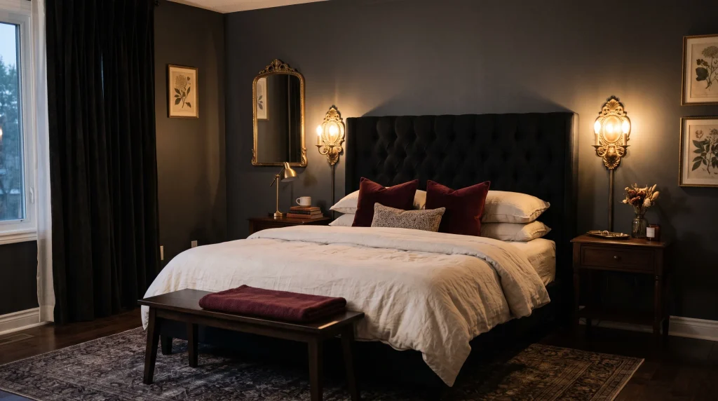
What makes it work: If you take only one idea from this entire article, let it be this one. Antique brass lighting is the single fastest and most transformative change you can make to a dark bedroom because it resolves the most common problem people experience with darker colour palettes the room looks beautiful in photographs and in the evening but feels cold, unwelcoming, or slightly gloomy during the day.
The aged golden finish of brass creates small, warm focal points that prevent deep colours from reading as heavy, and the organic variation in an antique finish the slightly darker patches, the gentle patina, the way it catches light differently from every angle gives the metal a life and character that polished chrome or matte black simply does not have.
When I designed a dark bedroom for a client in a north-facing Victorian terrace that received almost no direct sunlight, switching her cool-toned silver lamps for a pair of antique brass wall sconces transformed the room from feeling dim and flat to feeling deliberately moody, warm, and luxurious.
Choosing the right fixtures and bulbs: The fixture itself matters, but the bulb inside it matters just as much — possibly more. Warm white bulbs at around 2,700 Kelvin are what you need in brass fixtures positioned against dark walls. Cool white bulbs at 4,000 Kelvin or above will cancel out all the warmth the brass finish creates, making the room feel clinical and undermining the entire point of the investment.
Choose bulbs specifically labelled warm white or soft white and check the Kelvin rating on the packaging before purchasing. For fixture styles, wall-mounted sconces are particularly effective in a bedroom because they free up the nightstand surface, position the light at exactly the right height for reading, and create a pair of warm glowing points on either side of the bed that anchor the whole arrangement visually. Table lamps work equally well if sconces are not practical for your space.
Making brass feel cohesive rather than random: The difference between a room that looks professionally styled and one that looks like it was assembled from separate shopping trips is almost always in the consistency of the metalwork finishes
. Repeating the brass finish two or three times throughout the bedroom — in lamp bases, drawer pulls, a mirror frame, a small decorative tray, or a curtain rod — makes it read as a considered design decision rather than a coincidental detail. Avoid scattering too many different metallic finishes across the same room; choose one warm metal (brass or bronze) and keep it consistent.
If you rent and cannot install permanent wall sconces, plug-in versions with a cloth-covered cord are widely available and look equally good when styled thoughtfully. Position them at eye level when seated in bed — roughly sixteen to twenty inches above the mattress — and slightly closer to the headboard than to the nightstand edge for the most useful and attractive result.
6. Lace Curtain Layers
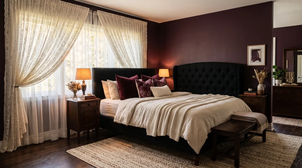
What makes it work: Lace curtains might initially sound like a grandmother’s sitting room, but in the context of a dark feminine bedroom, floor-length ivory lace against a deep plum or charcoal wall is genuinely and unexpectedly beautiful.
The delicate fabric pattern creates soft, shifting shadows on the wall and floor as daylight moves through it, adding a subtle animated texture to the room that solid curtains simply cannot achieve. The contrast between the ornate quality of the lace and the depth of the wall colour behind it creates exactly the kind of layered, considered atmosphere that defines the dark feminine aesthetic at its best.
This is one of those combinations that sounds uncertain in theory but looks immediately right in practice the delicacy of the lace is what gives a dramatically dark room its softness and femininity, balancing the depth of the walls with something light, patterned, and alive with movement.
Choosing and hanging lace curtains for the best result: The key decisions with lace curtains are the tone, the length, and the hanging position, and all three matter more than most people realise before they have tried this in their own space.
Choose ivory, cream, or very muted blush lace rather than bright optical white, which looks stark and clinical against any deep wall colour and immediately undermines the warmth you are trying to create. The panels should be genuinely floor-length — not ending an inch above the skirting board as a compromise, but reaching all the way to the floor in a clean, deliberate line.
Hang the curtain rod four to six inches above the window frame and extend it six to eight inches beyond both sides of the window opening. This one adjustment makes the window appear significantly wider and the ceiling measurably taller, and it also allows the full curtain panel to hang without any fabric bunching at the sides when the curtains are open during the day.
Layering lace with heavier curtains for function: Beautiful as lace curtains look, they provide very little privacy and almost no light control on their own, which makes them impractical as a standalone window treatment in a bedroom.
The solution is to layer them in front of or behind a heavier lined curtain in a complementary colour charcoal, deep plum, or a warm dark grey all work well as the backing layer and connect the window treatment visually to the rest of the room palette. When the heavier curtains are open during the day, the lace filters the incoming light into something soft and diffused rather than harsh and direct, creating the beautiful shadowed texture on the wall that is one of the most atmospheric effects in a dark feminine bedroom.
At night, closing both layers gives you full privacy and total blackout without sacrificing the romantic quality of the window treatment. Use a black or antique brass rod that connects the hardware to your other furniture and lighting finishes for the most cohesive result.
7. Plum Accent Bedding
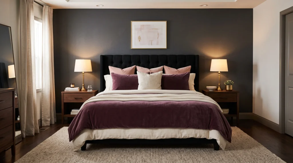
What makes it work: Plum is one of the most underrated choices for a dark feminine bedroom because it occupies a very useful position in the colour palette — richer and more dramatic than dusty rose, softer and more enigmatic than burgundy, and with a slightly cool purple undertone that sits beautifully alongside cream, warm wood, antique brass, and almost every darker wall shade from charcoal to forest green.
It reads as sophisticated and intentional in a way that brighter purples do not, largely because its depth and slight greyness tie it to the same family of complex, muted tones that characterise the best dark feminine interiors. Where burgundy brings warmth, plum brings a sense of mystery and depth that feels particularly right in a sleeping space — somewhere between romantic and atmospheric in a way that makes the bedroom feel like a true retreat rather than simply a decorated room.
How to introduce plum without overdoing it: The most effective approach is always to start with a single piece rather than committing to a full set. A plum velvet duvet cover or quilted coverlet is the strongest statement you can make from a single item, because the texture of velvet adds an extra layer of richness to the colour the pile catches warm lamplight differently from cotton or linen, creating subtle variations across the surface that give the bed a quiet dimension that photographs beautifully and looks even better in person.
Build around this single plum piece with cream or ivory linen sheets, one or two cushions in closely related tones such as mauve or dusty rose, and a neutral throw at the foot of the bed in a warm beige or soft grey. This layered approach creates a bed that looks genuinely expensive and considered without requiring a large investment or a complete replacement of your existing bedding.
Keeping the palette controlled and cohesive: The most common mistake with deep accent bedding colours is introducing too many competing tones around them, which makes the room look busy and unresolved rather than moody and intentional.
For plum to work at its best, limit the surrounding palette to three or four closely related tones: plum, cream, and one soft accent such as mauve, dusty rose, or warm taupe. Keep cushions within that narrow family rather than introducing bright contrasting colours, and choose bedside accessories lamps, trays, vases that connect to the brass or warm wood tones already present in the room rather than adding a new metallic finish.
Repeating the plum at a small scale elsewhere in the space, in a ceramic vase, a candle holder, or a framed art print, is what takes the bedding from looking like a standalone purchase to looking like a fully considered design decision. With restraint and consistency, plum bedding can make an entire dark feminine bedroom feel pulled together and beautiful.
8. Gothic-Inspired Mirror
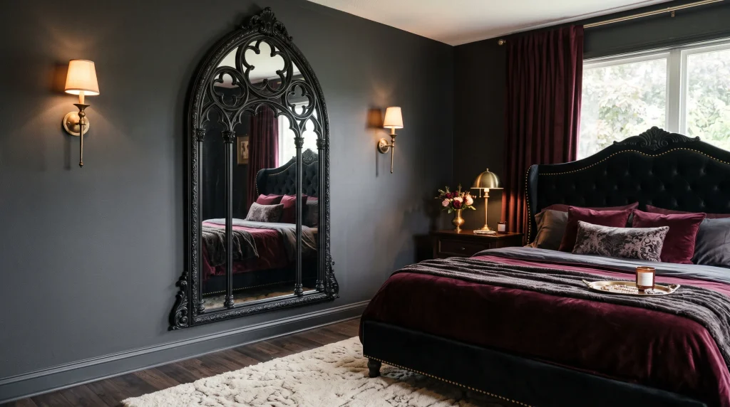
What makes it work: A Gothic or antique-style mirror is one of the most effective single investments you can make for a dark bedroom because it serves three distinct functions at once — it adds strong visual character, it reflects available light to prevent the space from feeling enclosed, and it provides a genuinely practical surface for getting dressed and checking your appearance before leaving the house.
Against a deep charcoal or plum wall, a tall arched or ornate-framed mirror creates an immediate focal point that has presence without requiring a large number of surrounding accessories to make the wall look finished. The frame itself does all the decorative work, which is why this approach is particularly effective in dark rooms where a gallery wall or a collection of smaller items can easily disappear against the deep background rather than standing out as intended.
Finding and placing the right mirror: Look for frames in matte black, aged bronze, dark wood, or hammered metal for the most authentic and effective dark feminine result. Avoid shiny chrome or highly polished silver — these finishes look out of place against deeper colour palettes and create a coldness that works against the warm, layered quality you are trying to achieve.
The shape of the frame matters considerably: a pointed or arched top gives the mirror its Gothic character, while a more simply curved or rectangular ornate frame reads as antique and romantic rather than specifically Gothic. The height of the mirror also matters — a taller piece, ideally at least five feet from base to top, creates significantly more visual impact than a small or medium mirror and reflects a larger portion of the room, making the space feel more open. Position it where it can capture natural light from a nearby window rather than reflecting a blank wall.
Styling the wall around the mirror: The surrounding decor around a statement mirror should be deliberately restrained so the frame does not have to compete with other focal points for the viewer’s attention. A simple upholstered bed, layered bedding in two or three tones, and one warm light source are enough to support the mirror’s character without overwhelming it.
If your room is small or receives limited natural light, a tall Gothic mirror positioned opposite or adjacent to a window can visually extend the floor space considerably this is a genuine and measurable effect rather than a decorating myth, and it is one of the most practical reasons to invest in a large reflective piece for a dark bedroom. For a softer feminine quality within the dramatic frame, combine it with rounded furniture shapes nearby, velvet textures on the bed, or a piece of muted floral artwork on an adjacent wall. The contrast between the ornate darkness of the frame and the softness of the surrounding elements creates exactly the layered personality that defines a successful dark feminine bedroom.
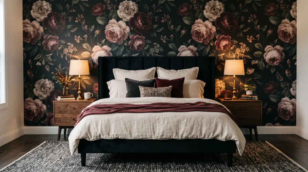
9. Moody Floral Wallpaper
What makes it work: A single wall of dark botanical wallpaper can transform a bedroom more dramatically and quickly than almost any other change on this list, because it adds colour, pattern, texture, and a sense of personality all at once. For a dark feminine bedroom, moody floral wallpaper on the wall behind the bed resolves a design challenge that many people struggle with: how to make a darker room feel rich and layered rather than simply painted a darker colour.
The botanical pattern creates a backdrop that changes as you look at it different flowers and leaves come forward in different lighting conditions, at different times of day, and from different angles within the room — which gives the space a living quality that a flat painted wall simply cannot replicate no matter how deep or beautiful the colour.
Choosing the right pattern and colourway: The most effective moody floral wallpapers for a dark feminine bedroom share a set of specific characteristics that are worth looking for rather than simply choosing the most dramatic or detailed design you can find.
A dark background — charcoal, black, deep forest green, or deep plum — is essential for creating the moody quality the style requires. The flowers and foliage printed on top should be in muted, complex tones rather than bright clear colours: burgundy, dusty rose, sage, cream, antique gold, and faded mauve all work beautifully and will not clash with the other toned-down colours in the room.
Oversized botanical prints work better than small dense patterns in a sleeping space because they read clearly from across the room and create a bold statement without producing the visual restlessness that small repeating patterns can generate in a space where you are trying to relax.
Installing and balancing the wallpaper in the room: Apply the floral wallpaper to the wall behind the bed only, using the remaining walls as painted surfaces in a colour pulled from the wallpaper’s background or a complementary deep shade
. This creates a clear purpose for the pattern and prevents the room from feeling overwhelmed by decoration. If you are hesitant about permanent wallpaper — particularly in a rented home or if you are unsure how committed you are to the look high-quality peel-and-stick botanical wallpapers now exist that look convincing, go up cleanly, and come down without damaging the wall surface
. Balance the pattern with solid-coloured bedding throughout: a plain velvet headboard in a tone pulled from the wallpaper, simple linen sheets in cream or ivory, and cushions in one or two of the floral accent colours. Repeating one flower colour from the wallpaper in a nearby throw, cushion, or ceramic vase helps the pattern feel integrated into the rest of the room rather than existing as a separate decorative decision.
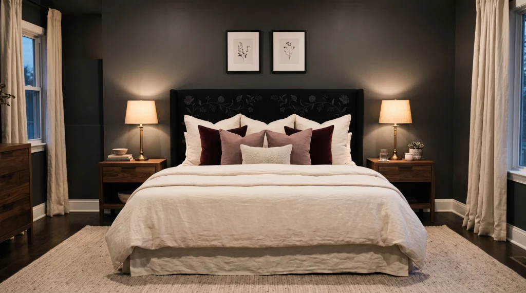
10. Black Floral Headboard
What makes it work: A black floral headboard occupies a very particular and effective design position: it combines the grounded, dramatic presence of dark upholstery with the softness and femininity of botanical detailing, producing a single piece that gives the bedroom a strong focal point without requiring a large number of additional decorative elements around it.
The dark upholstery provides the visual weight and structure, while embroidered or embossed botanical details across the surface prevent it from looking plain or severe, introducing a decorative quality that is distinctly feminine without being overtly soft or pretty. This makes it an ideal choice for anyone who wants a noticeable and characterful focal point in their dark bedroom without committing to patterned wallpaper across an entire wall, bold paint on multiple surfaces, or a large collection of accessories that require ongoing curation.
Choosing the right headboard shape and detail: The silhouette of the headboard matters as much as its surface decoration, because the shape determines how the piece reads from across the room. A gently curved or arched top creates a softer, more romantic feeling that suits the dark feminine aesthetic particularly well the curve introduces a feminine line that contrasts pleasingly with the darkness of the upholstery and the more angular shapes of nightstands and lamps.
A tall rectangular headboard with straight lines reads as more tailored and structured, which works well in a larger bedroom where the added height gives the bed more visual presence but may feel slightly imposing in a smaller space. For the botanical detailing, look for embroidered floral patterns rather than printed ones wherever your budget allows — embroidery creates genuine three-dimensional texture that catches lamplight in a way that a flat print cannot, adding a richness to the headboard that you will notice and appreciate every time the light changes.
Building the rest of the bed around the headboard: Because the black floral headboard already carries considerable visual interest through its pattern and texture, the bedding and accessories around it should be chosen with restraint rather than adding more pattern and detail on top.
Warm white or ivory linen sheets are the ideal base they create a clear contrast against the dark headboard that allows the botanical detailing to remain visible and prominent. Add two or three cushions in muted tones that echo colours from the embroidery: dusty mauve, soft burgundy, or warm cream all work beautifully.
A single textured throw in a complementary neutral draped at the foot of the bed adds the final layer of softness. Keep bedside tables simple and uncluttered, and use warm lamps on each side to cast light upward across the headboard in the evening — this is the moment when the embroidered or embossed detailing becomes most beautiful, when the texture catches the warm light from below and the botanical pattern seems to emerge from the dark fabric.
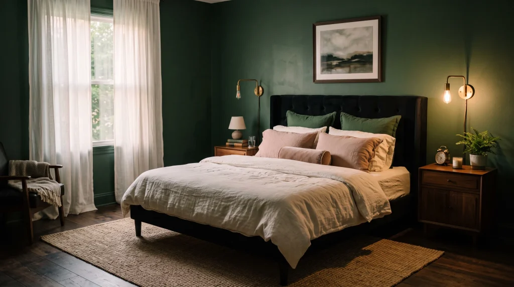
11. Deep Green Walls
What makes it work: Deep green walls offer a dramatic alternative to charcoal or black for a dark feminine bedroom, and they bring something that purely neutral dark shades cannot provide: a sense of the organic, grounded, and alive. Forest green, pine, bottle green, and deep sage all share a quality of feeling simultaneously enveloping and natural they make a bedroom feel like a place of genuine refuge rather than simply a decorative exercise in using darker colours.
This is partly because green is the colour we associate most strongly with the natural world, and our nervous systems respond to it differently from how they respond to neutral darks. I painted a small spare room in a deep bottle green and found that it transformed from a dark, underused space into something that felt like a study or library in the best possible sense — intimate, considered, and immediately calming in a way that a grey or charcoal wall in the same room simply did not achieve.
Finding the right shade of deep green: Not all deep greens work equally well in a bedroom context, and the undertone of the shade you choose makes a significant difference to how the room feels in practice. Forest greens with warm yellow undertones think of shades like Farrow and Ball’s Calke Green or Little Greene’s Obsidian Green feel rich and grounded and work beautifully with warm wood furniture, brass metalwork, and cream or warm white textiles.
Cooler blue-green shades like teal or deep sage have a different quality slightly more sophisticated and complex, and particularly beautiful in rooms that receive good natural light where the blue in the pigment can come to life. Avoid greens with grey undertones if your room does not receive strong natural light — these can look muddy and flat in low-light conditions rather than rich and deep. Always test your chosen shade on the wall in at least two large sample patches and observe them at different times of day and in artificial light before committing to painting the whole room.
Styling deep green walls for the most effective result: Once the walls are painted, the furnishing choices around them are what determine whether the room looks sophisticated and intentional or simply dark and unfinished. Ivory or warm white bedding is essential it creates the contrast that makes deep green walls look rich rather than heavy, and it provides a visual rest point that prevents the room from feeling oppressive.
Walnut or warm oak furniture works far better alongside deep green than black furniture does, because the warm wood tone adds another layer of natural warmth that prevents the palette from feeling severe. Antique brass lighting is ideal, both because the warm metal tone complements the earthiness of the green and because the glow it produces at night is particularly beautiful against a deep coloured surface. Add one woven basket, a small ceramic vase in an earthen tone, or a trailing plant for texture and a reinforcement of the natural, grounded quality that makes deep green walls so effective in a sleeping space.
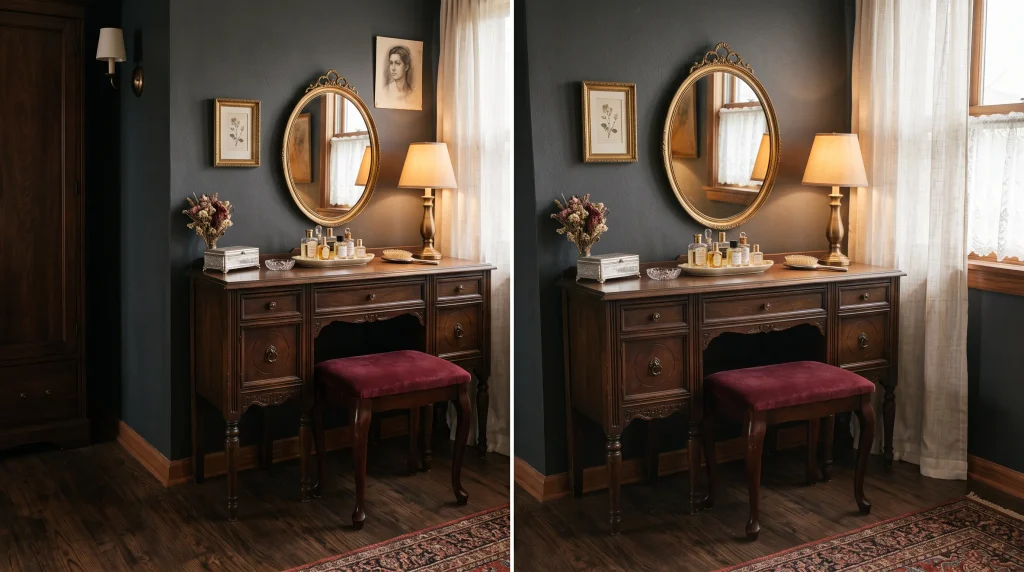
12. Vintage Vanity Corner
What makes it work: A vintage dressing table corner gives an otherwise overlooked or underused bedroom area a clear purpose while simultaneously adding character, warmth, and a sense of personal ritual to the space.
Getting ready in front of a beautiful vanity with good lighting and a thoughtfully assembled surface feels meaningfully different from doing the same thing in front of a bathroom mirror over a sink it makes the process feel like a pleasure rather than a routine, and that quality of turning everyday moments into something more enjoyable is one of the things that the best-designed bedrooms do consistently. In a dark feminine bedroom, the right vintage vanity piece becomes part of the room’s visual identity rather than a purely functional afterthought, particularly when the finish, the mirror shape, and the stool upholstery are all chosen to connect with the wider palette and aesthetic of the space.
Choosing the right vanity piece and mirror: Look for a compact dressing table in dark walnut, black-painted wood, or an aged finish that has the slightly worn, characterful quality of genuine or well-made vintage furniture rather than the uniformly smooth finish of new mass arket pieces.
The table does not need to be large a narrow console of around ninety to one hundred centimetres wide provides enough surface space for the essentials without dominating the corner or eating into the floor plan of a smaller bedroom. The mirror is the element that gives the vanity its personality and its visual impact, so choose it carefully: an oval or softly arched mirror feels more romantic and feminine, a rectangular mirror with an ornate frame reads as more vintage and characterful, and a round mirror creates a clean contemporary quality that suits more minimal dark bedrooms
. An antique brass lamp positioned to one side of the mirror provides warm task lighting that is far more flattering than the overhead lighting most bedrooms rely on.
Styling the surface and keeping it functional: The ongoing challenge with any dressing table is keeping it looking beautiful in everyday use rather than simply appearing styled in photographs. The most effective solution is a small tray ceramic, lacquered wood, or brass that corrals the items you use most often: a perfume bottle, a ring dish, a hand cream, and perhaps a small candle.
Everything else that does not live on the surface goes into the drawers, which are what make a dressing table genuinely practical for daily use rather than simply decorative. A burgundy velvet or dusty rose upholstered stool or small chair completes the corner and introduces a soft texture at a lower level that balances the harder surfaces of the table and mirror above.
Repeat one finish from your bedroom’s wider palette brass in the lamp, walnut in the table frame, or black metal in the mirror surround to create visual continuity between the vanity corner and the sleeping area across the room.
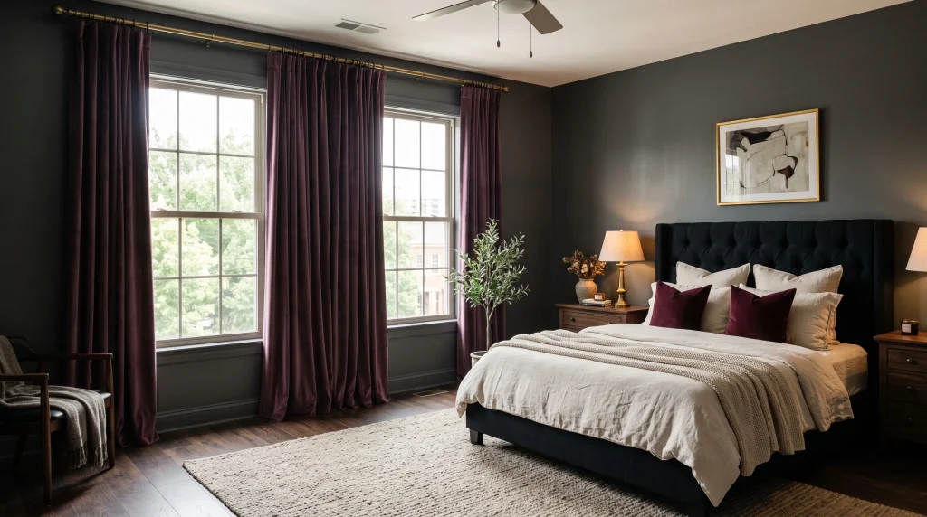
13. Plum Velvet Curtains
What makes it work: Floor-length velvet curtains change a bedroom more dramatically than most people expect before they try them, because they work simultaneously on height, colour, texture, and light absorption in a way that no other window treatment can replicate.
Plum velvet in particular is an excellent choice for a dark feminine bedroom because the fabric absorbs and reflects light in a complex, shifting way the shade appears different in morning light, afternoon light, and lamplight, and this constant subtle variation gives the curtains a life and richness that flat or lightweight fabrics simply do not have. In a room with charcoal walls or dark furniture, plum creates enough colour contrast to remain visually distinct and interesting without introducing the brightness of a lighter accent shade, and the purple undertone in plum connects it naturally to the cooler, more mysterious end of the dark feminine palette in a way that burgundy, which reads warmer and more red, does not.
Hanging velvet curtains for maximum impact: The difference between curtains that look afterthought and curtains that look like a considered design decision almost always comes down to the hanging height and the width of the treatment rather than the fabric or colour itself.
Mount the curtain rod four to six inches above the window frame not just above the glass, but measurably above it, in line with or close to the ceiling cornice in a room with high ceilings. Extend the rod six to eight inches beyond both sides of the window opening so that when the curtains are open during the day, the fabric sits entirely to the side of the glass rather than covering any of it.
This makes the window appear significantly wider than it actually is and fills the wall on either side of the window with rich vertical colour, transforming the whole wall rather than just the window itself. Use a simple black or antique brass rod — the hardware should support and frame the fabric, not compete with it.
Practical considerations for velvet curtains in a bedroom: Full velvet curtains are heavier than most other fabrics, which means they require sturdy curtain rods and wall fixings rather than the lightweight rails that work for lighter curtains.
If the full weight of velvet feels impractical for your window size or budget, choose interlined curtains with a velvet face fabric and a lighter lining — you get the same visual richness and drape from the outside while the interlined backing gives the curtain enough weight to hang well and provides some additional insulation and light control.
For rooms that receive strong morning sun, pair the velvet panels with blackout lining to protect both the fabric from fading and the occupant from early light. In rooms with limited natural light, keep nearby accessories — bedding, a reflective mirror, a pale rug — in lighter tones to ensure the dark curtain fabric does not overwhelm the remaining available brightness.
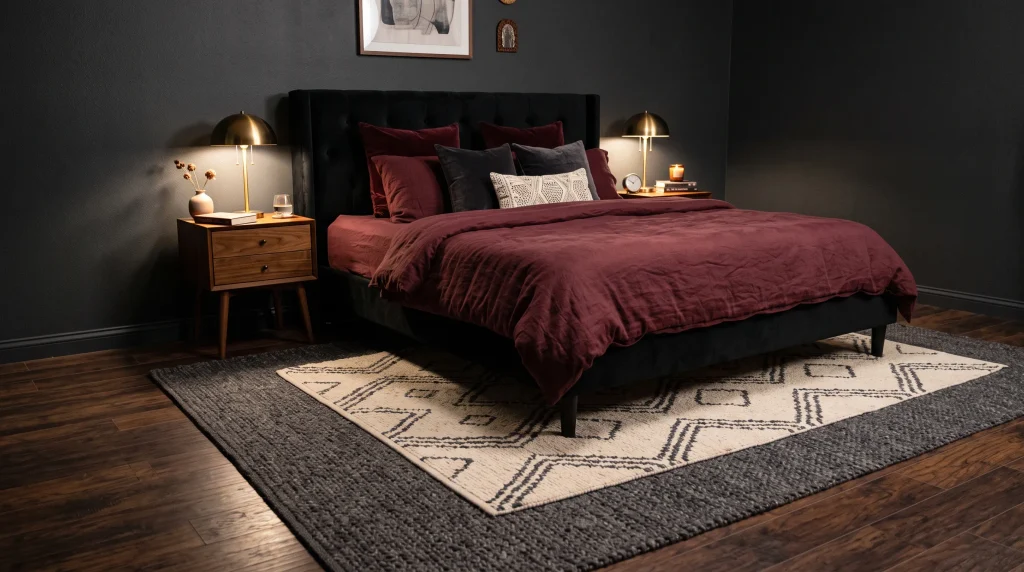
14. Layered Rugs
What makes it work: Rug layering is one of those decorating approaches that sounds fussy and complicated before you try it but is actually one of the most forgiving and flexible things you can do in a bedroom.
The principle is simple: a large neutral or dark rug anchors the bed and defines the sleeping zone, and a smaller patterned or contrasting rug sits partially on top, adding texture, colour, and a sense of intention to the floor that a single rug on its own cannot achieve.
The effect is that the floor becomes part of the room’s layered visual story rather than simply a neutral surface beneath the furniture, and in a dark feminine bedroom where layering is the key to making the space feel rich and considered rather than simply dark, this contribution from the floor level is genuinely significant. This technique is particularly valuable in larger bedrooms where a single rug, even a generously sized one, can look undersized or visually lost beneath a large bed frame.
How to choose rugs that work together: The most important decision in rug layering is ensuring that the two pieces work together rather than competing, which means being deliberate about how you vary them.
The lower rug should be large enough to extend at least eighteen to twenty-four inches beyond the sides of the bed and to the foot of the bed this anchors the furniture properly and creates the floor-level foundation the upper rug sits on. In a dark feminine bedroom, good choices for the base rug include a large charcoal textured weave, a deep mocha flatweave, or a subtle dark grey pattern that provides depth without demanding attention.
The upper rug should be noticeably smaller roughly half to twothirds of the lower rug’s dimensions and should introduce something the base rug does not have: a softer colour, a more visible pattern, or a different pile height. Muted cream with a faint geometric, a dusty rose with a floral border, or a warm tonal pattern in blush and beige all layer beautifully over a darker base.
Keeping layered rugs practical and safe: The aesthetic effect of layered rugs is only an advantage if the practical reality is comfortable and safe, and there are a few straightforward steps that make the difference between rugs that look beautiful and stay in place versus rugs that slide, bunch, and create a trip hazard.
Use a non-slip underlay beneath the lower rug on any hard floor surface this is important even for a single rug but becomes essential when you add a second layer on top, because the weight and movement of the upper rug will push and shift the lower one without an underlay to anchor it.
Place a smaller piece of non-slip matting or rug tape between the two rugs as well to prevent the upper piece from sliding toward the side of the bed where it gets the most foot traffic. Avoid combining two heavily patterned designs — one should be primarily a texture or a very quiet pattern, and the other can introduce a slightly more visible design. The visual result should feel layered and generous, not busy or chaotic.
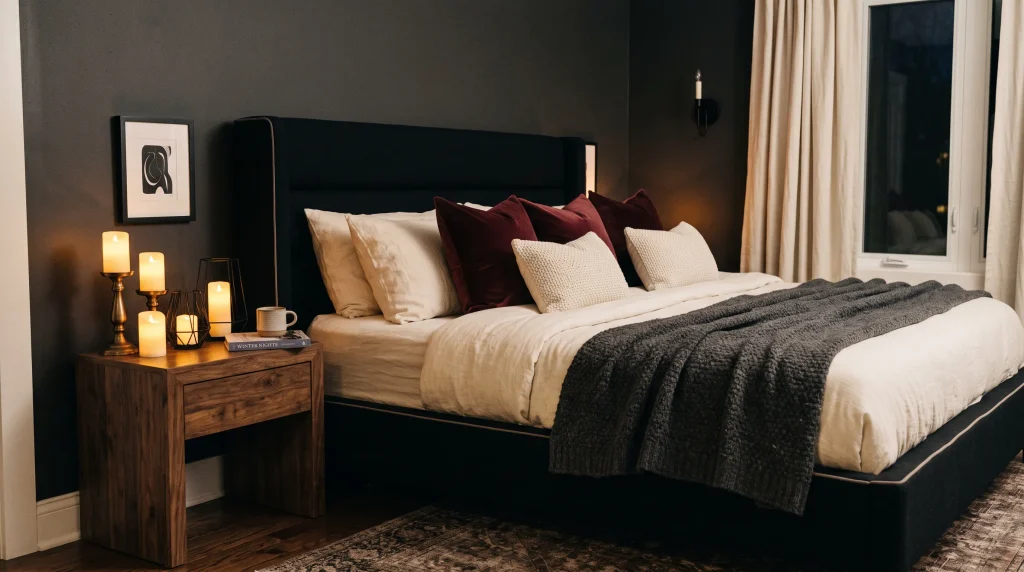
15. Romantic Candle Styling
What makes it work: Candles do something that no electric light fixture can entirely replicate, regardless of how warm the bulb colour or how thoughtfully the fitting is chosen. They create small, living points of warmth that flicker very slightly with air movement, casting gentle shifting shadows on nearby walls and surfaces that make a dark bedroom feel genuinely intimate and atmospheric rather than simply lit.
The difference between a dark bedroom with only electric lighting and the same room with a grouped candle display on a nightstand or dresser is remarkable the candles add a softness and aliveness to the space that immediately makes it feel like a place of deliberate, considered comfort rather than a room that simply has its lights on. This effect is particularly powerful in a dark feminine bedroom because the deeper wall colours and richer fabrics already suggest a retreat-like quality, and the candles are the final element that makes the suggestion feel completely real.
Creating an effective candle display: The arrangement of candles matters considerably to the overall effect, and a thoughtful grouping always looks better than candles scattered randomly across multiple surfaces. Choose three to five candles of clearly different heights a tall pillar candle, a medium jar candle, and one or two smaller votives and group them on a tray rather than placing them directly on wooden furniture.
The tray serves both a safety purpose and a visual one: it contains the grouping, makes it easy to move or adjust, and creates a defined zone that makes the arrangement look deliberate rather than accidental. For candle holders and tray materials, black glass, smoked glass, or antique brass all complement a dark feminine bedroom palette beautifully, and mixing two of these materials within a single display adds visual interest without complexity. The varying heights of the grouped candles create movement and dimension, and the warm light they cast on nearby brass hardware, velvet cushions, and dark walls is genuinely beautiful.
Practical safety and maintenance: Open-flame candles in a bedroom require specific practical precautions that are worth taking seriously rather than simply assuming you will be careful in the moment.
Always place candles on a stable, heat-resistant surface and keep them well away from curtains, bedding, and any other fabric the generally recommended clearance is at least twelve inches in any direction. Never leave lit candles unattended or fall asleep with them burning, which sounds obvious but is a genuine risk in a cosy, dimly lit bedroom where the whole atmosphere encourages relaxation.
If open flames feel impractical for your household if you have young children or pets, if you live in a rental with restrictions, or if you simply prefer not to manage the safety requirements high-quality flameless LED candles have improved enormously in recent years and now create a convincingly real flickering effect that is difficult to distinguish from the real thing in a softly lit bedroom. Pairing flameless candles with a warm electric lamp nearby creates layered lighting that achieves the same atmospheric quality as real candles with none of the associated concerns.
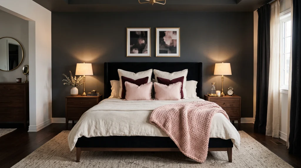
16. Blush Accent Details
What makes it work: Blush accents are the element that prevents a dark feminine bedroom from feeling cold, austere, or unwelcoming, and they do this work quietly and without disrupting the deeper colour palette that gives the room its character. Against charcoal walls, black furniture, plum bedding, and burgundy throws, a carefully chosen muted dusty pink creates a gentle counterpoint a note of softness that reminds you the room is designed for comfort and pleasure rather than simply for drama. The key word throughout is muted.
Dusty or antique blush, with a slightly greyed or aged undertone, is what works beautifully in a dark feminine bedroom. A clear, bright candy pink in the same context would look jarring and entirely out of place, which is why this is one of those ideas where the specific tone of the colour matters more than almost anything else about how it is used.
Where and how to introduce blush into a dark bedroom: The most effective places to introduce blush into a dark feminine bedroom are the textiles specifically pillows, throws, and any upholstered details at a small scale. Start with one or two blush cushions positioned at the centre of the bed, in front of the darker sleeping cushions and the deeper-toned decorative pillows.
A single blush throw folded loosely at the foot of the bed adds another soft note at floor level without disrupting the layering of the bedding above. These two changes alone — two cushions and a throw — are often enough to visually lift a dark bedroom from feeling heavy to feeling balanced and inhabitable. Beyond the bed, a small blush-toned ceramic vase on a nightstand, a piece of abstract artwork with a dusty rose element, or a low-wattage lamp with a blush glass shade can all carry the accent colour quietly into other parts of the room without making it feel consciously designed around a pink theme.
Keeping blush controlled and sophisticated: The restraint with which blush is used is precisely what makes it effective in a dark feminine bedroom context, and the most common mistake is simply using too much of it. Two or three small points of blush scattered across the room one on the bed, one nearby, and perhaps one on a surface is enough to register as an intentional accent colour.
More than that, and the blush begins to compete with the deeper tones for dominance rather than softening them, which undermines the whole purpose of using it. Because blush accents are small scale and relatively inexpensive compared to furniture or paint, they are also one of the easiest elements to refresh seasonally a new pair of blush cushions or a different blush throw in a slightly different texture can give the room a subtle update without any of the commitment or cost involved in changing larger pieces.
Choose dusty rose or antique blush shades consistently throughout so that all the blush tones in the room share the same slightly muted, aged quality and read as part of a considered palette rather than a random collection of pink things.
How to Combine These Ideas in One Room
One of the most common questions I get from readers is how to choose from a list like this without the finished room ending up as a chaotic mix of ideas that do not work together. The answer is always to think in layers wall, bed, lighting, accents and to select ideas from different categories so that each layer contributes something distinct rather than several ideas in the same category competing with each other for the same visual role.
Here is a combination that works beautifully in practice, based on rooms I have put together using this exact approach:
Layer one — walls: A charcoal matte accent wall behind the bed, with the remaining walls in a warm taupe or light greige that shares the grey undertone without the full depth of the charcoal. This gives the room a clear focal direction from the moment you walk in.
Layer two — bed: An emerald or burgundy velvet upholstered bed against the charcoal wall, with layered cream linen sheets, a plum or burgundy duvet cover, and two or three cushions in dusty rose and cream. This creates a bed that is visually rich without being busy.
Layer three — lighting: Antique brass wall sconces on either side of the bed, positioned at eye level when seated, with warm 2,700 Kelvin bulbs. A grouped candle display on one nightstand adds a second layer of warmth after dark.
Layer four — accents: Two blush cushions at the centre of the bed, an arched Gothic mirror on the adjacent wall, and plum velvet curtains at the window. These final elements tie the palette together and ensure the room has a coherent visual identity rather than looking like a collection of separate purchases.
This four-layer approach produces a bedroom that feels layered, deeply feminine, and completely considered — dramatic enough to feel genuinely special, balanced enough to feel liveable every day.
Conclusion
A beautiful bedroom does not need to be bright or minimal to feel warm, welcoming, and entirely your own. The right combination of deep colours, soft textures, warm metallic lighting, and carefully chosen feminine details can create a space that genuinely feels like a retreat — sophisticated and cosy in equal measure, and personal in a way that a lighter, safer palette rarely achieves.
The most important lesson from decorating with dark palettes across many different homes, room sizes, and budgets is to start with one change and live with it before adding more. A charcoal accent wall, a velvet throw in a deep jewel tone, or a new pair of antique brass sconces can tell you everything you need to know about how far you want to take the look in your own space. Dark feminine bedrooms reward patience and deliberate layering — each element adds to the last rather than competing with it, and the room gets better with every addition when those additions are chosen with care.
Pick one idea from this list that genuinely excites you and that fits your existing furniture and space. Make that one change and spend a week with it before deciding what to do next. And if this post has given you the inspiration you were looking for, please save it to Pinterest and share it with someone who is ready to finally create a bedroom they will love waking up in every morning.
Related Post: 20 Bedroom Lighting Ideas That Make Your Space Feel Cozy & Beautiful





One Comment