How to Make a Tiny Kitchen Feel Luxe
A small kitchen doesn’t have to feel like a compromise. ✨
Luxury was never really about square footage — it’s about the choices you make with the space you actually have. A tiny kitchen with the right hardware, lighting, and a couple of concealed appliances can feel more considered than a sprawling one filled with clutter.
If your tiny kitchen feels cramped, dated, or visually cluttered, you don’t necessarily need a full remodel. The biggest difference usually comes from reducing visual noise, improving lighting, choosing one focal feature, and upgrading the handful of things you touch every day — hardware, faucet, lighting — rather than spreading a budget thin across everything at once.
Quick reference: where luxury actually comes from in a small kitchen
| Idea | Cost | Difficulty | Best for |
|---|---|---|---|
| Cabinet hardware | $ | Easy | Renters and homeowners alike |
| Dimmer switch / layered lighting | $–$$ | Easy–Medium | Dark or single-fixture kitchens |
| Declutter + open shelving edit | $ | Easy | Any small kitchen |
| Mirror or glossy backsplash panel | $–$$ | Easy–Medium | Narrow galley kitchens |
| Full-height slab or tile backsplash | $$$ | Medium | Kitchens already being remodeled |
| Integrated/panel-ready appliances | $$$$ | High | Full renovations |
Conceal Your Appliances
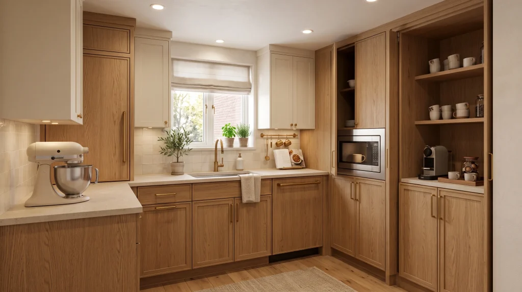
A microwave sitting in plain sight above the stove is one of the small details that tends to undercut a “designed” feeling — it’s often the first thing your eye lands on, and it reads as an afterthought rather than a planned kitchen. That said, this isn’t about hiding every appliance; some kitchens display a nice stand mixer or a stack of cast iron on purpose, and it works because it’s a deliberate choice, not a leftover one. The distinction that actually matters is visual consistency, not concealment for its own sake.
The same logic applies to the fridge, dishwasher, and even the coffee maker. Panel-ready or integrated appliances that match your cabinetry tend to blend into the overall design instead of breaking it up with stainless steel or plastic fronts. This matters more in a small kitchen than a large one, simply because there’s less room for the eye to rest — every surface is more visible, so every visual break gets noticed.
Best for renters or smaller budgets: you don’t need a full panel-ready appliance suite to get most of this benefit. A toaster and blender tucked into an appliance garage, a coffee station hidden behind a pocket door, or a small bar fridge built into lower cabinetry all achieve a similar effect without replacing every major appliance. The goal isn’t to hide that you cook and live in the kitchen — it’s to make sure what’s on display looks chosen, and what isn’t chosen stays out of sight.
Choose One Statement Feature
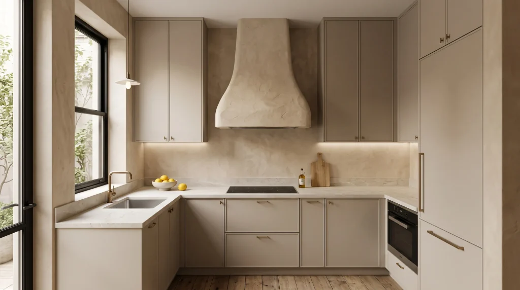
A small kitchen genuinely benefits from having one thing that draws the eye — a plastered range hood, a bold-colored range, or an unusually shaped light fixture over the sink. In a bigger kitchen, this same detail might get lost among several other features competing for attention. In a tiny one, it becomes the natural focal point almost by default.
The stove and its hood are a common place to put this energy, since they’re already the visual center of most kitchens. A hand-plastered or Venetian-plaster hood, a range in a saturated color like deep green or navy, or a simple brass strap detail around an otherwise plain hood can all do this job. The point isn’t to spend a fortune — it’s to be deliberate about which single element gets the spotlight, so the rest of the kitchen can stay quieter by comparison.
Once you’ve picked the statement piece, resist the urge to add a second one nearby. Two competing focal points in a small space usually cancel each other out rather than doubling the effect. If the hood is bold, keep the backsplash and counters simple. If the lighting is the standout, let the cabinetry and hardware stay understated. This kind of restraint is honestly the harder skill to develop, but it’s often the difference between a kitchen that looks curated and one that looks busy.
If you only do one thing here: pick whichever feature is already the visual center of the room — usually the range or the sink wall — and put your budget there instead of spreading it evenly across several smaller updates.
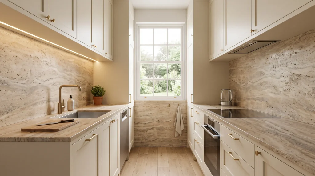
Go Full-Height with the Backsplash
A short backsplash that stops a few inches above the counter, leaving a strip of bare wall or paint above it, tends to visually chop the kitchen into segments — counter, backsplash, wall, upper cabinet — which reads as more piecemeal than a small space can really afford. Extending the material all the way up to the underside of the upper cabinets, or even to the ceiling if there are no upper cabinets, removes those visual breaks entirely.
Full-height slab stone is the most dramatic version of this, especially when the same stone continues from the countertop straight up the wall, but it isn’t the only option. Large-format tile in a continuous, simple pattern achieves something similar for a fraction of the price, and even a single sheet of painted MDF or beadboard, extended the full height, gives the impression of one cohesive surface rather than several stacked materials.
The continuity is really what does the work here — a small kitchen can absorb a lot of visual noise if it comes in one connected sweep, but the same amount of detail broken into separate horizontal bands starts to feel busy fast. If a full slab isn’t realistic for your budget, look for tile or paint options that at least run edge-to-edge without a change in material partway up, since that unbroken line is usually what reads as “expensive” even when the underlying material is fairly affordable.
Worth the splurge? Of everything on this list, a full-height backsplash is one of the pricier changes to do properly, since it usually involves removing the existing one. It tends to be worth prioritizing if you’re already mid-remodel, but not usually worth tearing into a functional kitchen for on its own.
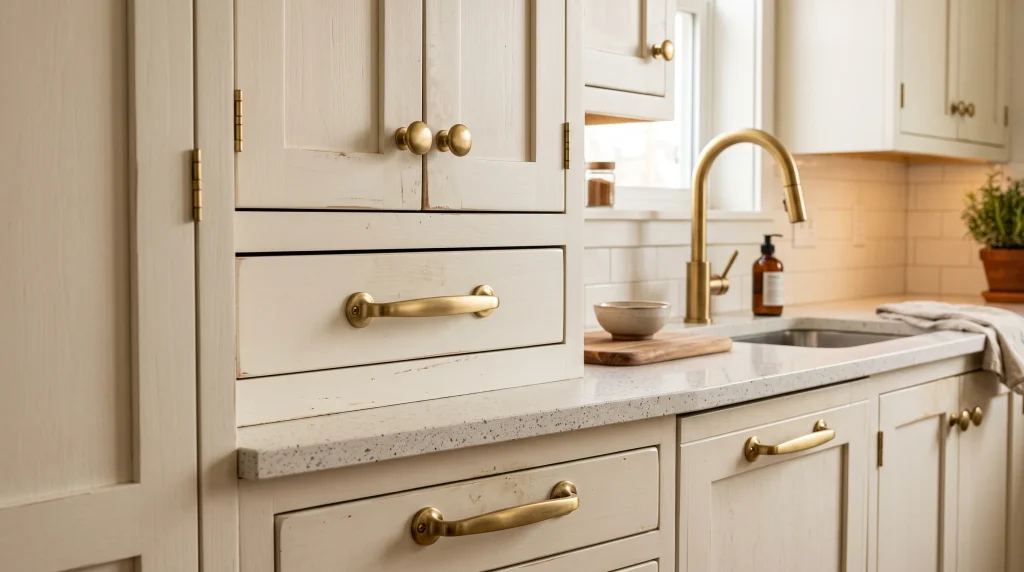
Upgrade Cabinet Hardware
Hardware is one of the few upgrades in a kitchen where the price difference between “fine” and “genuinely nice” is often smaller than people expect, yet the visible difference is disproportionately large. A heavy, well-machined knob or pull has a different feel in your hand than a lightweight stamped one, and that tactile quality is part of how people register quality even if they couldn’t explain why.
Consistency matters as much as the individual pieces. Mixing chrome pulls with a brass faucet and black hinges creates a scattered, unplanned look, even if each piece is nice on its own. Picking one finish family — brushed brass, unlacquered brass, matte black, or aged bronze — and carrying it through the cabinet pulls, faucet, and any exposed hinges ties the whole kitchen together in a way that’s easy to underestimate until you see it done.
Best for renters: since this doesn’t touch the cabinet boxes themselves, it’s one of the few upgrades on this list that travels with you or reverses cleanly at move-out — keep the original hardware in a labeled bag and swap it back before you leave.
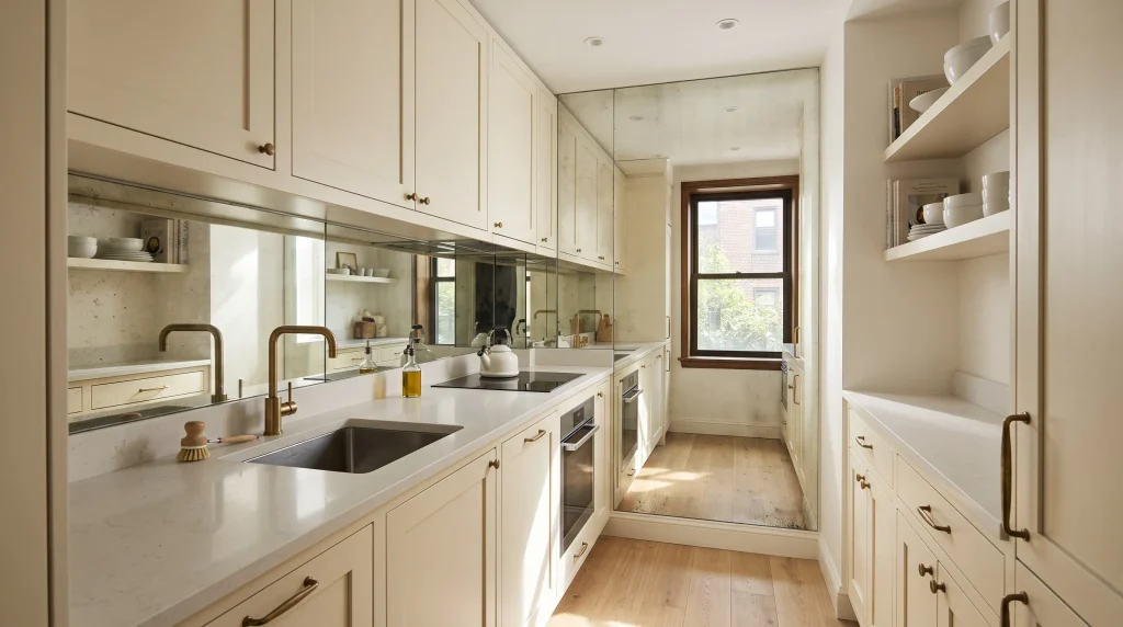
Use a Mirror or Reflective Surface
Small kitchens, especially narrow galley layouts, benefit enormously from anything that bounces light and visually extends the depth of the room. A mirrored backsplash panel behind the stove or sink is the most direct version of this — it reflects whatever’s across from it, whether that’s a window or the opposite wall, which genuinely makes the room read as wider than it is.
If a full mirror panel feels like too much, glossy tile, polished stone, or even a glass backsplash achieves a softer version of the same effect. The common thread is a surface that catches and redirects light rather than absorbing it, which matters most in kitchens that don’t get much natural daylight to begin with. A high-gloss finish on just one wall or the backsplash is usually enough; doing it everywhere can tip into feeling cold or clinical.
Placement is worth thinking through before committing. A mirror or glossy surface positioned to reflect a window will amplify natural light throughout the day, while one facing a blank interior wall won’t do much for you. If you’re renting or want a lower-cost test run, a cut-to-size mirror panel mounted with adhesive strips behind the stove is a genuinely reversible way to see the effect before committing to anything permanent like tile or stone.
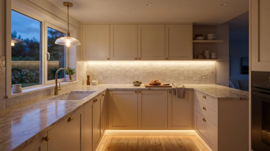
Layer Your Lighting
A single overhead fixture is often the weakest lighting choice in a small kitchen, because it tends to flatten the room and leave the countertops in your own shadow while you’re working. Layering a few smaller light sources — under-cabinet LEDs, a toe-kick strip, and one decorative fixture — usually does more for the room’s atmosphere than upgrading to a bigger single light.
Under-cabinet lighting solves the practical problem of shadowed counters, but it also adds a warm glow that makes the whole kitchen feel more finished after dark. A subtle LED strip along the toe-kick, the gap between the cabinets and the floor, is a smaller and more surprising detail — it makes the cabinetry look like it’s floating slightly, which reads as considered in a way that’s hard to pin down but easy to notice.
For the decorative layer, a single well-chosen pendant or a pair of small sconces near the sink gives the room a focal point at eye level rather than everything coming from the ceiling. A dimmer switch, even a basic plug-in version for a plug-in fixture, is one of the cheapest upgrades on this whole list and arguably one of the most effective — it lets the same kitchen shift between bright, functional light for cooking and a softer glow for evenings, without needing to add or remove a single fixture.
Best for narrow galley kitchens: if you can only tackle one lighting change, prioritize under-cabinet lighting over a new ceiling fixture — it fixes the shadow problem directly at counter height, which is where a galley kitchen’s lighting usually falls short first.
Commit to a Cohesive Color Palette
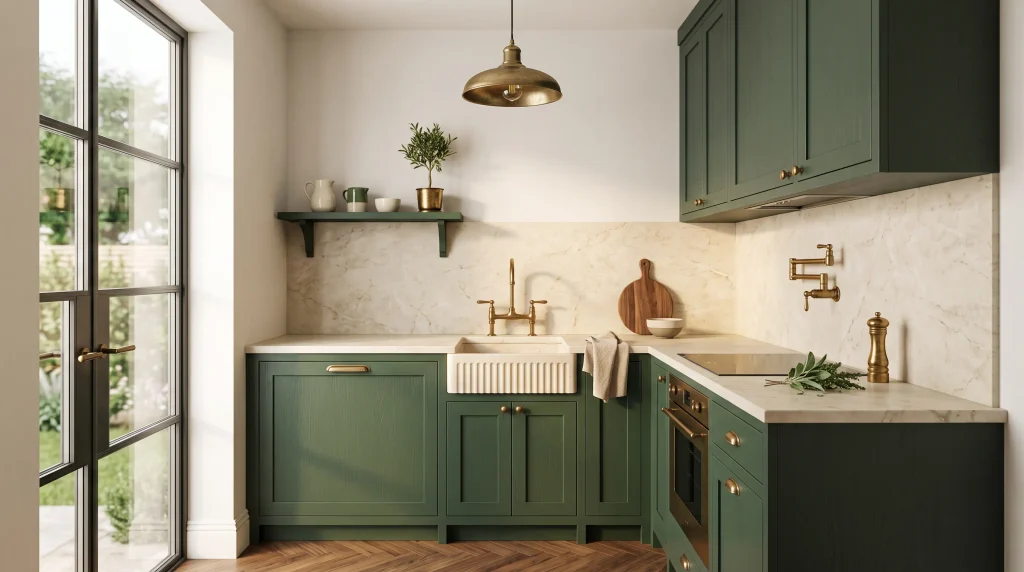
A kitchen with five or six different colors and finishes competing for attention will almost always look smaller and busier than one built around two or three tones used consistently. This is especially true in a small footprint, where there simply isn’t enough visual space to absorb a lot of contrast without feeling chaotic.
Picking a primary cabinet color, a complementary counter and backsplash tone, and one accent — a hardware finish, a light fixture, or a single piece of decor — gives the eye a clear, repeated pattern to follow around the room instead of constantly resetting. Neutral and natural tones tend to feel calm and expensive by default, but a deep, saturated color like a dark green, navy, or charcoal can look just as luxurious, sometimes more so, when it’s used with the same discipline.
Where people usually go wrong is treating every surface as a separate decorating decision — one color for the walls, another for the cabinets, a third for the backsplash, a fourth for the floor — without stepping back to see how they interact as a whole. Before committing to any single material or paint color, it’s worth laying out swatches or samples of everything together first, since a color that looks great alone can clash badly once it’s sitting next to three other finishes in the same small room.
Declutter Ruthlessly
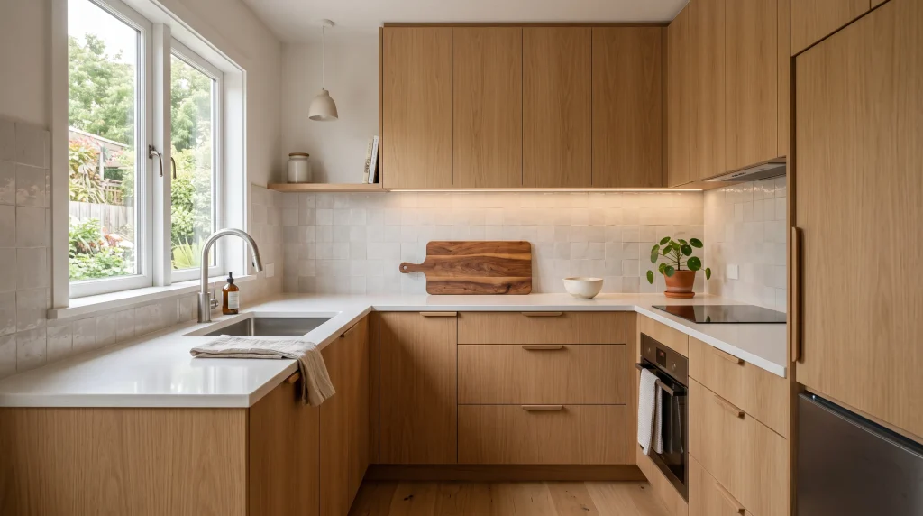
This is the least glamorous idea on this list and also probably the most effective one. A countertop covered in a toaster, a knife block, mail, spare chargers, and half-used spice jars will make even a genuinely well-designed kitchen look chaotic, while a kitchen with almost nothing sitting out looks considered and calm by default, regardless of how expensive the actual finishes are.
The fix isn’t necessarily buying more storage — it’s being more selective about what earns counter space. A single beautiful cutting board or a plant might stay out because it adds something visually, while the blender, the mail pile, and the pile of reusable bags go into a cabinet or drawer specifically designated for them. In a small kitchen, every item left on the counter takes up a disproportionate amount of visual real estate compared with the same clutter in a larger room.
This applies just as much to the inside of cabinets and drawers as it does to visible surfaces, particularly if you have any glass-front or open cabinetry. A jumbled cabinet behind a glass door undercuts the whole point of using glass in the first place. Take an afternoon to sort through what’s actually being used versus what’s just accumulated, and you’ll likely find you don’t need nearly as much storage as you assumed — you mostly need better organization for what you already have.
Add Open Shelving Selectively
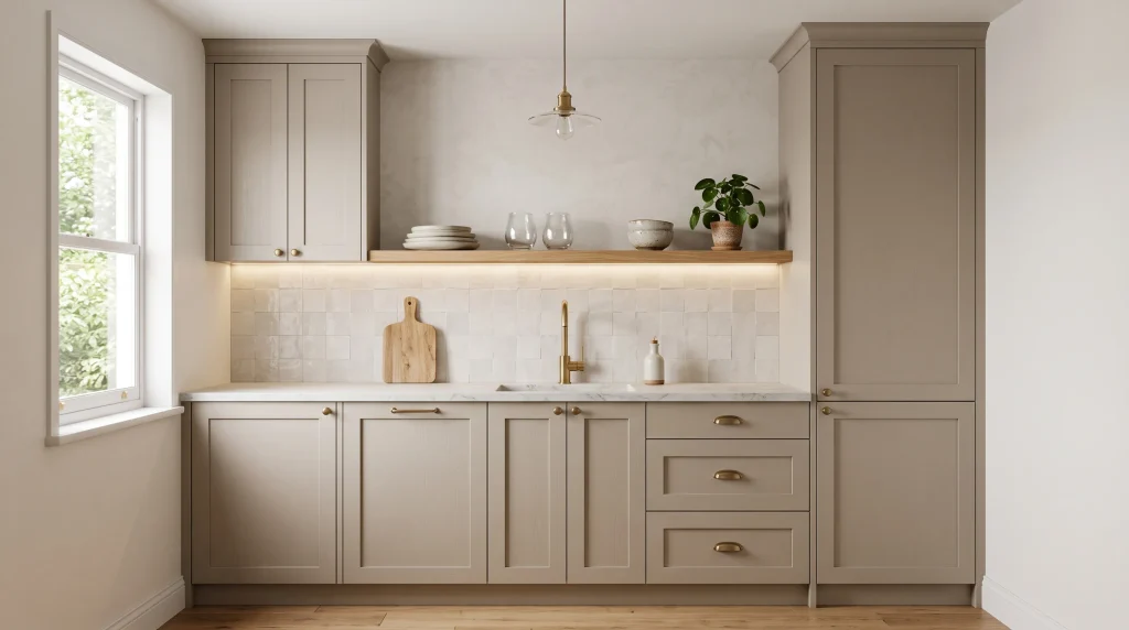
Open shelving gets recommended constantly for small kitchens, and it does genuinely make a room feel airier by removing the visual bulk of upper cabinet doors — but it only works if what’s sitting on the shelves is worth looking at. A shelf full of mismatched mugs and half-empty cereal boxes will look worse than a closed cabinet, not better.
The kitchens where open shelving reads as luxurious tend to keep it deliberately sparse: a small stack of matching plates, a few pieces of ceramic or glassware with a shared color story, maybe one plant. Think of it less like storage and more like a small display, with everyday overflow kept somewhere else out of sight. This is also a good spot to introduce a bit of personality — a set of vintage glasses, an unusual ceramic bowl — without it clashing with the rest of the kitchen’s more neutral finishes.
If you’re not ready to commit to full open shelving, replacing just one or two upper cabinet doors with glass fronts achieves a softer version of the same effect. It lets a little bit of curated display through without exposing every single shelf, which can be a more forgiving option if your dishware collection is more “practical” than “photogenic.”
Invest in a Few High-Quality Fixtures
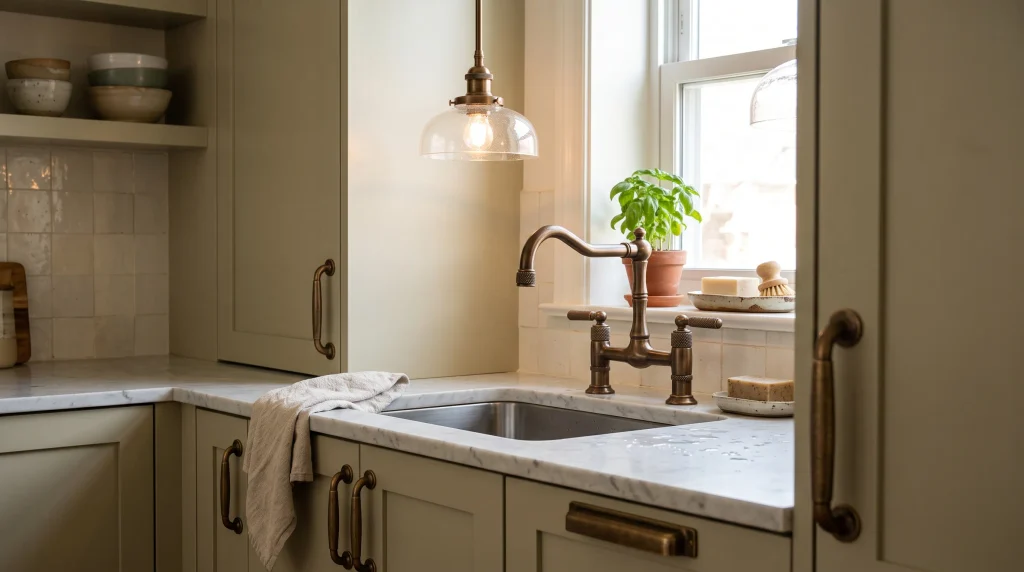
You don’t need every element in a small kitchen to be expensive — you need a handful of things that clearly are. A well-designed faucet, a good set of cabinet pulls, and a nice light fixture are the three items people tend to notice and touch most often, which makes them worth a slightly bigger portion of the budget than, say, the exact brand of dish soap dispenser.
This doesn’t mean the most expensive option available is automatically the right one. A refurbished or secondhand faucet from a reputable brand often has the same heft and finish quality as a brand-new one at a fraction of the price, and vintage or antique hardware can bring a level of character that a mass-produced modern equivalent simply doesn’t have. The goal is quality and consistency of finish, not necessarily the highest price tag on the shelf.
Spend your limited budget on the things you interact with daily rather than spreading it thin across everything. A gorgeous faucet next to a slightly dated cabinet door will still register as an upgrade, while a dozen small, forgettable purchases spread evenly across the kitchen tend to disappear into the background without anyone consciously noticing them. Prioritizing a few genuinely good pieces over many average ones is one of the more counterintuitive lessons in small-space design, but it consistently pays off.
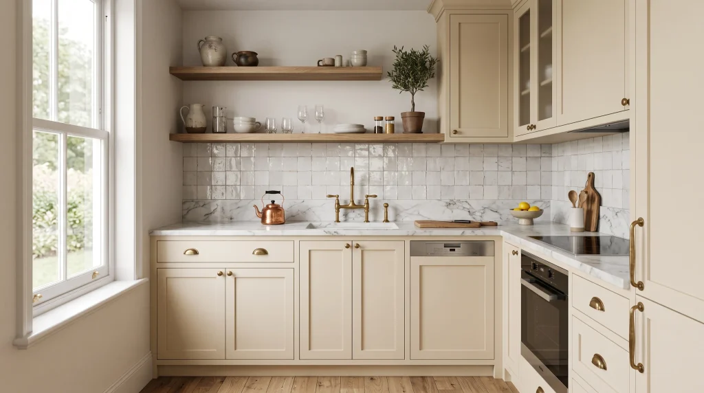
Match Finishes and Textures Intentionally
Luxury often comes down to how well different materials sit next to each other rather than how expensive any single one is on its own. A kitchen where the cabinet hardware, the faucet, the light fixtures, and even the door hinges all share a similar finish family feels considered in a way that’s hard to fake with any individual purchase, however nice it might be.
This extends beyond metal finishes to texture as well. Pairing a matte cabinet finish with a glossy countertop, or mixing a honed stone counter with a slightly textured tile backsplash, creates visual depth without adding more colors or patterns into the mix. It’s a subtler move than choosing a bold color, but it’s often what separates a kitchen that looks flat from one that looks layered and dimensional.
The easiest way to check this before committing to anything is to physically lay your material and finish samples next to each other — tile, countertop, cabinet paint chip, hardware finish — rather than picking each one separately over the course of a renovation. Small mismatches that seem fine in isolation, like a slightly warmer brass next to a cooler-toned tile, become much more obvious once they’re installed together in a small, closely viewed room.
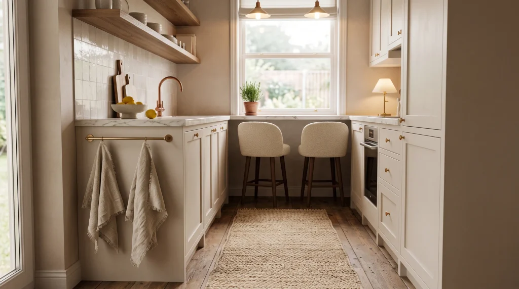
Bring in Soft Textiles and Finishing Touches
Kitchens tend to be dominated by hard surfaces — stone, tile, wood, metal — and a little bit of softness goes a long way toward making the room feel more like a finished living space rather than a purely functional one. A woven runner, a set of linen tea towels left out deliberately rather than shoved in a drawer, or upholstered stools at a peninsula or small breakfast bar all add a layer that hard materials alone can’t provide.
These details are also some of the least permanent and least expensive changes on this entire list, which makes them a good starting point if you’re renting or not ready to commit to anything structural. A runner or a set of stools can be swapped out easily if your taste changes, unlike a backsplash or cabinet hardware, and they add warmth immediately without any installation at all.
The same principle that applies to hardware and finishes applies here too — pick textiles that relate to the rest of the room’s color palette rather than introducing something entirely unrelated. A single stack of matching linens or one well-chosen runner tends to read as more intentional than several unrelated soft items scattered around trying to add personality individually.
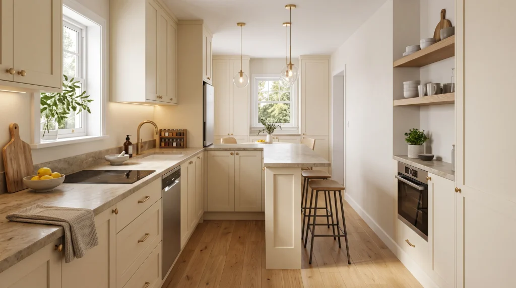
Skip the Island, Add a Peninsula or Cart
One of the most common frustrations with small kitchens is the assumption that a proper kitchen needs an island, and that without one the space can never feel complete or luxurious. In a genuinely tight footprint, forcing an island in usually makes the room feel more cramped, not more finished, since it eats into the walking space you need for the kitchen to actually function.
A peninsula — a counter extension attached to existing cabinetry rather than a freestanding island — often solves the same problems an island would (extra counter space, a spot for stools, a visual anchor) without requiring the same amount of open floor space around it. Because it’s attached on one side, it also tends to be cheaper to install than a fully freestanding island with its own plumbing or electrical runs.
A simple rule of thumb: if adding an island would force anyone to squeeze sideways between it and the surrounding cabinets to get through, skip the island. That clearance problem rarely resolves itself once the kitchen is in daily use, and a peninsula or cart is almost always the more livable choice in that situation.
If even a peninsula isn’t realistic, a well-chosen rolling cart or a small piece of furniture styled to match the kitchen can provide some of the same benefits temporarily — extra surface area when you need it, and a place to hide small appliances underneath, while staying flexible enough to move or remove entirely if it doesn’t work out. The goal isn’t to replicate a larger kitchen’s layout in miniature; it’s finding the version of extra counter space that actually fits your specific room.
Frequently Asked Questions
How can I make my kitchen look expensive on a budget?
Focus on the details people actually touch and notice first — cabinet hardware, a dimmer switch, and a decluttered countertop — rather than spreading a small budget thin across every surface. These changes are inexpensive individually but have an outsized visual effect compared with their cost.
Does a small kitchen need an island to feel luxurious?
No. An island can actually make a tight kitchen feel more cramped if there isn’t enough clearance around it. A peninsula, a rolling cart, or simply a well-organized layout without any central piece can achieve a similar sense of completeness without sacrificing walking space.
What colors make a small kitchen look bigger and more luxurious?
Light, neutral tones reflect more light and tend to feel airy, but a cohesive palette matters more than the specific colors chosen. A deep, saturated color used consistently across two or three elements can look just as luxurious as an all-white kitchen, as long as it isn’t competing with several other unrelated tones in the same room.
Is a full-height backsplash worth the cost in a small kitchen?
It’s one of the more noticeable upgrades because it removes the visual break between the counter, wall, and upper cabinets. If a full slab isn’t in the budget, tile or paint that runs edge-to-edge without changing material partway up the wall gives much of the same effect for less.
Should I hide my kitchen appliances in a small space?
Concealing at least the microwave and, where possible, the fridge and dishwasher behind matching panels removes visual clutter that’s especially noticeable in a compact room. It’s not necessary to hide everything — a few well-chosen appliances left visible can even add character — but a mix of visible and concealed tends to look more intentional than everything on display at once.
Conclusion
Making a tiny kitchen feel luxe rarely comes down to one big renovation — it’s a series of smaller, deliberate choices that add up: better hardware, layered lighting, a cohesive color story, and a counter that isn’t buried under clutter. None of these ideas require doubling your budget or knocking down a wall. Start with whichever change feels most overdue in your own kitchen, whether that’s swapping out dated knobs or finally clearing the counter for good, and build from there. The kitchens that feel the most luxurious are rarely the largest ones — they’re the ones where every choice, however small, was made on purpose.