16 Blue Tile Bathroom Ideas That Feel Fresh and Luxe
A beautiful bathroom can start with one unforgettable tile choice. Blue can make a space feel fresh, calm, dramatic, or wonderfully luxurious — and it’s one of the few colors that works equally well in a beach cottage and a downtown condo.
Unlike trend colors that cycle in and out every few years, blue has stayed a consistent favorite across decades of design shifts, which is part of why it keeps showing up in both budget refreshes and high-end remodels.
I’ve worked through three bathroom renovations over the past six years — a powder room, a guest bath, and a full primary bathroom gut renovation — and blue tile is the one choice that consistently gets compliments from guests without feeling like a trend that will look dated in five years.
These blue tile bathroom ideas are built from that hands-on experience, ongoing conversations with tile contractors and installers, and current design trends, not just theory pulled from a showroom catalog.
From soft subway tiles and coastal blue-and-white combinations to rich navy walls, moody finishes, and elegant brass accents, there’s a version of this palette for almost any budget or bathroom size.
Some of these ideas cost as little as a few hundred dollars for a powder room accent wall; others involve a full shower retile that can run into the thousands. I’ve tried to flag realistic cost ranges and common mistakes throughout so you’re not just looking at a mood board, but actually planning a project you can execute.
Whether you’re updating a small powder room or planning a full remodel, the right shade, pattern, and material can completely change how the space feels. Keep reading for practical inspiration — including real cost ranges, lighting considerations, and installation pitfalls to avoid — that you can actually use when you sit down with a contractor or start pricing tile at the showroom.
Why Choose Blue Tiles for Your Bathroom?
Blue sits in a rare spot on the color wheel: it reads as calming, which is why spas, hospitals, and hotel bathrooms lean on it so heavily, but it can also feel rich and expensive in the right shade.
Few colors manage both ends of that spectrum. A pale powder blue feels serene and airy, while a saturated cobalt or navy feels bold and intentional — the same base hue can carry two completely different moods depending on how dark you go and what you pair it with.
Blue is also one of the most forgiving colors when it comes to resale. Buyers rarely object to blue the way they might to a bold red, orange, or an unusual accent color that feels too personal to the previous owner. In my own renovations, blue tile consistently appraised well and never needed to be “explained away” during showings, unlike a few bolder choices I’ve made in other rooms of the house that agents specifically flagged as things a buyer might want to change.
There’s also a practical argument for blue: it hides water spots and soap scum better than pure white, especially in a matte or textured finish, which matters in a room that gets used daily. And because blue spans everything from pale coastal shades to near-black navy, it’s flexible enough to work with almost any other design element already in your home — wood tones, metal finishes, countertop material, even existing flooring you’re not planning to replace.
That flexibility is a big part of why designers keep returning to it project after project, rather than treating it as a passing trend.
1. Navy Blue Statement Wall
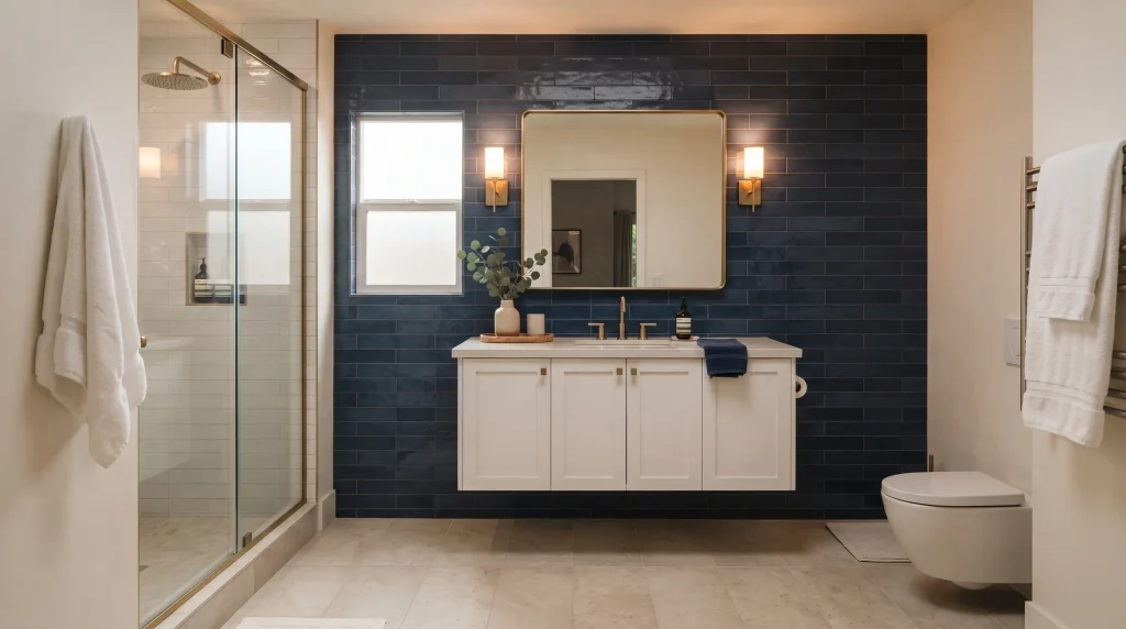
A navy blue wall can instantly give a bathroom a designer feel without changing the entire room. This deep shade creates a strong backdrop for white porcelain, warm wood, or brushed brass, making simple fixtures look more intentional than they would against a plain white wall. Use the darker tile behind the vanity, bathtub, or shower to create a clear focal point while keeping the remaining walls lighter, so the room doesn’t feel like it’s closing in on itself.
In my experience, this approach works especially well when a bathroom feels flat or overly neutral — builder-grade bathrooms with white tile and beige walls are the most common candidates. The contrast adds depth, and reflective tile surfaces can bounce light around the room, helping the space feel polished rather than heavy, even in a fairly small footprint.
When I tiled a navy accent wall in my own guest bathroom, the biggest lesson was lighting. Without layered lighting, the wall absorbed so much light that the room felt noticeably smaller by evening, even though it looked great during the day. I ended up adding a second sconce on either side of the mirror to compensate, which made a bigger difference than I expected going in.
For a balanced finish, pair navy tile with crisp white surfaces and a few warm accents. A white vanity, pale quartz countertop, and light flooring keep the darker wall from visually shrinking the ba
throom, while brass hardware adds a subtle luxe touch without requiring a full metal-finish overhaul. Choose larger tiles if you want fewer grout lines and a calmer appearance, or use slim subway tiles for more texture and a slightly more traditional feel. Expect to pay roughly $12–$25 per square foot installed for a mid-range porcelain navy tile, depending on your region, tile format, and installer rates — mosaic and handmade-look tiles will run higher.
2. Light Blue Subway Tiles
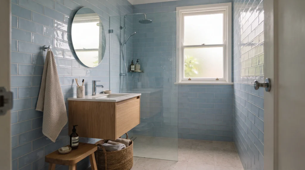
Light blue subway tiles are an easy way to make a bathroom feel brighter, cleaner, and more welcoming. Their familiar rectangular shape keeps the design timeless, while the soft blue color introduces enough character to prevent an all-white room from feeling sterile or clinical. Run the tiles across the shower walls or around the vanity for a consistent visual flow that ties the room together without a lot of extra decorating.
A glossy finish is particularly useful in smaller bathrooms because it reflects natural and artificial light, making the room feel more open than its actual square footage. The result is a space that feels open and fresh without relying on complicated patterns, oversized accessories, or expensive decorative changes — which makes this one of the more approachable ideas on this list for a DIY-inclined homeowner or a first bathroom refresh.
To keep the look sophisticated, combine pale blue walls with warm white grout, simple chrome or nickel fixtures, and natural wood. A light oak vanity can soften the cooler tile while woven baskets and cotton towels add practical texture without adding visual clutter. If the bathroom is narrow, installing the subway tiles horizontally can visually emphasize the room’s width, which is a trick I’ve used in a couple of long, narrow guest bathrooms with good results.
For a more tailored appearance, consider stacking the tiles vertically or using a subtle offset pattern instead of the classic brick-lay. I’ve noticed that keeping the surrounding decor restrained lets the blue tile remain the main feature without making the bathroom feel visually busy.
This is also one of the most budget-friendly options here — standard ceramic subway tile typically runs $3–$8 per square foot for the material itself, before installation labor, which can add another $5–$10 per square foot depending on your area and the complexity of the layout.
3. Blue and White Coastal
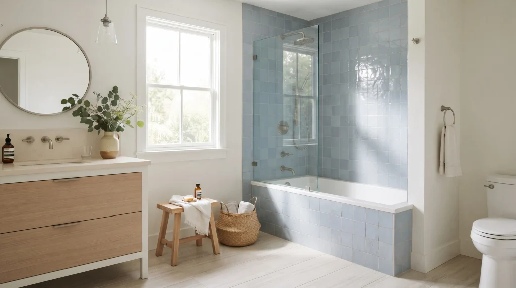
Few color combinations make a bathroom feel as fresh and effortless as soft blue paired with clean white. This palette works because the white surfaces amplify natural light while blue tiles add just enough color to create personality without overwhelming the room. Try blue tile around the shower or bathtub, then repeat white through the vanity, countertop, and towels for visual balance across the whole space.
Pale oak can bring warmth without disturbing the airy feeling that makes this combination work so well. In my experience, this combination works especially well in bathrooms that feel cold or overly plain, because the gentle contrast creates a welcoming space without making the design feel overly decorated or themed — a common risk with coastal-style bathrooms that lean too hard into a nautical concept.
For a polished coastal look, focus on natural textures instead of obvious nautical accessories. Skip the anchor decor, rope-wrapped mirrors, and starfish accents, which tend to date the space quickly and can push a subtle color palette into theme-park territory. A woven basket, linen hand towel, light wood stool, or simple ceramic vase can add character while keeping the room sophisticated and adaptable if your taste changes down the line.
Choose brushed nickel or chrome fixtures if you prefer a crisp finish, or introduce aged brass for a warmer interpretation of the same palette. Soft blue mosaic or ceramic tiles can work beautifully beside white grout and pale stone flooring, especially in a shower surround where the mosaic can wrap around curves and niches more easily than large-format tile. Keep patterns controlled so the room stays visually calm — one patterned element, like a mosaic accent band, is usually enough. The finished space should feel bright, comfortable, and timeless enough to enjoy well beyond current bathroom trends, which is really the goal with any coastal-leaning renovation meant to last more than a few years.
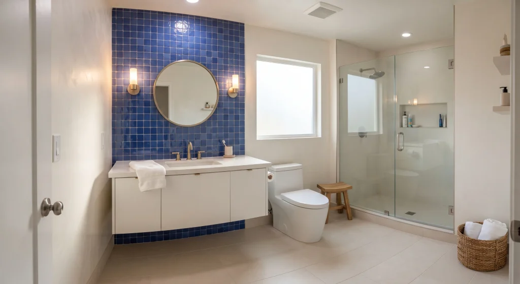
4. Cobalt Blue Mosaic
A cobalt blue accent can turn an ordinary bathroom wall into a striking focal point without covering every surface in a dramatic shade. This saturated color works particularly well behind a vanity, inside a shower niche, or across a compact feature wall where its intensity reads as a deliberate design choice rather than an overwhelming one. Pair it with white porcelain and simple fixtures so the tile remains the star of the room.
Glossy mosaic pieces can catch natural light and create subtle movement across the surface throughout the day, while matte versions offer a quieter, more contemporary finish that some homeowners prefer for a calmer overall feel. I’ve seen this work well in smaller bathrooms because a concentrated burst of color feels intentional rather than overwhelming, especially compared to covering an entire small room in the same saturated shade.
Balance cobalt tile with calm surrounding materials so the room feels sophisticated rather than busy. White grout can sharpen the individual mosaic shapes and make the pattern more legible from across the room, while pale stone, warm oak, or soft beige accessories can soften the intensity of the blue and keep it from feeling cold.
If you have limited natural light, use layered vanity lighting to keep the saturated surface clear and vibrant — cobalt can look almost black in dim, single-source lighting, which is a common mistake I’ve seen in otherwise well-planned bathrooms that only budgeted for one overhead fixture. Brass fixtures can add warmth to the space, but chrome works beautifully too for a cooler, more modern look, depending on the rest of your fixtures. For a practical update, keep the bold tile in one clearly defined zone and repeat small blue accents through towels or ceramics instead of introducing another competing pattern or color elsewhere in the room.
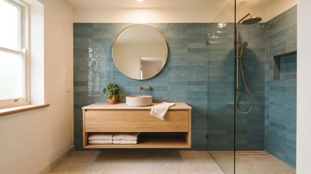
5. Teal Tile Walls
Teal bathroom tiles bring more depth than a pale blue while still keeping the room fresh and inviting. This blue-green shade works especially well when you want something more distinctive than traditional white or navy, without going as bold as a true jewel-tone blue. Use teal across a shower wall, behind a floating vanity, or inside a recessed niche to create a defined feature that doesn’t require retiling the entire room.
Matte tile gives the color a grounded, contemporary look, while glazed surfaces make it brighter and more reflective — the choice largely comes down to whether you want the wall to feel like a quiet backdrop or an active focal point. The key is to let teal provide the personality while keeping countertops, fixtures, and larger surfaces relatively simple, so the color doesn’t have to compete with too many other decisions in the room.
To make teal feel modern rather than dated — a real concern with this shade, given its strong association with 1980s and 90s bathroom design — combine it with warm neutrals and clean-lined fixtures. Cream stone, light oak, brushed brass, and soft white towels can balance the cooler blue-green tone beautifully and pull it firmly into a current, updated look rather than a retro one.
A simple rectangular tile keeps the room streamlined, while small-format tiles can add texture around a shower or backsplash for more visual interest. If the bathroom is compact, avoid covering every wall with the darkest teal available; instead, create one strong focal area and keep neighboring surfaces light. I’ve noticed this approach makes richer colors feel intentional while preserving an open, comfortable atmosphere, rather than making a small room feel like it’s shrinking around you, which is the most common complaint I hear about darker teal used floor-to-ceiling in a tight space.
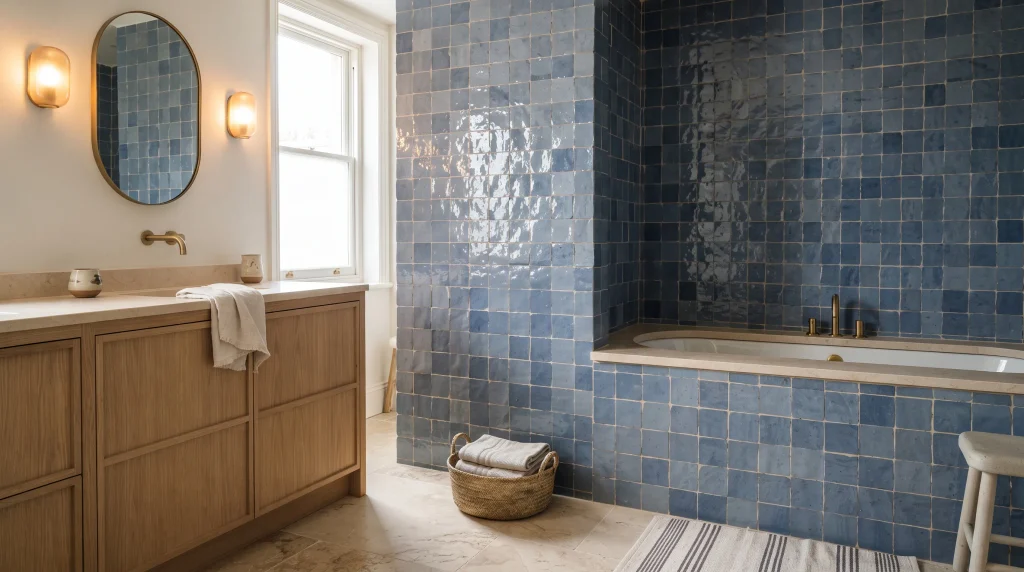
6. Blue Zellige Tile
Zellige-inspired blue tiles add character through their uneven surfaces, soft color variation, and handmade appearance. Instead of looking perfectly uniform, each piece can catch light differently, giving the wall subtle depth throughout the day that a flat, machine-made tile simply can’t replicate. This finish works beautifully behind a vanity, around a bathtub, or across a shower enclosure when you want the bathroom to feel collected and personal rather than showroom-perfect.
Choose a soft powder blue for an airy effect or a deeper blue for more drama, depending on the mood you’re going for. The irregular texture also makes simple fixtures feel more thoughtfully chosen without requiring elaborate decoration, since the tile itself is doing most of the visual work in the room.
Because zellige-style tile already has plenty of visual texture, keep the rest of the room relatively restrained. White or warm ivory grout can create a seamless appearance, while natural stone countertops and light wood introduce gentle contrast that complements the handmade look. Brass fixtures complement richer blue shades particularly well, whereas chrome or nickel keeps the overall look cooler and cleaner if that’s more your style.
Use good task lighting around the vanity so the tile’s surface variations remain visible rather than getting lost in shadow. One practical note from contractors I’ve spoken with: confirm your specific product is rated for wet areas before purchasing, since not all zellige-style tiles are, despite how they’re sometimes marketed. Follow manufacturer waterproofing guidance closely, especially around showers — this is a tile where cutting corners on installation shows up as cracked grout or water intrusion within a year, given how porous some of these handmade-style products can be compared to standard ceramic or porcelain. Budget accordingly, since genuine zellige and high-quality zellige-inspired tile both tend to run noticeably higher than standard subway tile.
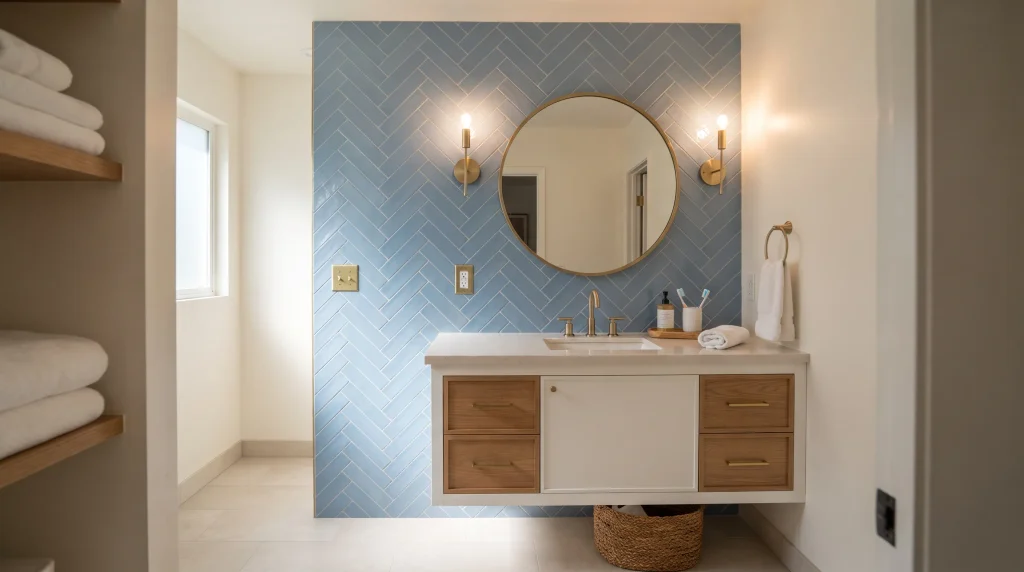
7. Herringbone Blue Tile
A herringbone layout gives blue tile an instant design upgrade by adding movement without introducing another color. The angled pattern naturally draws the eye across the wall, making even a simple ceramic tile feel more custom and intentional than the same tile laid in a standard grid. It works especially well behind a vanity or across a shower wall where the pattern can become a clear focal point of the room.
Soft blue keeps the effect relaxed and easy to live with long-term, while deeper shades create more contrast and a bolder overall statement. If you want a bathroom that feels thoughtfully designed without looking overly complicated, this layout offers an easy way to introduce architectural interest using a tile you might otherwise consider fairly plain.
The trick is to let the pattern have enough breathing room around it. Pair the blue herringbone wall with a simple vanity, uncomplicated countertop, and restrained accessories so the lines remain visually clear rather than getting lost among other busy elements. White grout can emphasize the geometry and make each individual piece pop, while a closely matched grout creates a softer, more continuous surface that reads more like texture than pattern from a distance.
Brass fixtures add warmth to a herringbone wall, although chrome can create a crisp, more contemporary finish depending on your other fixtures. Before installation, check that your tile is suitable for the intended wet area and discuss the layout with your installer — a precise starting point matters more here than with a straight-set pattern, since a misaligned starting row becomes obvious once the pattern reaches a corner, niche, or fixture. I’ve seen herringbone installations look noticeably uneven simply because the installer didn’t plan the layout from the room’s most visible point first, so it’s worth asking your contractor directly how they plan to lay out the pattern before work begins, not after.
8. Brass Fixture Pairing
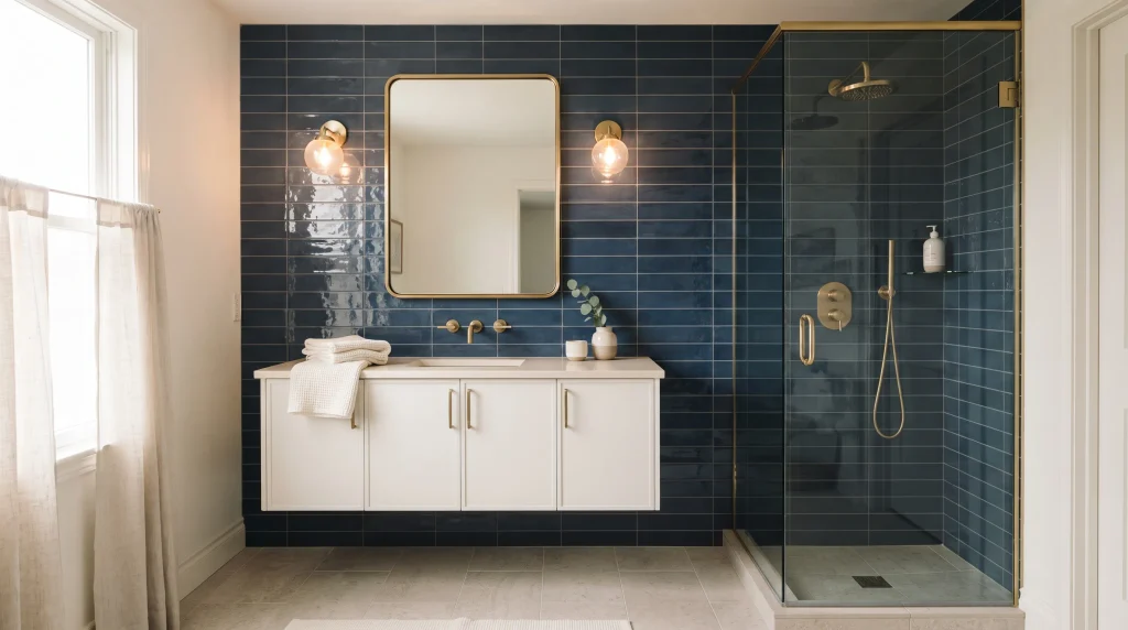
Blue tile and brass fixtures create a naturally luxurious combination because the cool wall color and warm metal balance each other beautifully. You do not need expensive finishes everywhere to achieve the effect — a brass faucet, cabinet pulls, mirror frame, or shower hardware can provide enough warmth to make a blue bathroom feel more polished, even on a modest budget. This pairing works with navy, cobalt, teal, and even softer blue shades, which makes it one of the more flexible ideas on this list.
The strongest result usually comes from repeating the same metal finish in several small places rather than mixing too many metallic tones throughout the room. Mixing chrome, nickel, and brass in the same space tends to look accidental rather than intentional, unless it’s done very deliberately by someone with a strong design eye.
For a cohesive look, let the blue tile remain the dominant color and use brass as an accent. A white or creamy vanity can provide a clean transition between the two finishes, while pale stone countertops keep the overall palette light and prevent the room from feeling too heavy or dark. If your tile has a glossy surface, warm lighting can enhance its depth and make the brass appear softer and more integrated rather than stark against the blue.
I’ve noticed that matching the faucet, handles, and lighting hardware creates a much more intentional result than adding random gold accessories after the fact, like a single gold-framed mirror that doesn’t relate to anything else in the room. Keep decorative pieces minimal, especially when the tile already provides plenty of visual interest on its own. Unlacquered brass costs more upfront — often 20-30% more than a standard finish — but develops a patina over time that many homeowners, myself included, actually prefer to the uniform look of a lacquered or plated finish, since it ages more gracefully and doesn’t show wear as obviously.
9. Small Bathroom Tiles
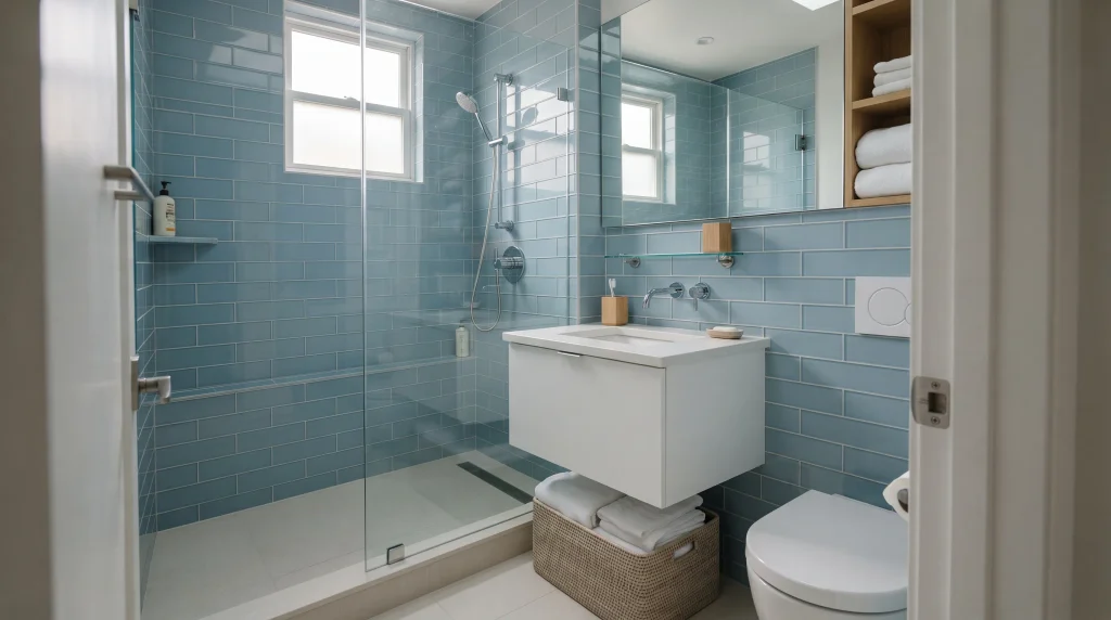
A small bathroom does not have to avoid color to feel spacious and bright. Light or medium blue tiles can actually create a more finished appearance while keeping the room visually open, contrary to the common advice that small rooms need to stay all-white. One effective approach is carrying the same tile from the shower wall toward the vanity, which reduces abrupt transitions and makes the space feel more connected rather than chopped up into separate zones.
A large mirror can reflect the blue surface and available daylight, adding another layer of depth to a room that might otherwise feel cramped. If the room feels tight, choose simple tile shapes and limit competing patterns so the eye can move easily across the space without getting stuck on too many different visual elements at once.
For compact bathrooms, proportion matters as much as color. Large-format tiles can reduce grout lines and create a calmer appearance, since fewer visible seams tend to read as more spacious, while smaller tiles may work better when you want texture around a niche or backsplash specifically. A floating vanity exposes more floor area and can make the room feel less crowded — in my experience, this makes a bigger visual difference in a small bathroom than the tile color choice itself, which surprised me the first time I renovated a truly tiny powder room.
Frameless glass also keeps the shower visually connected to the rest of the space rather than boxing it off with a frame and curtain. I’ve noticed that keeping fixtures streamlined makes a bigger difference than adding lots of decorative pieces in a small room, where every extra object competes for limited visual space. Finish with white towels, one warm wood accent, and practical storage for a clean, comfortable result that doesn’t feel like it’s trying too hard to compensate for square footage.
10. Blue Floor Tile
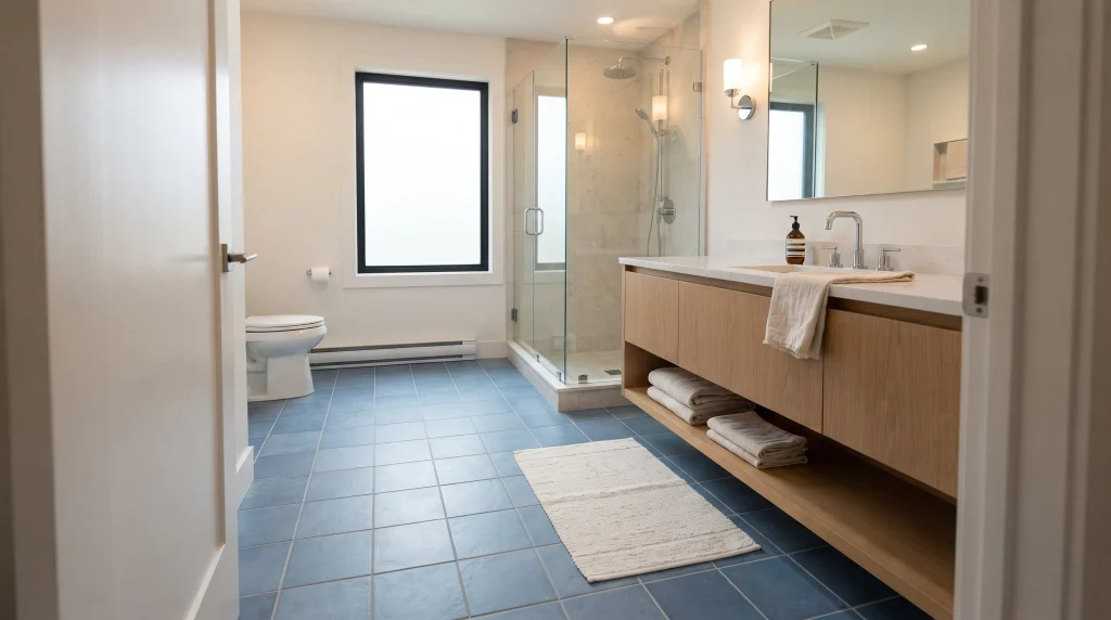
A blue floor can give a bathroom a strong foundation while allowing the walls to stay light and uncluttered. Instead of placing color at eye level, this approach draws attention downward and creates a subtle sense of depth that a lot of bathrooms are missing when every surface is treated the same way. Medium blue works particularly well with white walls, cream cabinetry, pale oak, and soft gray stone.
Porcelain is a practical choice for many bathroom floors because it is durable and available in finishes designed for wet areas, including textured options that improve slip resistance without looking obviously “safety-focused.” If the room already has several visual features — a statement mirror, an interesting vanity, patterned wallpaper — a simple blue floor tile can provide personality without making the overall design feel crowded or competitive.
For a more decorative effect, consider a small-format pattern, geometric layout, or blue-and-white motif on the floor, but keep the walls relatively quiet if you go this route. In compact bathrooms, larger floor tiles can reduce the number of grout lines and create a cleaner visual field, while smaller tiles may provide additional texture and pattern that reads well in a bigger space.
Always check slip-resistance ratings before choosing a product — specifically the DCOF (dynamic coefficient of friction) rating, which most reputable manufacturers list on the spec sheet. It’s worth asking your supplier directly if this isn’t listed, since it isn’t always prominently displayed in showroom samples. A floating vanity can also help expose more of the floor, making the blue surface feel like a deliberate design feature rather than something that’s mostly hidden under cabinetry. Finish with simple textiles, like a plain bath mat rather than a patterned one, so the flooring remains the room’s visual anchor without competing elements pulling focus away from it.
11. Blue Shower Tile
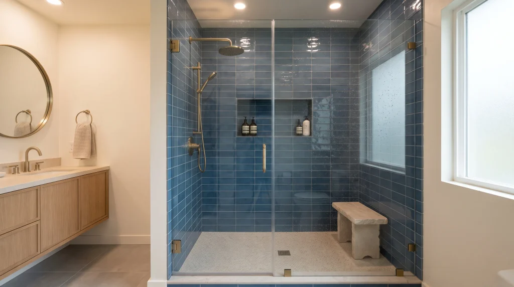
A blue-tiled shower can become the bathroom’s strongest visual feature while keeping the rest of the space calm and neutral. Covering the shower walls in a consistent shade creates a defined zone that feels more architectural than a basic tiled enclosure, especially when the tile runs floor to ceiling rather than stopping partway up the wall. Glass doors are especially useful because they keep the blue surface visible from the rest of the bathroom rather than hiding it behind a curtain.
For a cohesive finish, carry the same tile into a recessed niche or small bench area if your layout includes one. This creates continuity and makes practical shower features feel integrated rather than added as an afterthought, which is a common complaint with showers where the niche was clearly tiled separately from the main walls.
Choose the tile finish according to the atmosphere you want and the maintenance level you can comfortably manage. Glossy blue surfaces reflect light and can make the shower feel brighter, while matte finishes provide a softer, more contemporary appearance but can show water spots and soap scum more readily if not cleaned regularly. Pair deeper blues with warm brass or brushed nickel fixtures, and use lighter stone or porcelain flooring to maintain contrast between the shower and the rest of the room.
Proper waterproofing behind the tile is essential, so this is genuinely one area where I’d recommend against DIY unless you have direct experience with shower pan systems and waterproofing membranes. A failed waterproofing job can mean tearing out the whole shower within a couple of years, which costs far more than paying a professional to do it correctly the first time — I learned this secondhand from a friend’s renovation that had to be redone after just eighteen months. A well-planned shower layout should also account for grout lines, niches, fixtures, and drainage before installation begins, not adjusted on the fly once tiling has started.
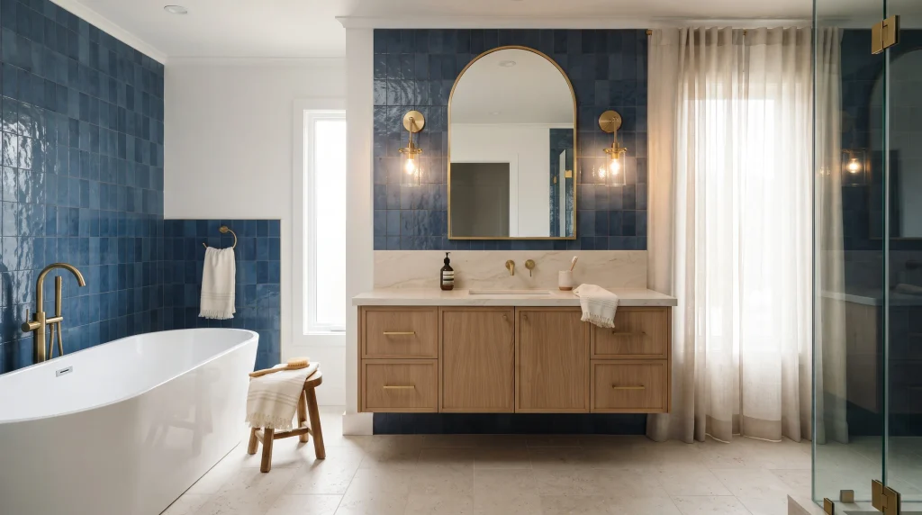
12. Blue and Gold
Deep blue and warm gold create a dramatic combination that can make an ordinary bathroom feel noticeably more luxurious. The secret is contrast: rich blue provides depth, while gold introduces warmth and visual sparkle that catches the eye in a way flat colors alone don’t. Use the darker tile behind the vanity, around the bathtub, or across a shower wall, then repeat gold through the faucet, cabinet hardware, mirror frame, or lighting fixtures.
This gives the room a deliberate focal point without requiring ornate decoration to feel special. Cream or white surfaces can soften the contrast and keep the overall palette balanced, especially when the bathroom has limited natural light and needs some brightness to offset the darker tones.
To prevent the combination from feeling overly formal, mix glamorous details with simple shapes and natural textures. A streamlined vanity, pale stone countertop, and soft cotton towels can make gold accents feel modern rather than traditional or overly ornate, which is the direction most homeowners are actually going for with this pairing today.
Choose one gold finish and repeat it consistently instead of combining several metallic tones — this is the single most common mistake I see in otherwise well-designed blue-and-gold bathrooms, where a polished gold faucet sits next to a brushed brass mirror and neither reads as intentional. Warm layered lighting can also enhance the richness of deep blue tile while making the metal details glow softly rather than looking harsh or overly reflective under a single bright overhead light. In my experience, restraint is what makes this palette feel expensive: a few carefully chosen gold elements usually look more sophisticated than covering every surface with metallic accents, which can tip the room from luxurious into gaudy fairly quickly if you’re not careful about where you stop.
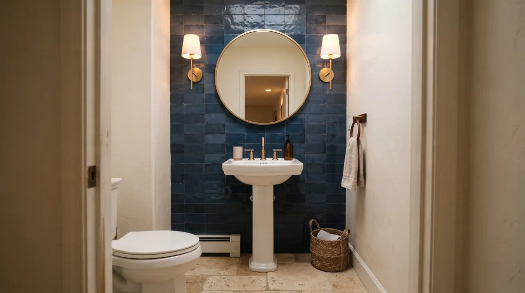
13. Powder Room Accent
A powder room is one of the easiest places to experiment with a stronger tile color because the space is usually compact and used for shorter periods, which lowers both the cost and the risk of a bold choice. A blue accent wall behind the sink can create an immediate focal point without overwhelming the entire home, since guests only see this one small room rather than living with the color daily. Deep navy, cobalt, or teal can all work beautifully here, especially when paired with a simple white basin and a well-chosen mirror.
Because there is less furniture to compete with the wall, the tile becomes a decorative feature on its own, almost like a piece of art rather than just a surface material. The result can feel polished, memorable, and surprisingly luxurious for what’s usually one of the smaller and less expensive rooms to renovate in a house.
Use the remaining surfaces to support the statement wall rather than compete with it. A round mirror can soften strong tile lines and add a bit of visual relief, while warm sconces add flattering light around the sink that also makes the tile color read more accurately than an overhead fixture alone. Brass hardware works especially well with deeper blue shades, but polished chrome can create a sharper, more contemporary effect if that suits your home better.
If the powder room has no window, choose lighting carefully so the tile does not appear dull or overly dark under artificial light alone — this is worth testing with a sample before committing to a full wall. I’ve noticed that small rooms often benefit from one confident design decision rather than several timid ones. Because a powder room is small, the tile, mirror, and lighting do most of the visual work, and I’ve found this is the lowest-risk place in a house to try a bold tile you’re not entirely sure about, since the cost and commitment are both limited compared to a full bathroom.
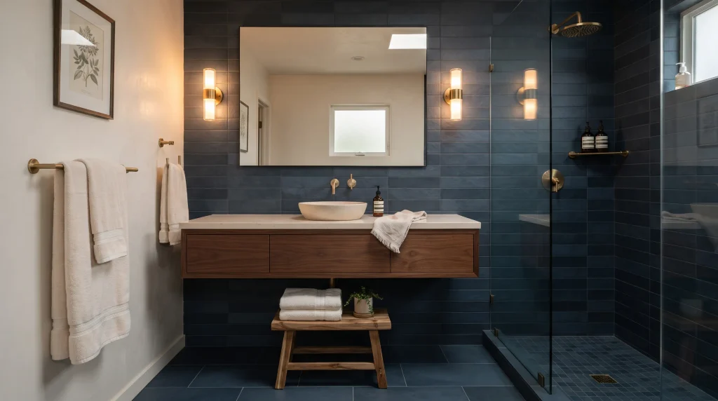
14. Moody Dark Blue
Dark blue tiles can give a bathroom a moody character that feels sophisticated rather than gloomy when the palette is balanced carefully. Deep navy and midnight blue work particularly well in larger bathrooms or spaces with strong layered lighting, since a dark, poorly lit room can quickly feel more like a cave than a retreat. Instead of covering every surface, consider using the darker tile behind the vanity or across the shower area while keeping other surfaces lighter.
Light countertops, mirrors, and towels then provide contrast that keeps the room from feeling visually closed in, even with a substantial amount of dark tile on the walls. The combination creates depth and can make ordinary fixtures appear more refined without relying on excessive decoration or elaborate architectural details to do the heavy lifting.
Lighting is especially important when working with a darker palette. Combine overhead illumination with wall sconces or vanity lighting so the tile remains dimensional throughout the day rather than reading as a flat, dark block.
Warm bulbs, generally in the 2700K–3000K range, can make navy surfaces feel inviting, while cooler bulbs create a cleaner, more modern appearance that some homeowners prefer for this look.
Natural wood is another useful balancing element because its warmth prevents the blue from feeling too cold or sterile, which is a real risk with very dark, glossy tile under the wrong lighting.
If you choose matte tile, expect a softer, quieter finish that hides water spots reasonably well; glossy tile will reflect more light and create a slightly more dramatic effect but will also show fingerprints and water marks more readily near sinks and shower glass.
Keep accessories simple so the rich wall color remains the main feature of the room rather than getting buried under competing decor.
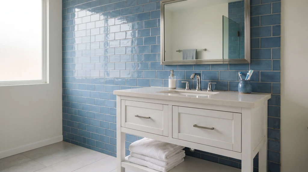
15. Ceramic Blue Tile
Blue ceramic tile is a practical way to introduce color while keeping the bathroom clean and familiar. Its smooth surface works beautifully with white cabinetry because the contrast makes both finishes look sharper and more deliberate. Choose rectangular tiles for a classic appearance, square tiles for a more traditional feel, or smaller formats when you want extra texture around the vanity or shower without a big commitment.
A medium blue shade can provide enough personality without becoming overpowering, which makes ceramic a good entry point if you’re nervous about committing to a bolder color elsewhere in the list. The finish also pairs easily with chrome, nickel, brass, and black fixtures, making it flexible when you want to update other elements of the room later without having to reconsider the tile.
To create a polished result, let the ceramic tile establish the color and keep surrounding materials simple. A white vanity, pale quartz countertop, and light flooring can make medium blue feel bright rather than heavy, especially in a room without much natural light. Glossy ceramic surfaces reflect light, which can be useful in bathrooms with limited natural illumination, similar to the glossy subway tile approach but with more flexibility in tile shape and layout.
If you prefer a quieter appearance, choose a softer sheen or matte ceramic finish instead, which tends to feel a bit more grown-up and less like a builder-grade bathroom. Ceramic is also one of the more affordable ways to get this look — typically $2–$6 per square foot for the material itself, before installation costs, which makes it one of the most budget-friendly options on this entire list. I’ve noticed that repeating the blue in one small accessory, such as a towel or ceramic container, can connect the room without making the color feel repetitive. Keep grout lines neat and consistently spaced for a crisp finished look, since ceramic’s regular shape makes any inconsistency in the grout lines much more noticeable than it would be with a more irregular tile.
16. Porcelain Blue Tile
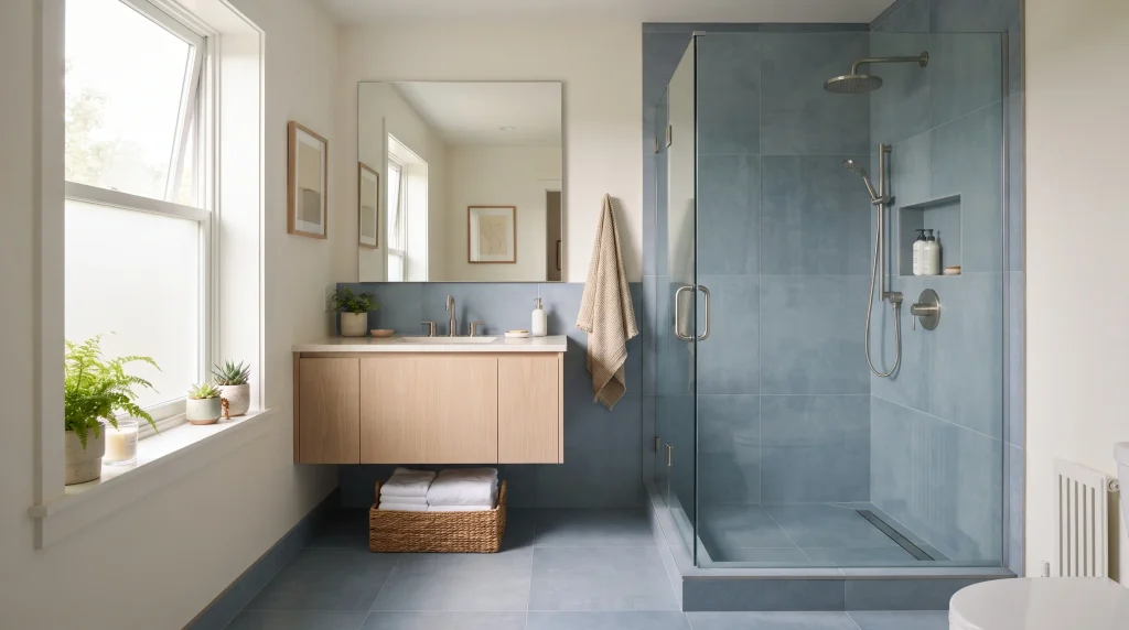
Blue porcelain tile can create a sleek, modern bathroom while offering a practical surface for areas that receive regular moisture and daily use. Large-format pieces can give the room a cleaner appearance because fewer grout lines interrupt the visual flow, which is part of why porcelain has become the go-to choice for a lot of contemporary bathroom renovations over the past several years. A medium or muted blue works particularly well when you want color without an overly dramatic effect.
Use the tile across the shower walls, floor, or both for a coordinated finish, then balance it with white fixtures and pale stone elsewhere in the room. The result feels streamlined, fresh, and easy to style with simple accessories, without requiring a lot of ongoing decorating decisions to keep it looking finished.
When choosing porcelain for a bathroom, pay attention to the product specifications rather than selecting purely by appearance in the showroom, where lighting can make tiles look different than they will at home.
Floor tiles should have an appropriate slip resistance rating for the intended application — this matters more in a shower or wet floor area than it does on a dry vanity wall. Shower installations require proper waterproofing and professional preparation, and codes for this vary by region, so it’s worth a quick call to your municipal building department if you’re unsure what’s required where you live.
Matte porcelain can create a softer, contemporary look, whereas a polished surface reflects more light and feels more refined but can also be more slippery when wet, which is worth considering for a shower floor specifically. Keep the surrounding finishes simple so the blue remains visually consistent throughout the space rather than getting broken up by too many competing materials. In my experience, large-format porcelain works especially well when the goal is a low-clutter bathroom, because the uninterrupted surfaces make the entire room feel calmer and more spacious, even when the actual square footage hasn’t changed at all.
Tile Selection Guide
Once you’ve settled on a shade, a handful of practical factors will make or break how it actually looks in your specific bathroom, as opposed to how it looked on a screen or in a showroom display.
Lighting matters more than almost anything else on this list. North-facing bathrooms with little natural light tend to make blue tile look cooler and darker than it appeared in the showroom, sometimes dramatically so.
Bring a sample tile home and view it at different times of day — morning, midday, and evening under your artificial lighting — before committing to a full order. I’ve seen homeowners fall in love with a tile at the showroom only to find it reads almost gray in their windowless bathroom once installed, which is a frustrating and expensive mistake to make.
Room size should guide how much of the color you use. Darker blues like navy and cobalt work best as an accent in small rooms rather than a full wraparound, unless the room has strong artificial lighting to compensate for how much light a dark surface absorbs. In larger, well-lit bathrooms, you have much more freedom to go bold across a bigger surface area.
Grout color changes the entire character of a tile installation. White grout sharpens the tile’s edges and pattern, making individual pieces more visually distinct, which works well for herringbone, mosaic, or zellige-style tile where you want the pattern to read clearly. Grout closely matched to the tile creates a softer, more continuous surface that reads more like a single block of color, which many homeowners prefer for large-format tile or subway tile in a calmer bathroom.
Sheen affects both the mood of the room and its practicality. Glossy tile reflects more light, which is genuinely useful in dim rooms, but it also shows water spots and fingerprints more readily. Matte tile hides water spots better, which matters in busy households with kids or frequent guests, but it can look slightly duller in a room without much natural light. Weigh both factors against your specific bathroom before deciding.
Blue Color Pairings
The metal finishes, wood tones, and accent colors you pair with blue tile change the entire feel of the room, even when the tile itself stays exactly the same. Here’s how the most common pairings tend to read in practice, based on both my own renovations and patterns I’ve seen repeated across dozens of bathroom projects.
| Pairing | Best For | Notes |
|---|---|---|
| Blue + white | Coastal, bright, timeless spaces | The most forgiving and universally appealing combination; works in almost any home style and rarely feels dated |
| Blue + brass/gold | Warm, luxurious, traditional-leaning spaces | Adds visible warmth to cooler blue tones; works especially well with navy, cobalt, and teal |
| Blue + black | Modern, high-contrast, dramatic spaces | Best in bathrooms with strong natural or artificial light, since the contrast can feel heavy in a dim room |
| Blue + natural wood | Scandinavian, warm-minimalist spaces | Softens blue’s coolness without adding an obvious metallic accent; a good fit for pale and medium blue shades |
If you’re unsure which pairing fits your home, look at what’s already fixed and hard to change — your existing flooring, cabinetry, or countertop material — and choose the pairing that complements those elements rather than starting from the tile alone. This is generally easier and less expensive than trying to change everything at once around a tile you’ve already fallen in love with.
Conclusion
The right blue tile can completely change the mood of a bathroom, making it feel brighter, calmer, richer, or more luxurious without requiring a complete redesign. These blue tile bathroom ideas show how different shades, patterns, materials, and warm accents can work in both large and small spaces, and how much of the final result comes down to details like lighting, grout color, and where exactly you place the color rather than the tile choice alone.
Start with one feature you genuinely love, then build the rest of the room around it with balanced colors and practical finishes rather than trying to incorporate every idea on this list at once. I’ve seen how thoughtful tile choices can transform an ordinary space into one that feels truly personal, often for less money than homeowners initially expect once they focus the budget on one strong feature instead of spreading it thin across the whole room.
If you’re planning your own project, get a sample tile home before you commit, ask your installer directly about waterproofing specifics for wet areas, and don’t be afraid to keep the boldest color in one focused zone rather than everywhere. Save this post on Pinterest, try your favorite idea, and share it with someone planning a bathroom refresh.


One Comment