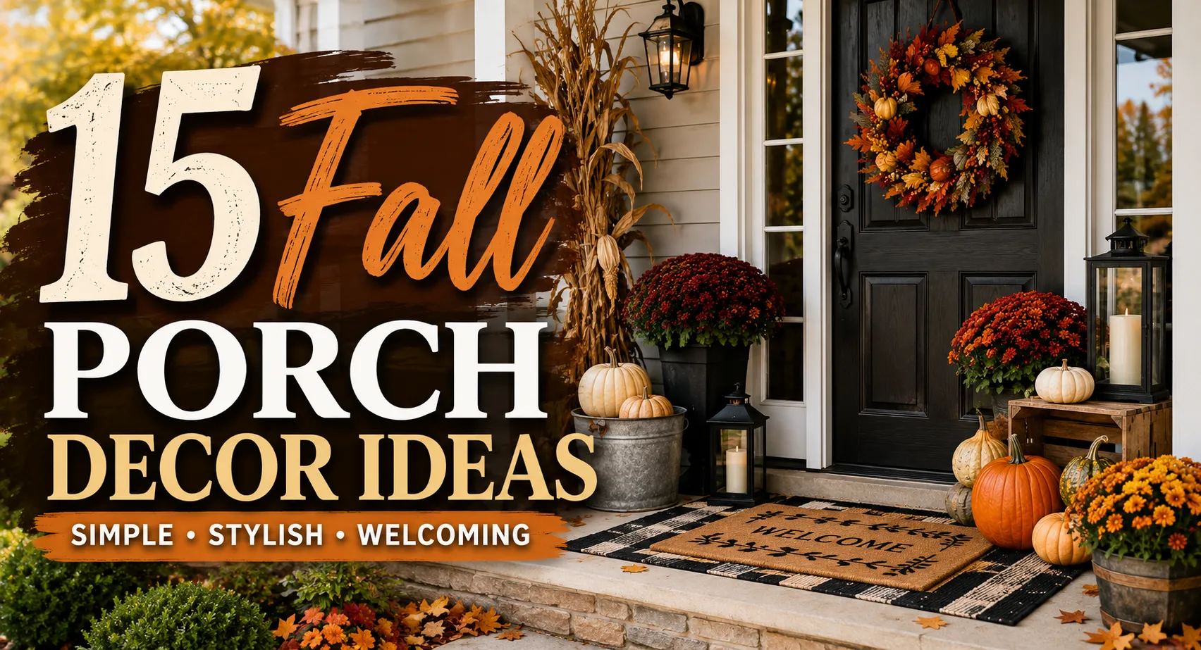
15 Fall Porch Decor Ideas Built for Real Weather, Not Just Photos
Fall porch decorating is easy in theory: add a few pumpkins, hang a wreath, put out some mums, and call it done. The trouble starts when the porch has to deal with rain, wind, direct sun, muddy shoes, and everyday foot traffic. A decoration that looks perfect when you first put it out can fade, tip over, trap water, or become an obstacle before the season is even over.
The best fall porch decor balances the seasonal look with the realities of an outdoor entrance. Pumpkin size matters. So does the material of a doormat, the placement of a planter, the contrast between a wreath and the front door, and how much space you actually have to walk through. A wide covered porch gives you very different options from a narrow entry exposed to the weather.
These 15 ideas focus on those details—not just what looks good in a photograph. You’ll get practical ways to style pumpkins, mums, wreaths, lanterns, seating, baskets, and small porches, along with material considerations, approximate costs, weather concerns, and mistakes worth avoiding.
1. Build pumpkin displays vertically, not in a row
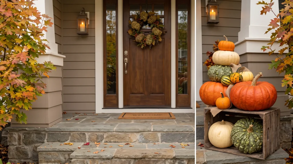
A straight line of pumpkins along the step edge reads like a grocery store display. Height is what makes it look designed.
Anchor with two or three pumpkins in the 12–18 lb range (typically a low-teens to mid-teens dollar price at grocery or garden stores in October, though this varies by region and retailer), then fill in with smaller sugar pumpkins or gourds between them. Mix a couple of finishes — smooth orange next to a warty “knucklehead” variety or a pale “Casper” white — so the display has texture variation without extra color.
By exterior style: on a farmhouse or rustic home, pair orange and heirloom pumpkins with a wooden crate or a scattering of dried corn husks underneath. On a modern or minimalist exterior, keep the palette mostly white and cream, and use a single orange variety as the only accent color so the display doesn’t compete with clean architectural lines. On a brick or stone exterior, warm terracotta and burnt-orange pumpkins tend to blend into the facade — cream and white pumpkins create more visible contrast.
Placement: build the arrangement so the center of each step stays clear, with pumpkins pushed toward the edges. This keeps the stairs fully usable and pulls the eye toward the door rather than down at the ground.
Durability note: thin-skinned decorative pumpkins soften faster in warm, humid, or wet conditions than in cool, dry weather. If you need the display to last six weeks or more, use faux pumpkins for the main arrangement and save real ones for the final stretch before Halloween. A rotting pumpkin also tends to attract pests, so check the base of each one weekly once temperatures start swinging.
On a porch under about 40 square feet, five or six pumpkins can already be enough to create a full display without crowding the walking path — more than that and it’s worth checking the space is still comfortable to walk through.
2. Layer a doormat over a full-size outdoor rug
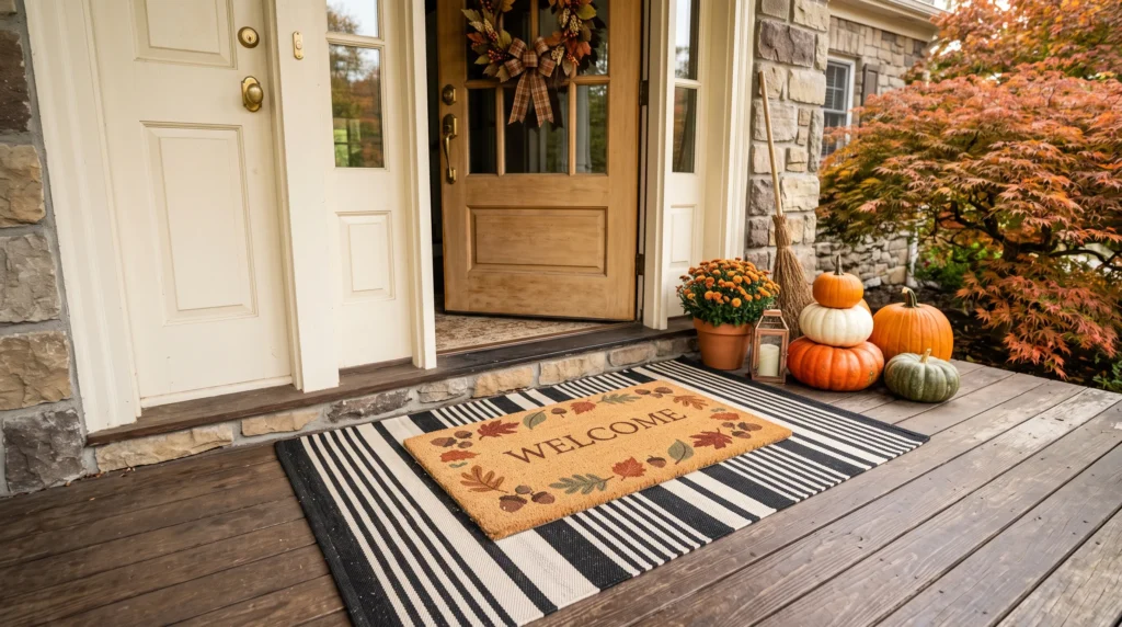
This is one of the easiest, lowest-cost changes on the list, and it can noticeably change how the entrance feels. Budget-wise, most layered doormat setups fall in an approximate $40–70 range total, depending on rug size and material, and take about ten minutes.
Put down a larger weatherproof rug first (a striped or jute-look 3’x5′ works on most porches) as a frame, then center a smaller seasonal mat on top. The two layers don’t need to match exactly — they just need to share one color or visual element. A black-and-cream striped base, for example, can support almost any top mat with a muted fall palette, while a natural woven jute base pairs with nearly anything.
The mistake almost everyone makes: choosing two mats that are both busy. When both layers have strong graphics or lettering, the entrance can look visually noisy rather than layered. Pick one plain, textured base and let only the top layer carry a pattern or message — that contrast is what makes the layering read as intentional instead of accidental.
Material notes: coir (coconut fiber) mats are the most durable for the top layer since they shed water and resist mildew, but they’re rougher underfoot. Printed polypropylene mats are softer and cheaper but fade faster in direct sun — if your porch gets afternoon light, expect to replace a printed top mat every season or two.
Renters: this is worth doing first, since it changes the whole entrance without touching the door, railing, or siding — nothing here needs permission from a landlord.
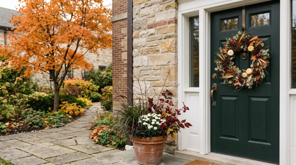
3. Choose a wreath based on your door color, not just the season
A wreath loses most of its effect if it’s the same tone as the door behind it. Rust, orange, and deep red pop against black, navy, or forest-green doors. Against a light or white door, you need darker foliage, burgundy accents, or deeper greenery to get contrast at all — bright orange on white can wash out from the street.
By style: a traditional fall wreath combines eucalyptus or autumn leaves with berries, pinecones, wheat, and a few small pumpkins. A farmhouse-style wreath leans on dried grasses, cotton stems, burlap ribbon, and muted orange leaves for a softer, more textured look. On a modern exterior, a simpler wreath — just eucalyptus or neutral dried foliage, without pumpkins or bright color — tends to look more considered than one packed with every seasonal element available.
Proportion: the wreath should be noticeable from the walkway but shouldn’t nearly cover the door. Keep it to roughly a third of the door’s width at most — beyond that it starts covering glass panels or decorative hardware rather than framing the door. If your door already has strong architectural detail (transom windows, paneling, a statement knocker), a simpler wreath usually looks more deliberate than an elaborate one.
Budget range: a full 22–24″ mixed wreath (eucalyptus, berries, small pumpkins) is typically somewhere in the $35–90 range, with natural or dried-element wreaths generally costing more and varying further by retailer. Faux holds up far better through rain than dried florals, which tend to shed after a few wet weeks — if your porch is uncovered, faux is close to essential.
Tying it together: repeat one element from the wreath elsewhere on the porch — the same berry color in a planter, or the same dried grass in a basket. That single repetition is often what makes an entrance read as “planned” rather than “decorated piece by piece.”
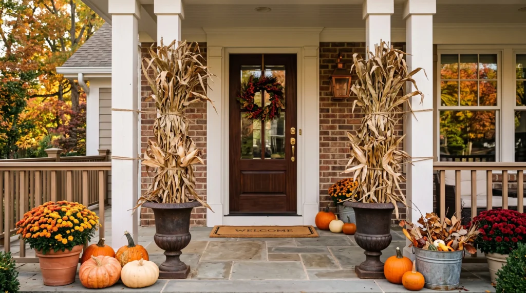
4. Use cornstalks for height, but secure them properly
Cornstalks solve a problem pumpkins and wreaths can’t: everything else on a porch sits low. A bundle on each side of the door pulls the eye upward and gives a tall, narrow entry more presence than ground-level decor alone can provide.
Tie bundles to porch posts or railings with wire, not just leaned against the wall — an unsecured 6-foot bundle in strong wind becomes a hazard, not decor. If your porch is exposed rather than covered, weight the base in a heavy urn or bucket filled with sand or gravel so a gust can’t tip the whole thing over onto the steps.
Pairing: the natural tan of cornstalks works well with orange pumpkins, galvanized metal buckets, wooden crates, brown woven baskets, and warm-toned mums for a traditional harvest look. If that combination reads as too busy for your taste, balance the cornstalks with white pumpkins and a single black planter for something more restrained and modern.
Why height matters here specifically: low pumpkin arrangements fill the bottom of a porch but leave everything above knee height empty. Cornstalks are one of the few decor elements that fix that without needing a ladder or permanent installation — which is especially useful on a tall or large entry where small decorations tend to disappear against the scale of the architecture.
Small porch alternative: a single tall dried-grass bundle (pampas or wheat, typically in the $15–25 range) in a narrow planter gets the same vertical effect at a third of the footprint, without the wind risk of full cornstalk bundles.
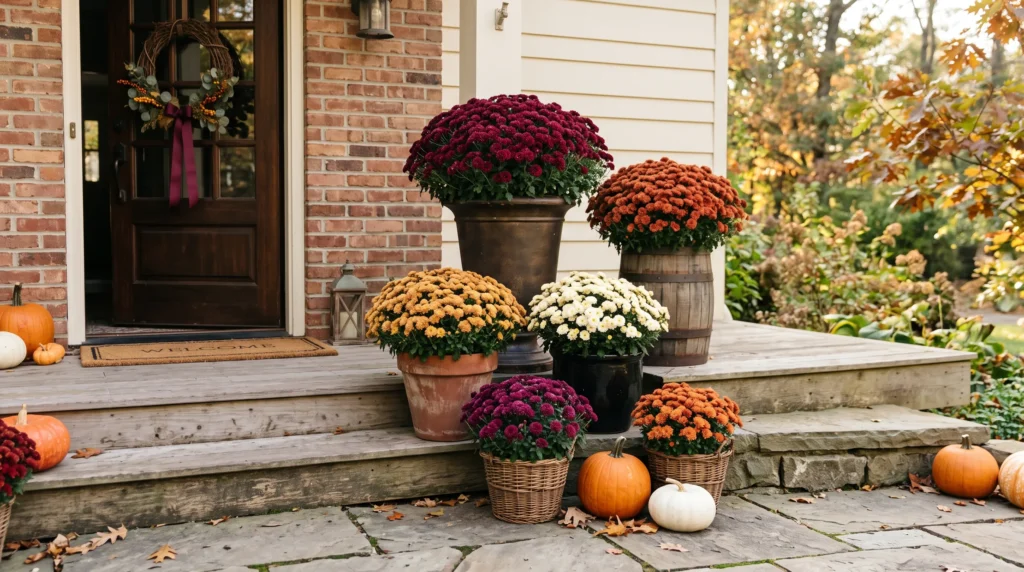
5. Layer mums by container height, not just color
Instead of a row of same-size pots, put the tallest planter toward the back and shorter pots or baskets in front — it reads as one arrangement instead of scattered plants. A matched pair of large planters flanking the door creates symmetry; an uneven grouping of different heights feels more relaxed and gathered.
On color: golden and orange read as classic harvest and work with nearly any exterior. Burgundy and rust look richer, especially under evening porch light. Cream or white mums are worth considering if you’ve already got orange pumpkins elsewhere and don’t want the whole porch to tip into one-note bright orange — they also photograph better against darker siding or brick.
Container choice matters as much as the flowers: a simple black planter makes even bright mums feel more contemporary. Terracotta, weathered wood, woven baskets, or galvanized buckets push the same flowers toward a farmhouse or rustic feel. The container is often doing more visual work than the mums themselves.
One thing worth checking before you buy: mums need actual drainage, not just a decorative outer basket. If you’re using a woven basket as a cover pot, make sure the inner nursery pot still has drainage holes and isn’t sitting in trapped water — that’s the single most common way mums die within two weeks of a fall porch display. On a narrow entryway, choose taller, narrower containers rather than wide pots that eat into the walking area.
Repeat, don’t scatter: if you use burgundy mums, bring that same shade into a wreath ribbon, a cushion, or a couple of pumpkins elsewhere on the porch. Repeating one color across separate decorations is a small trick that makes everything look like it was chosen together rather than assembled piece by piece.
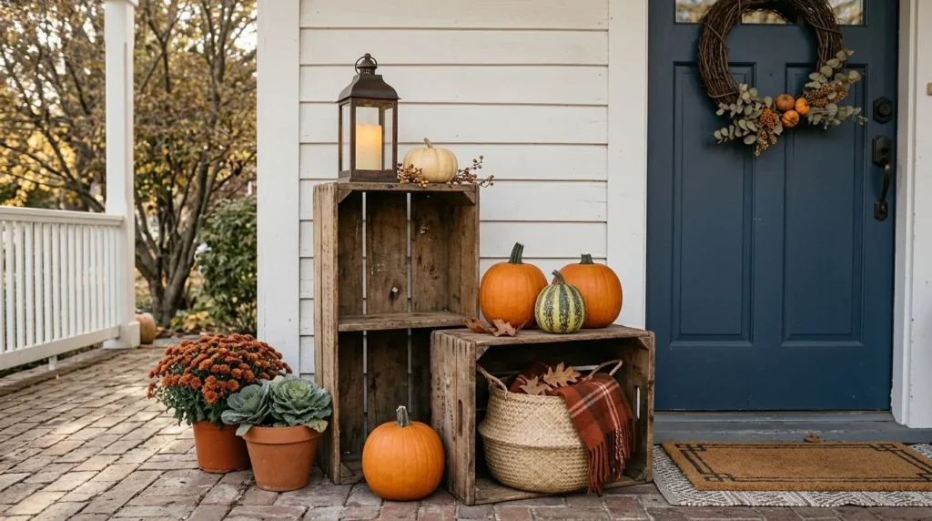
6. Turn crates into display shelves, not just containers
A single upright crate near the door, raising a lantern or small pumpkin to eye level, does more visual work than three crates full of the same stuff on the ground. Use a second, lower crate for the bigger pumpkins or a basket — the difference in height is what gives the arrangement depth instead of everything sitting flat at the same level.
By style: weathered or reclaimed wood crates pair naturally with orange pumpkins, dried corn, burlap, and galvanized metal for a rustic look. Unfinished or lightly stained crates work better with cream pumpkins and simple greenery for a cleaner farmhouse feel. On a modern porch, use fewer crates — one or two at most — with a clean, simple finish rather than obviously distressed wood.
Unfinished pine crates are typically in the $10–20 range at craft stores; if you want a faster route, an old wooden wine crate free from a local liquor store works identically and looks more genuinely aged than most store-bought “farmhouse” crates.
Keep the tallest crate against the wall or railing — not in the walking path on steps, where the added height becomes a trip risk in low evening light. This idea is also a good option if you already own seasonal decorations in different sizes: changing the height of what you already have often makes an arrangement look fuller without buying anything new.
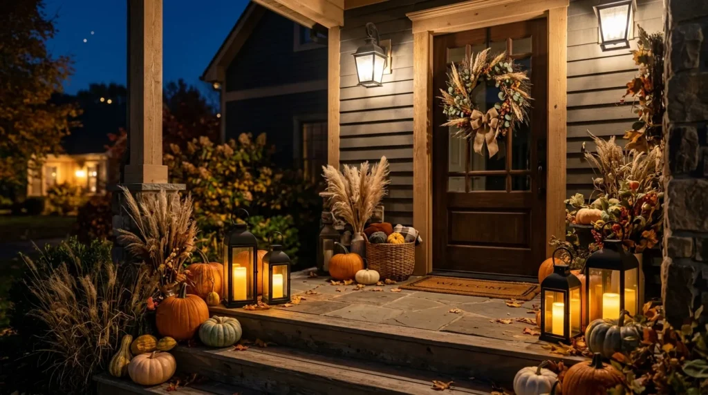
7. Light the porch for after dark, not just for daytime photos
A porch that looks great at 2pm often disappears completely by 7pm — and most trick-or-treaters and evening guests only see it in the dark. Lighting is the one element on this list that changes how the whole display reads depending on the time of day.
Use battery-powered LED lanterns, not open flame, especially near dried cornstalks or grasses — this isn’t a minor caution, dried plant material near an open flame outdoors is a real fire risk. Warm-white LEDs (around 2700K) read as candlelight; anything labeled “daylight” or “cool white” will look sterile and out of place next to pumpkins and natural materials.
Finish and placement: black metal lanterns create strong contrast against cream pumpkins and light-colored siding. Wood or bronze finishes feel warmer and more traditional. On a softer modern porch, simple lanterns with clean frames give the same glow without adding another decorative pattern to compete with everything else.
Group lanterns in twos or threes at slightly different heights rather than spacing single lanterns evenly — even spacing reads as a hallway, not a display. If the rest of the porch is already busy with pumpkins, a wreath, and mums, treat the lanterns as a supporting layer rather than another focal point; their job is warmth and depth, not competing for attention.
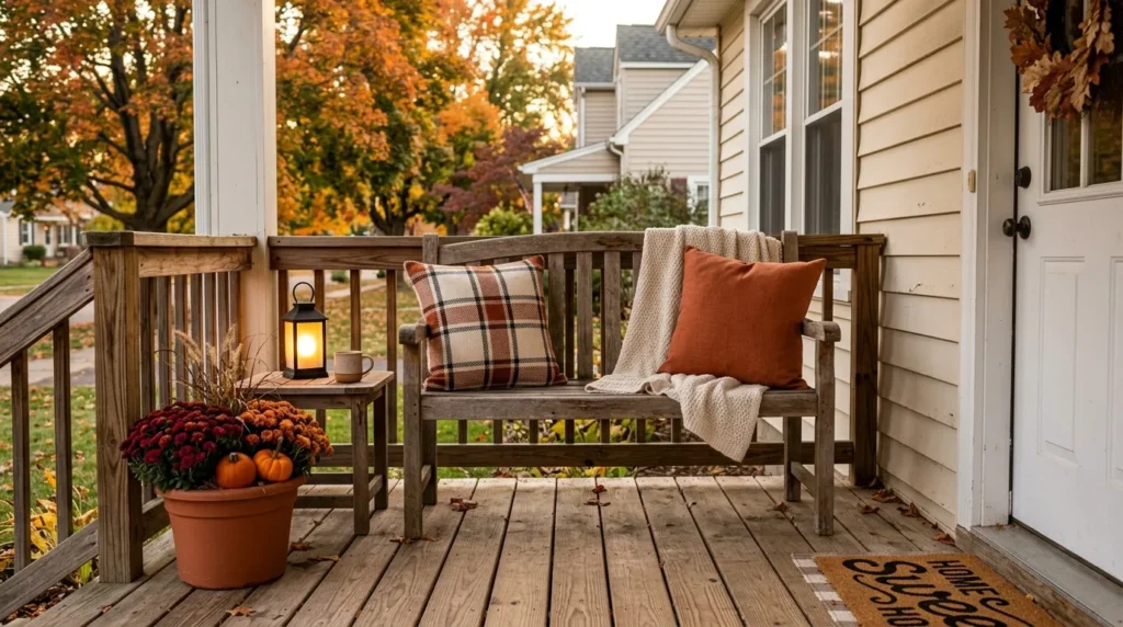
8. Add outdoor-rated textiles if you have seating
If there’s room for a bench or chair, a plaid cushion or throw does more to make a porch feel “finished” than another round of pumpkins — seasonal textiles turn a porch from a decorated space into something that actually feels like an extension of the home.
Buy outdoor-rated (not just outdoor-styled) fabric — regular cushions left out through fall rain will mildew within a couple of weeks. Stick to one strong pattern per seating area; if the cushion is a bold plaid, keep any additional pillow solid rather than layering two competing patterns.
Color combinations: cream and black feels classic and works with almost any pumpkin palette. Rust and beige leans warmer and pairs naturally with cornstalks and wood tones. Deep green and tan reads a little more traditional. Whichever you choose, repeat one of those colors elsewhere on the porch — a planter, a wreath ribbon, a pumpkin — so the seating doesn’t feel disconnected from the rest of the display.
Leave a comfortable, unobstructed walking path past any bench or chair — narrow porches lose this rule first, and it’s the one that actually matters for safety, not just aesthetics. The U.S. Consumer Product Safety Commission specifically recommends keeping porches, steps, and entryways clear of obstacles, particularly around Halloween foot traffic. On an uncovered porch, bring cushions inside during wet stretches rather than leaving them out — even outdoor-rated fabric holds moisture longer than most people expect if it never gets a chance to dry out.
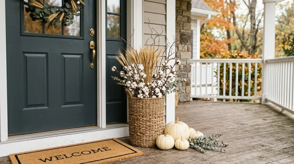
9. Use one woven basket for texture, not a decoration dump
A basket filled with mixed dried wheat, cotton stems, and a few branches adds height and softness without adding another loud color block — useful if you’ve already got orange pumpkins and a wreath and don’t want a third focal point competing with them.
Place the tallest stems toward the center or back of the basket and let shorter pieces spread out naturally around them, rather than arranging everything at the same height. This idea works especially well on a neutral or modern porch, where bright orange decorations elsewhere might feel too intense — a natural woven basket with dried grasses adds texture without adding more color.
Two or three materials, tallest toward the back, is the ceiling. Basket arrangements packed with five or six different dried elements tend to look cluttered rather than “gathered,” because there’s no single material doing the visual work — everything competes for attention at once.
Placement: put the basket beside the door rather than directly in front of it. If the entrance is narrow, a tall, narrow basket is a better fit than a wide floor basket, since it occupies vertical space while leaving the walking area open.
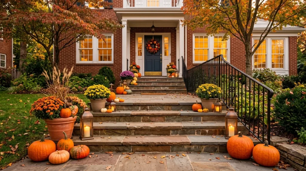
10. Treat multi-step entries as a path, not a shelf
If your home has three or more front steps, don’t decorate every single one — that’s the fastest way to create a tripping hazard and, weirdly, to make the display look busier rather than more finished.
Put the larger elements (planters, lanterns) on the bottom step or ground level, then progressively smaller items as you go up, and leave at least one step entirely clear. Keep everything to the outer edges, away from the center walking line and clear of the handrail. Scale should shrink with the staircase — bulky decorations on every step narrow the usable width of the stairs and create real risk in low light, not just a cluttered look.
A classic combination for taller staircases: orange pumpkins, mums, lanterns, and dried grasses repeated in smaller groupings as the steps rise, so the eye is led naturally toward the door rather than stopping at one oversized display near the bottom. For a more understated version, repeat cream pumpkins with greenery and natural baskets instead — this restrained approach tends to work better if the home’s exterior already has a lot going on architecturally or in color.
This approach is particularly effective on tall front entries, where the repeated shapes create rhythm up the staircase instead of relying on one large arrangement to fill the whole space.
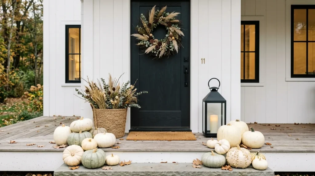
11. Go neutral if your exterior is white, gray, or black-doored
White, cream, and pale green pumpkins read as seasonal without fighting a modern or Scandinavian-style exterior the way bright orange can. The trick with an all-neutral palette is texture, not color — mix smooth and ribbed pumpkins, add one woven basket, and include at least one genuinely dark element (a black lantern, charcoal planter) so the arrangement has an anchor and doesn’t go flat.
A fully neutral display where everything is the same shade of cream tends to photograph as unfinished — the fix is contrast in material and shape, not more pumpkins. Mix smooth pumpkins with ribbed or warty varieties, add natural stems, and bring in at least one woven or textured surface so there’s visual interest even without color variation.
This approach works especially well on porches with white siding, gray stone, black doors, or natural wood exteriors, where a bright orange harvest display can look mismatched against the architecture. On a very small porch, it’s worth concentrating the neutral arrangement around one area — the door and one side — rather than spreading a few neutral pieces thinly across the whole space, which tends to read as sparse rather than minimal.
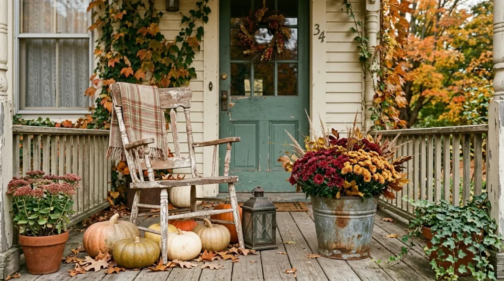
12. Build a vintage look around one or two real pieces, not a matching set
A galvanized bucket, a weathered wood chair, or an old enamel container does more for a “collected over years” feel than five new products labeled “farmhouse.” Buy secondhand where you can — thrift stores and estate sales are the actual source of the aged-metal, worn-wood look that new “vintage-style” products are trying to fake, usually at a fraction of the price of buying it new.
Building the look: a galvanized bucket filled with mums can sit beside a weathered wooden chair, with a few pumpkins filling the space underneath. An old-style lantern reinforces the theme without needing another large decorative piece. Color helps keep everything cohesive — muted orange, faded cream, olive green, rust, brown, and aged metal naturally complement one another, so you don’t need to match finishes exactly, just keep the palette in that same worn, muted family.
Skip stacking too many themed pieces at once; two solid vintage anchors read as authentic, five reads as a set someone bought together, which undercuts the effect you’re going for. The best vintage arrangements actually leave some imperfection visible — slightly uneven textures, aged metal, weathered wood — since perfectly coordinated “vintage-style” pieces tend to look more like a matching set than something gathered over time.
On a modern home, use vintage elements selectively — one old-fashioned chair or galvanized planter against a clean exterior creates contrast without pushing the whole porch into a fully traditional look.
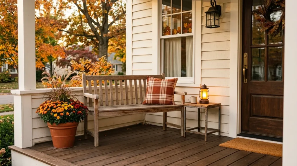
13. Make seating functional before you make it seasonal
A bench that looks perfect in photos but sits in full afternoon sun with no shade will just sit unused. Check your porch’s actual sun exposure before buying seating, and only then add the fall cushion, small side table, and a lantern — the seasonal styling should come after the seating actually works for how the porch is used, not before.
Two chairs and a small table work if the porch is wide enough to leave a full walking lane past them; on a narrow porch, one slim bench against the wall beats two chairs that end up blocking the path to the door. You don’t need many accessories once the seating itself is right — a comfortable seat, one seasonal textile, a small table or lantern, and a nearby planter is usually enough to create a real sitting area rather than just a styled photo prop.
A wooden bench, a rocking chair, or a compact outdoor chair can all work as the anchor; what matters more than the furniture style is whether the spot actually gets used once it’s decorated. If the porch faces west and gets strong late-afternoon sun for most of the fall, factor that into fabric choice too — darker outdoor fabrics fade faster under direct sun than lighter ones.
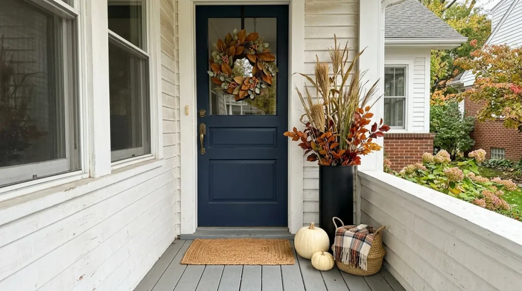
14. For small porches, go vertical and stop at three floor pieces
Concentrate everything around the door: one tall element (wreath, narrow planter, or hanging basket) plus two or three small floor pieces — that’s it. Trying to fill a small floor area with the same number of pieces a large wraparound porch would use is the single biggest reason small-porch decor looks cluttered in photos.
Think in layers rather than quantity. The door itself is the first layer, a vertical decoration adds height above it, and a few floor-level pieces add depth without eating into the walkway. This layered approach creates a fuller-looking entrance without requiring enough decor to physically fill the space.
Never place a planter or basket directly in the doorway’s swing path — even a small one, if people have to step around it daily, gets moved or removed within a week. For apartment landings or very narrow entryways, a seasonal wreath paired with a layered doormat (see idea #2) may genuinely be all the space calls for. If there’s room for exactly one more element, make it something vertical rather than another object competing for floor space.
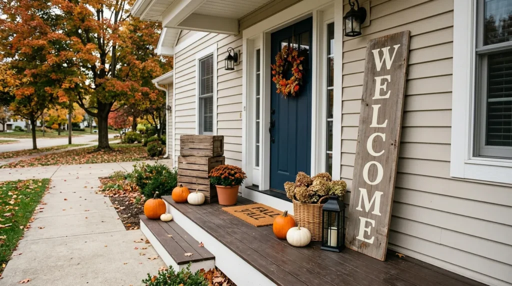
15. Pick a welcome sign people can actually read from the sidewalk
Small lettering — anything under a couple of inches tall — tends to disappear from the street or sidewalk; if the sign is meant to be seen approaching the house, not just up close, size the letters generously. A crowded design with lots of small text or decorative elements often becomes unreadable once the sign is surrounded by pumpkins and planters, even if it looked fine on its own.
Sizing to the space: a tall leaning sign works on a larger porch beside the doorway; a smaller hanging sign suits a narrow entrance better. Wood, black metal, and neutral painted finishes can all work depending on the home’s exterior — match the sign’s finish to what’s already there rather than treating it as a separate decision.
Match the sign’s finish to what’s already there: black lettering pairs naturally with a black lantern or planter already on the porch, and wood-toned lettering ties into crates or baskets. A sign that repeats a color already on the porch reads as planned; a sign that introduces a brand-new color reads as an afterthought.
A simple leaning sign also has a practical advantage over a mounted one: it’s easy to remove or swap out once the season changes, without any installation to undo.
My other blog on kitchen decoration please check
Decorating in Different Climates
Most of this guide assumes a US-style front porch. If you’re decorating outside the US, a few things shift: UK homes are more often terraces or semis with a front step or stoop rather than a covered porch, so treat these as ideas to adapt for a doorway rather than a full floor space — layered doormats, a wreath, and a single planter (ideas #2, #3, and #14) translate most directly. In Australia, autumn runs March through May rather than October, so the seasonal materials (dried grasses, foliage, lanterns) still apply, but pumpkin timing and availability will differ from the Northern Hemisphere, and it’s worth checking what’s actually in season locally before planning a pumpkin-heavy display.
How many pumpkins are too many for a small porch?
Past five or six on a porch under roughly 40 square feet, pumpkins start crowding the walking path more than they add to the display. Fewer, larger pumpkins photograph better than many small ones.
Do real pumpkins last all fall, or should I use faux ones?
In warm, humid, or wet conditions, real pumpkins can deteriorate noticeably faster than they do in cool, dry weather. If you need decor to last six-plus weeks, use faux pumpkins for the bulk of the display and real ones only for the final stretch before Halloween.
Are battery-powered lanterns bright enough for a porch?
Most battery LED lanterns in the 2700K (warm white) range are plenty bright for accent lighting at a doorway or on steps — they’re not meant to replace your porch light for security, just to add warmth to the display after dark.
What’s the fastest, cheapest way to make a porch look seasonal?
Layering a seasonal doormat over a plain outdoor rug is one of the lowest-cost, lowest-effort changes on this list — most setups run under $70 and take about ten minutes.
Can I decorate a porch for fall without spending on new mums or planters?
Yes — reusing containers you already have and changing height (via crates or risers) rather than buying more items is usually enough to make an existing arrangement look fuller, without new plants.